The Metropolitan Opera has been showcasing performances for hundreds of years, ever since its founding in 1883. Its first opera house was on Broadway and 39th, moving to the Lincoln Center in 1966. Its performances have been viewed by many, with its early days operas being entirely in Italian, and then German, until eventually settling into a wide range of acts that are mostly performed in their original languages, save a few exceptions.
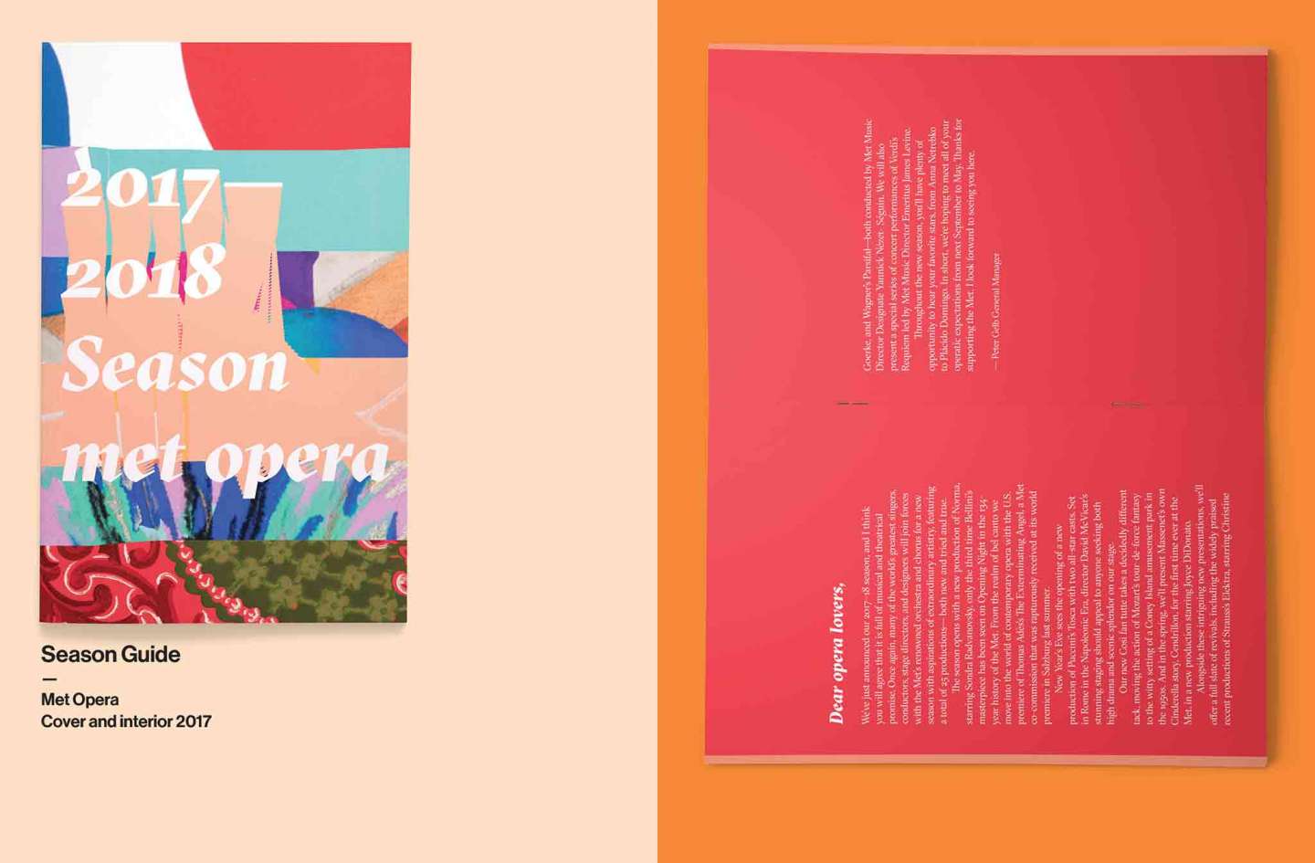
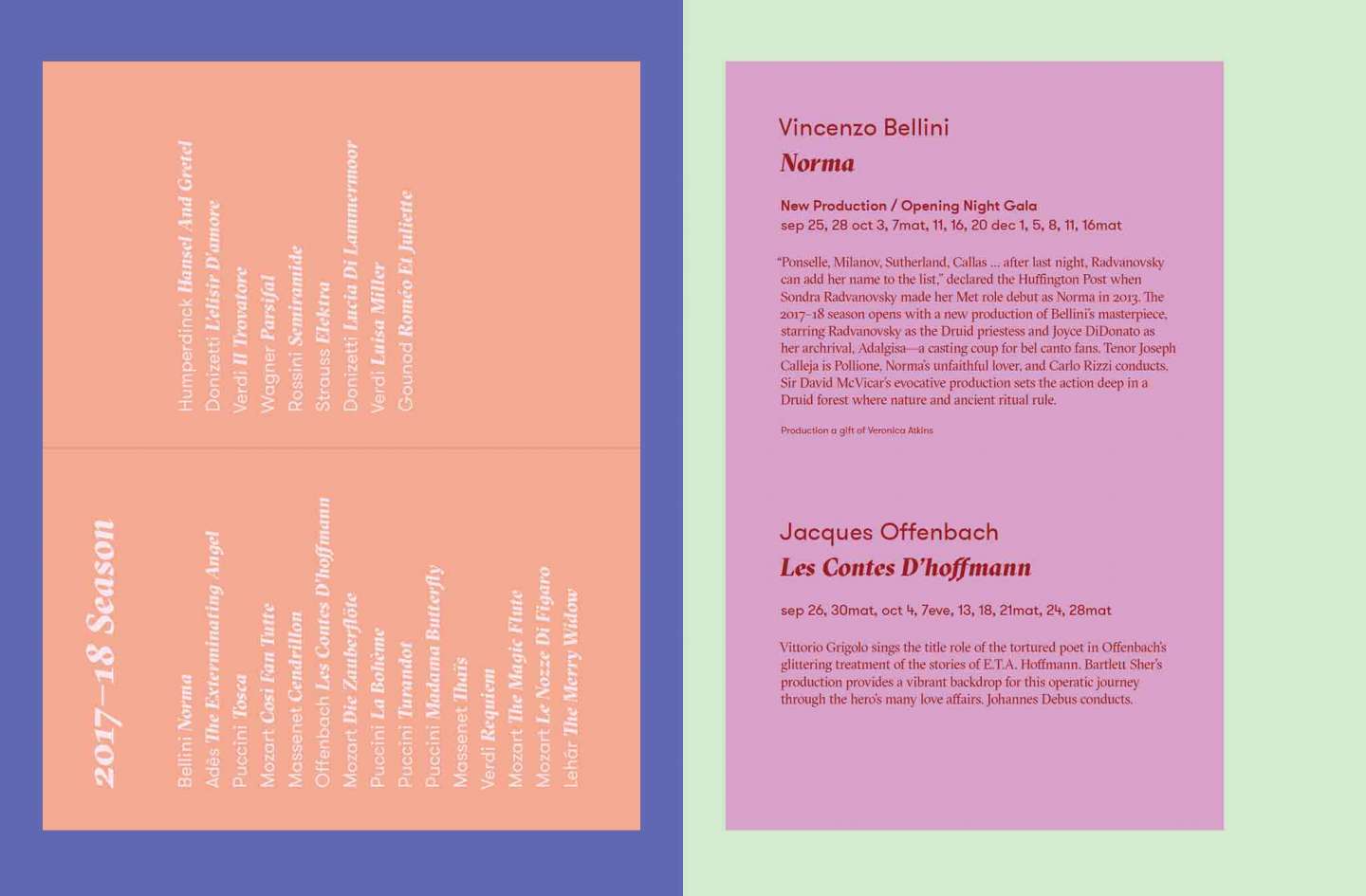
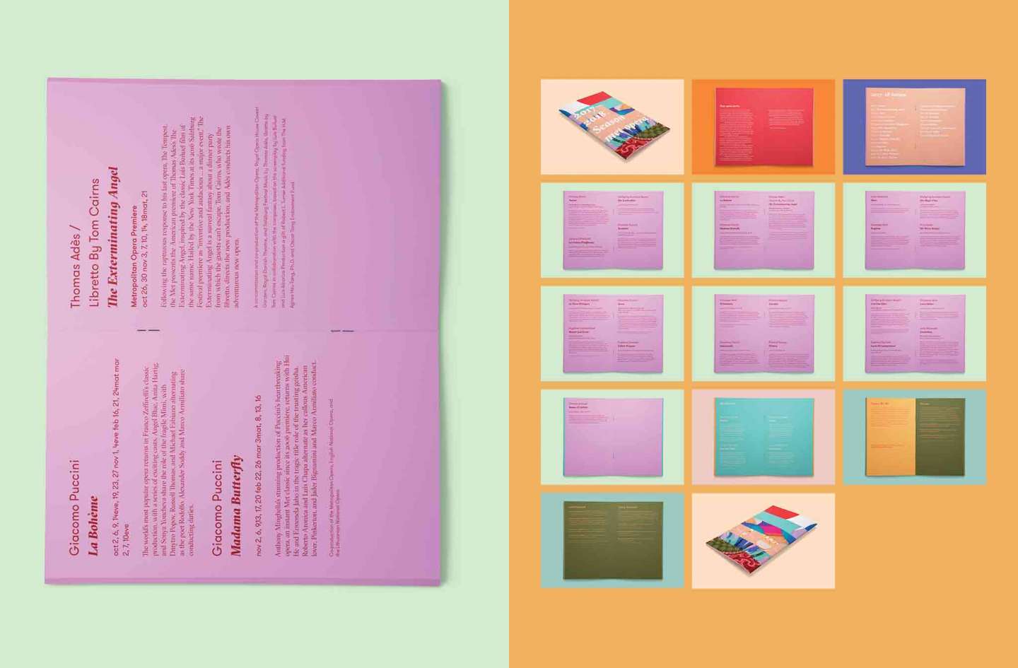
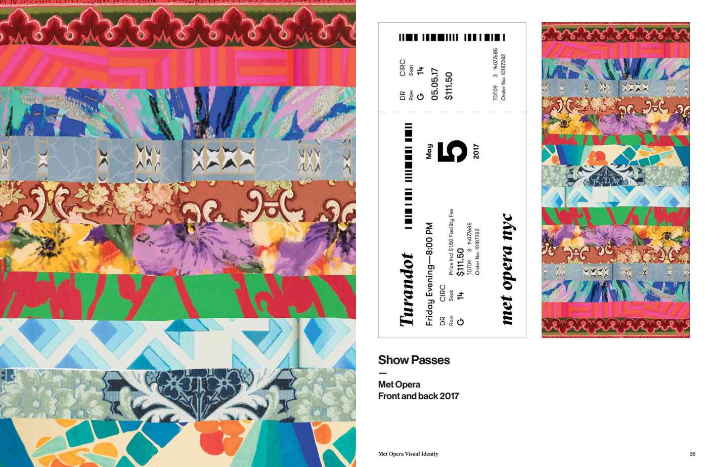
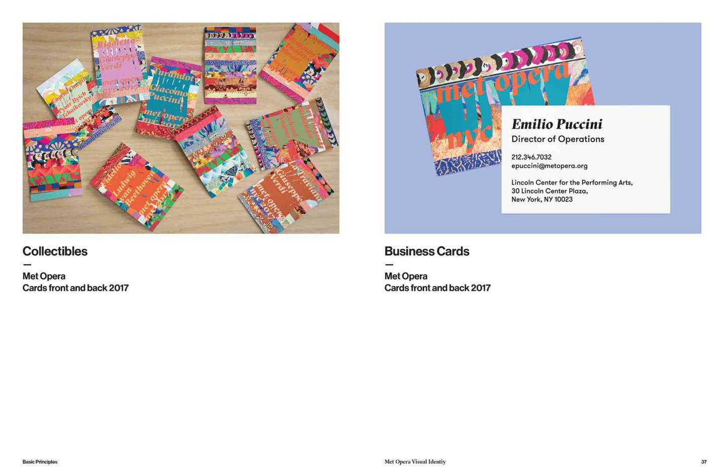
The intent of this rebranding is to revitilize the Opera’s aesthetics to suit a younger, newer audience while keeping true to its classical roots and the spectacle that is to experience an opera unfold before one’s eyes. By utilizing broad stripes based off of colorful patterns as its base graphic element, and incorporating contemporary typefaces, the rebranding brings forth a sense of spectacle—the patterns through variation in color and shapes evoke the idea of different elements coming together to form a performance. While the typographical design, endeavors to preserve the classical identity of an Opera, its treatment is unorthodox and provocative, eliciting compelling reactions for a younger, curious audience.