made is a skincare and cosmetics brand designed to abolish the ridiculous gender division of hygiene and self care products.
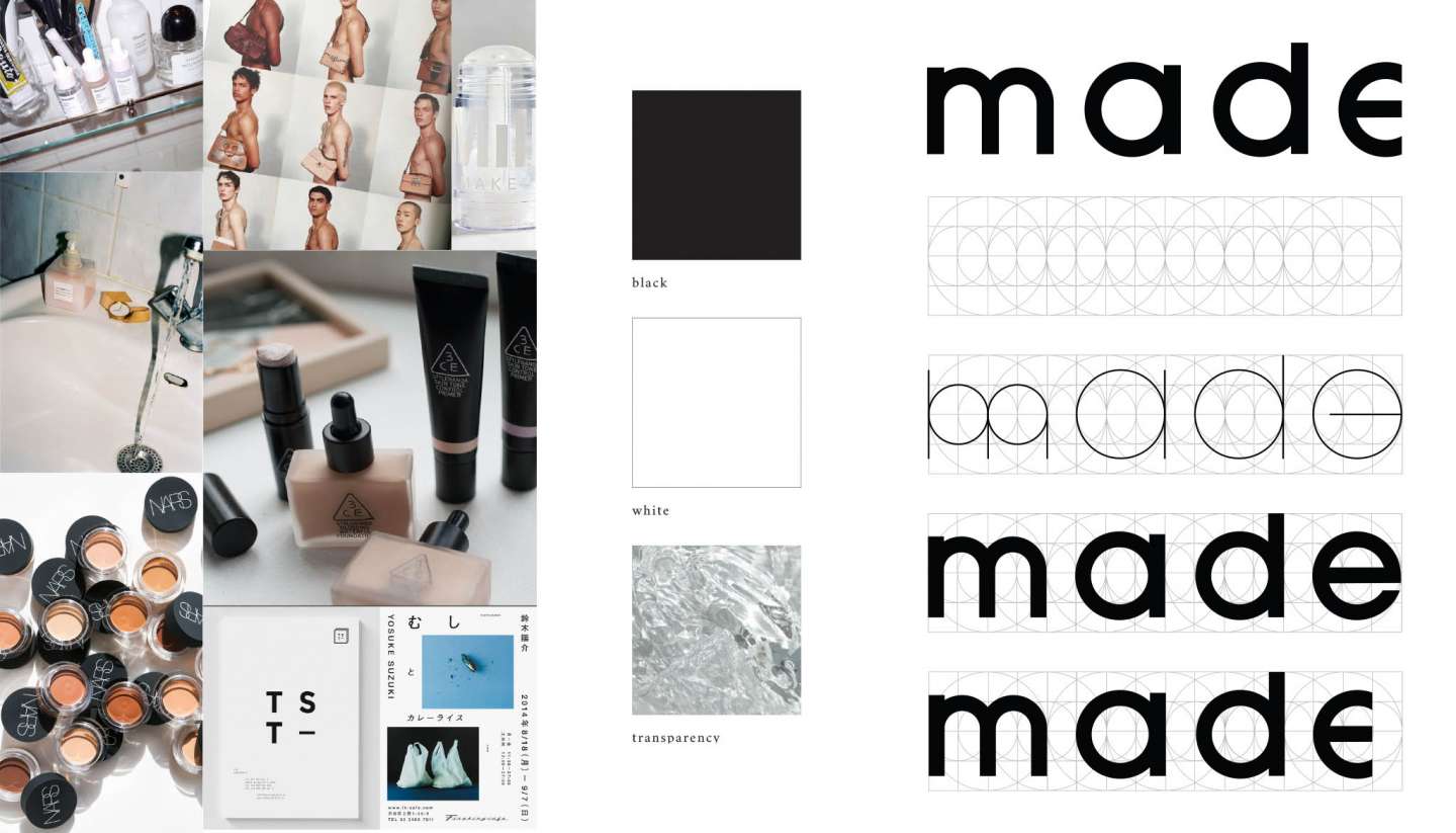
The aesthetic is borderline classically generic, so as not to alienate anyone due to its inclusive nature, but still stylish, in the same realm of brands like Glossier and Milk Makeup.
The logo’s amputated E is a hint of irony; the ideal consumer of made is someone who knows who they are and wants a company that respects that, a company that validates that mindset. The end of the E being chopped off is representative of the fact that, no matter how well you know yourself, there’s still so much potential for change. made is more about the message than the products, but everyone can participate in basic hygiene.
The logo also adheres to a grid — made of squares and circles to ensure perfect geometry — that became the basis of the rest of the branding elements.
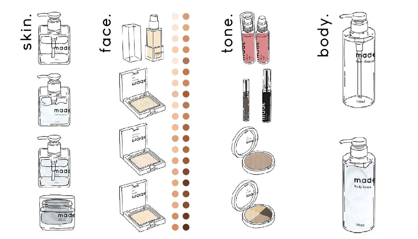
The various product lines (skin., face., tone., and body.) are distinct from each other due to packaging shape; skin. and face. share square-based packaging, and tone. and body. using circle-based packaging. Everything is packaged in literal transparency.
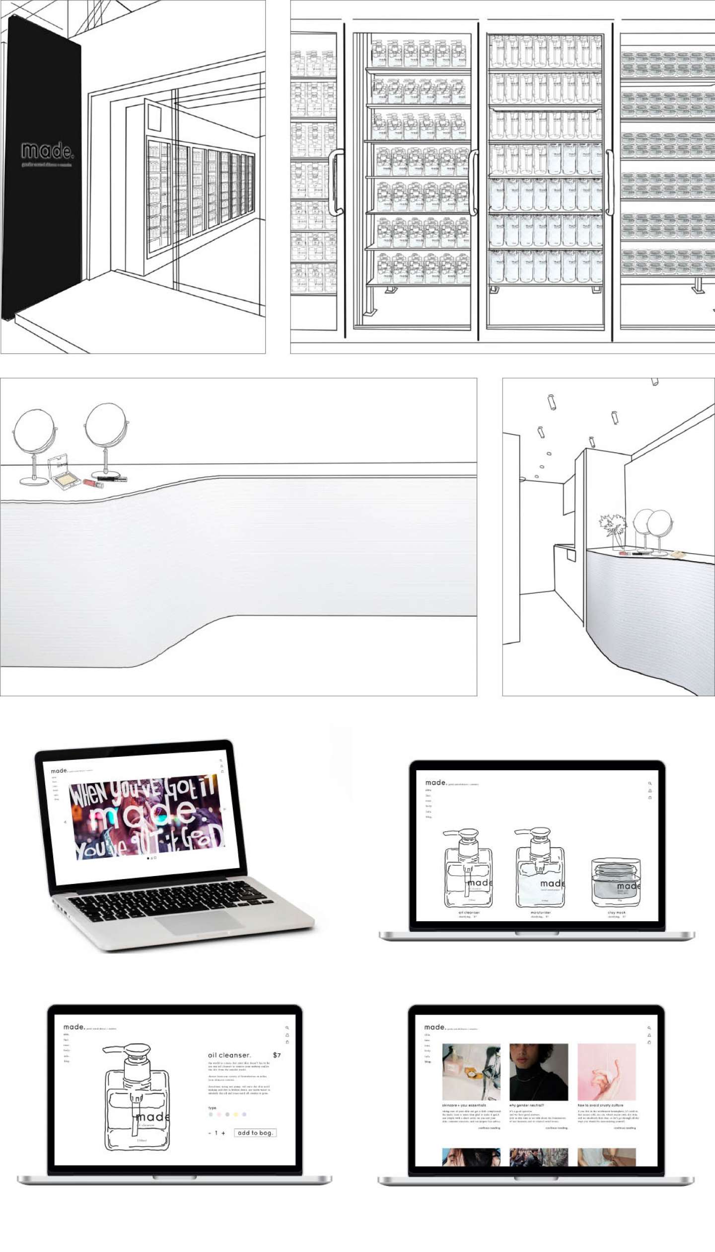
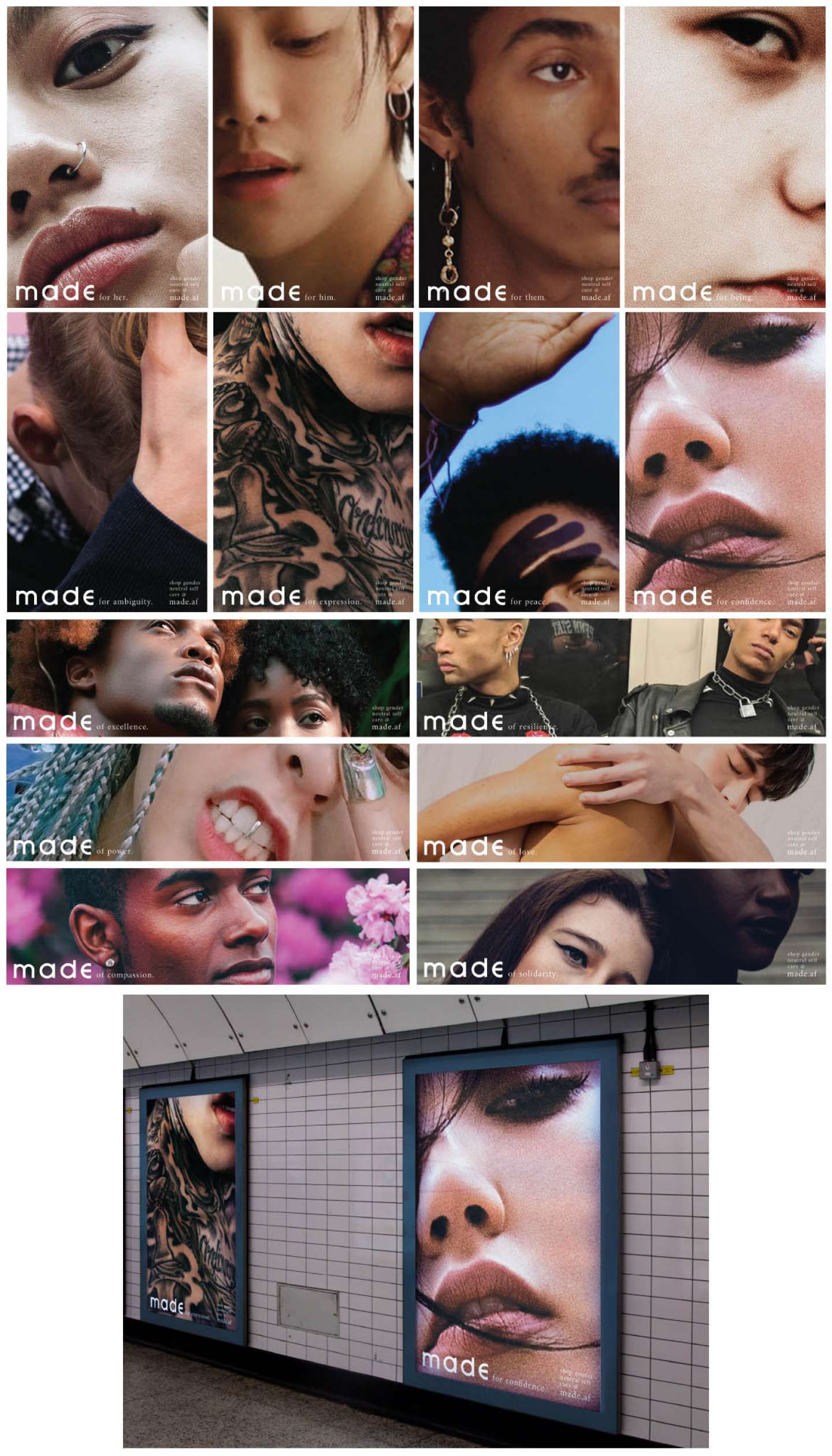
made’s general marketing is a form of empowerment. The print ad campaigns feature extreme close-ups, meant to obscure the gender of the model as much as possible. The tags are divided into two categories, incorporating the brand name. The poster ads use “made for…” and the banner ads use “made of…” as the beginning of their slogans. The brand website also has a blog section, meant to further interact with consumers, to further the concept of inclusion.