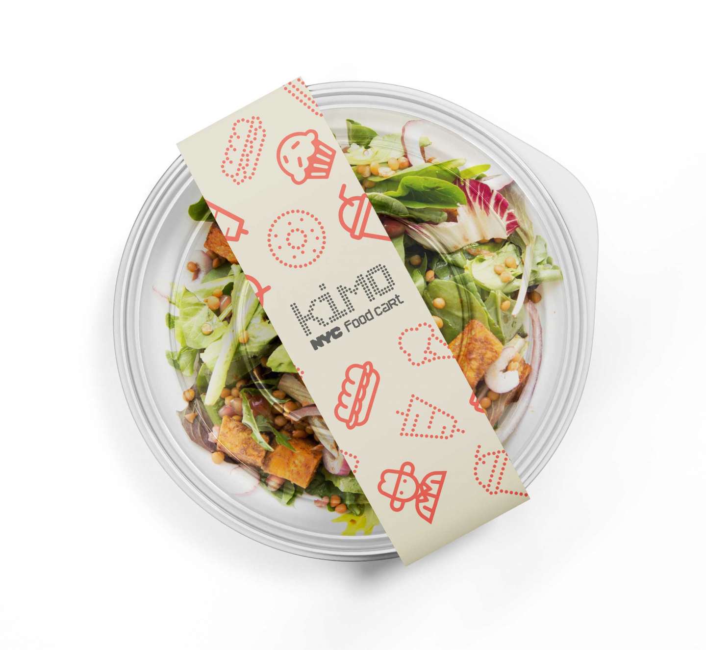
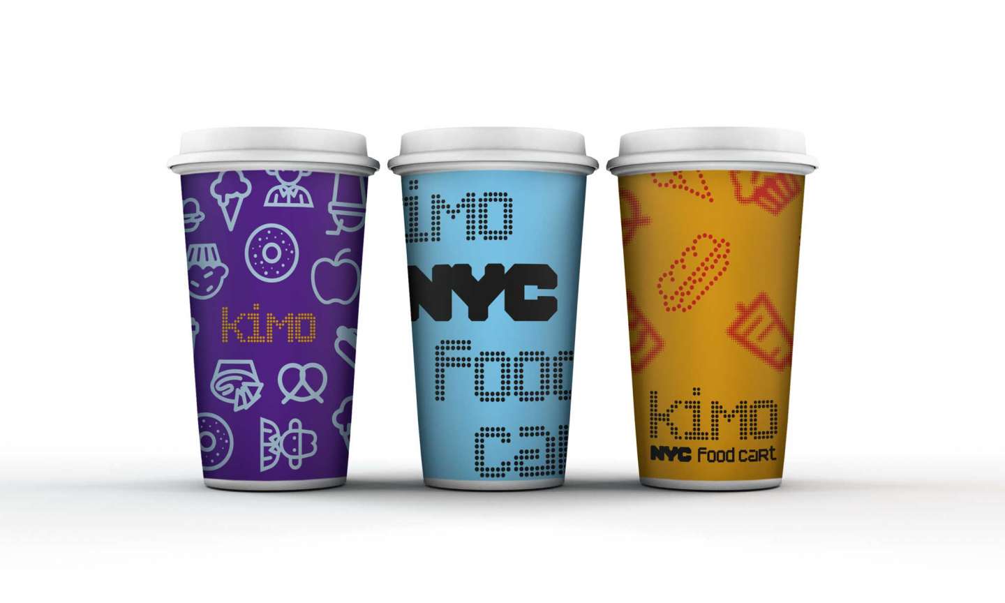
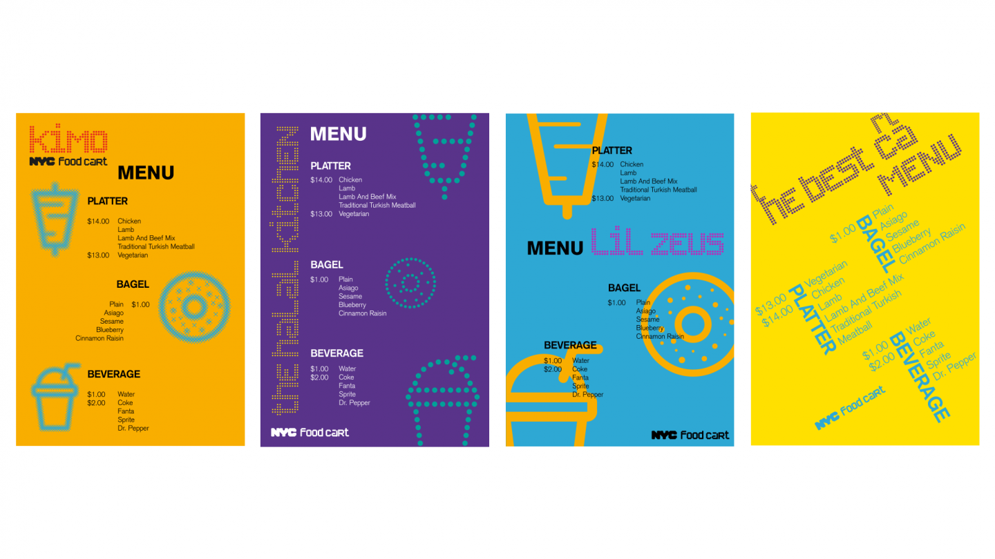
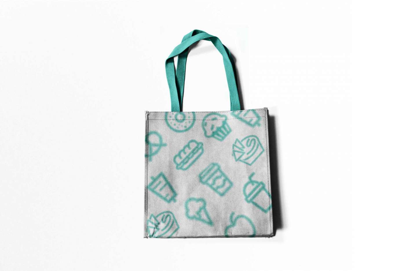
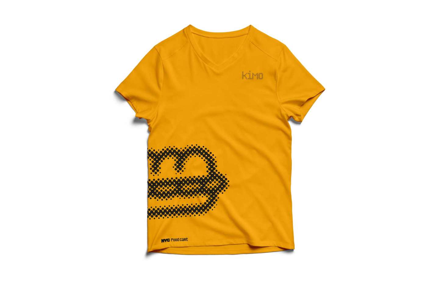
This is a rebranding project for the whole of New York City’s food carts. When I was doing the research, I found the location dots were so crowded on the map. So I decided to use this as the concept. Dots can represent lots of things such as location, community and diversity, which are suitable for NYC. The pop arts and silkscreen have some good examples of making dots. The color palette is from the rainbow which shows diversity. And it’s good to prepare for pride week every year in NYC. There are three iconography systems for this project for different situations. The first one is only for large scale printing. The second, a line version can be used in any circumstance, while the last single dot line system will be used as an alternative when the first one is not appropriate. Also these multiple systems provide the options for the cart owners to customize their brand to show their own personalities.