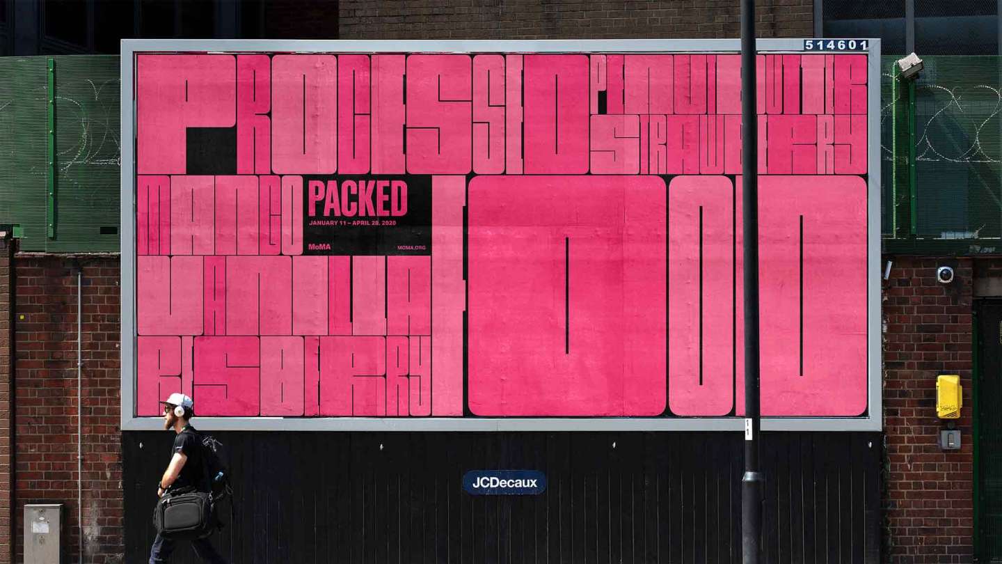
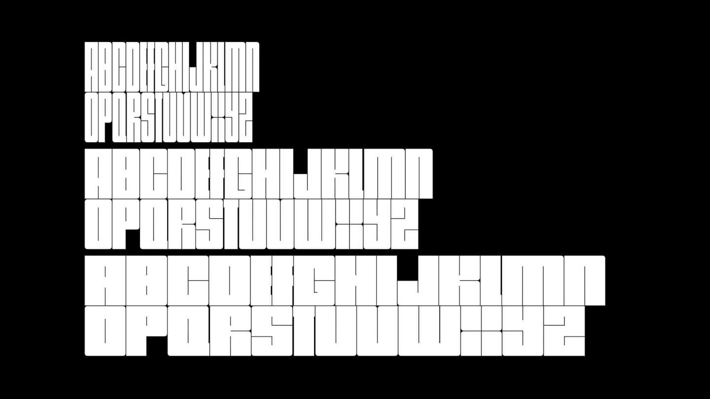
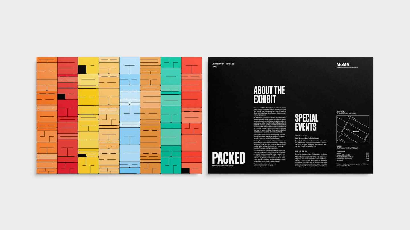
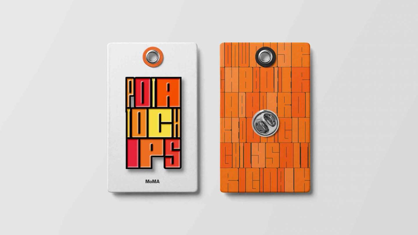
To design an identity system for an exhibition of processed food, the challenge was to translate the overwhelming display at a supermarket into a beautiful, understandable, systematic design. The color blocks that are created by the resemblance between similar products interested me. People do not recognize the products by their logos or packaging designs at supermarkets. They recognize them by the forms and colors of the products. A custom font was created for translating this behavior into the design identity that conveys the packed quality of a display and the beauty of processed food.
View on Portfolio:
https://chihaochang.com/packed