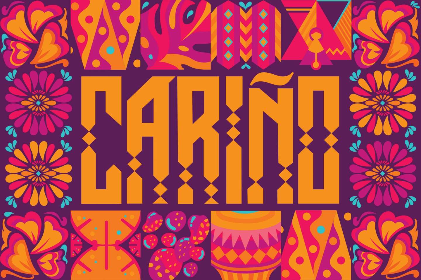
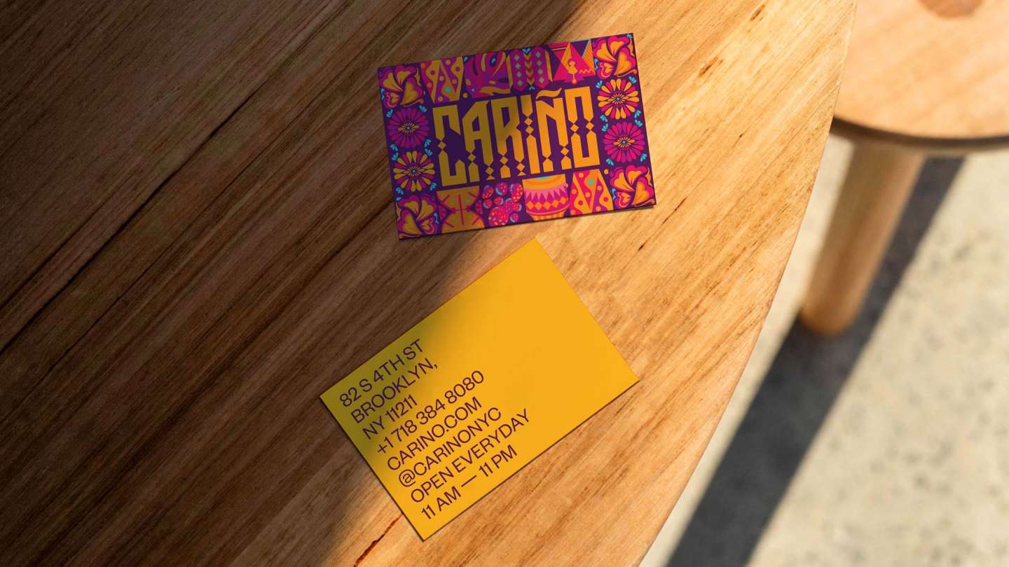
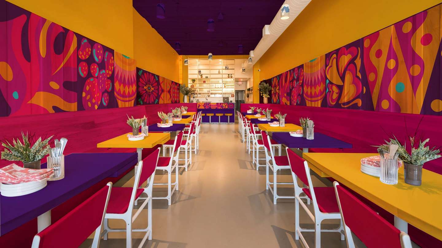
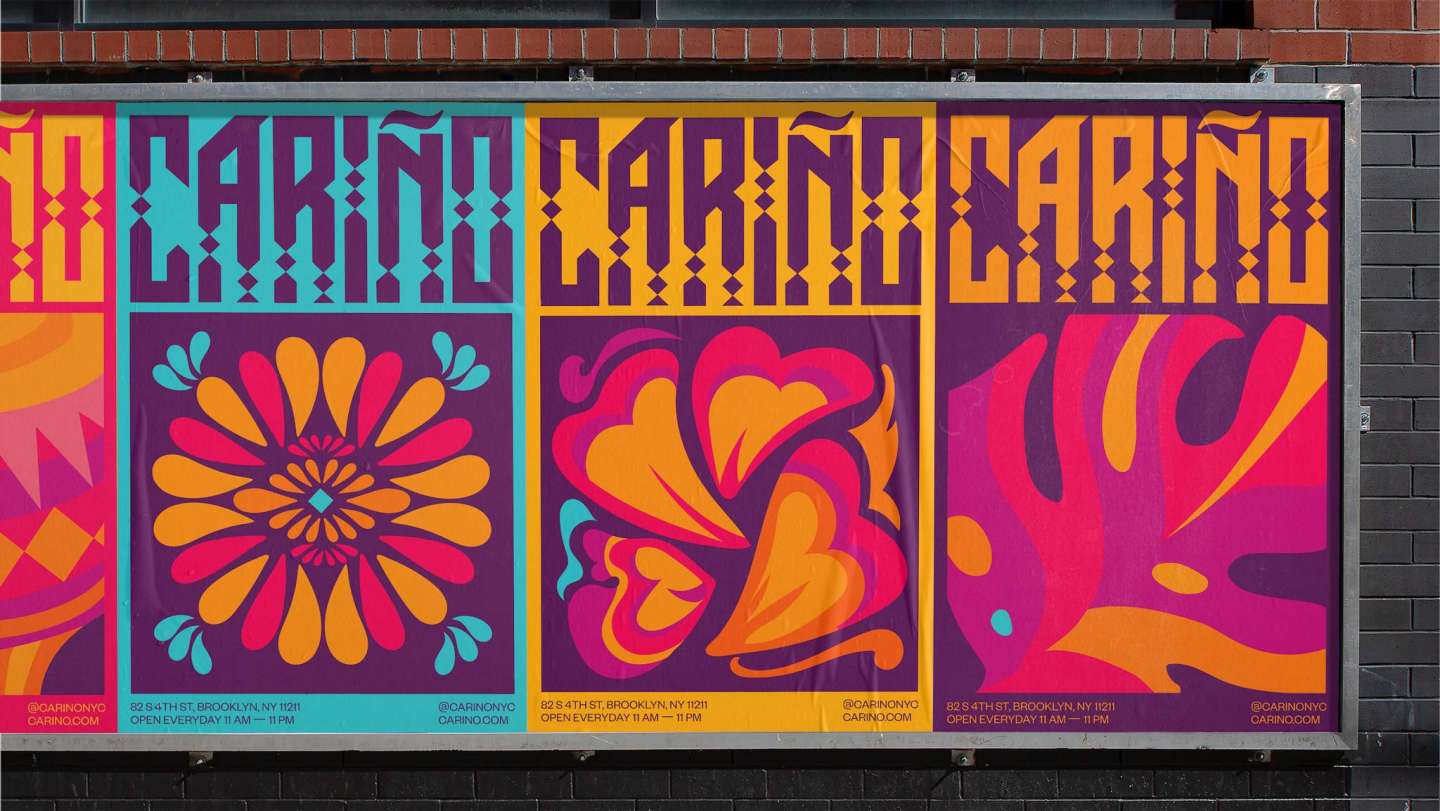
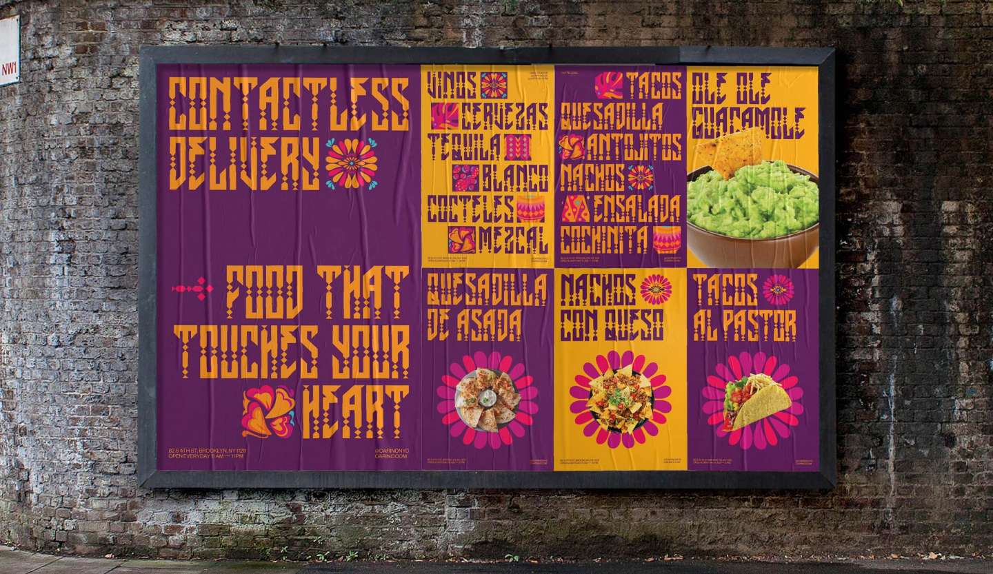
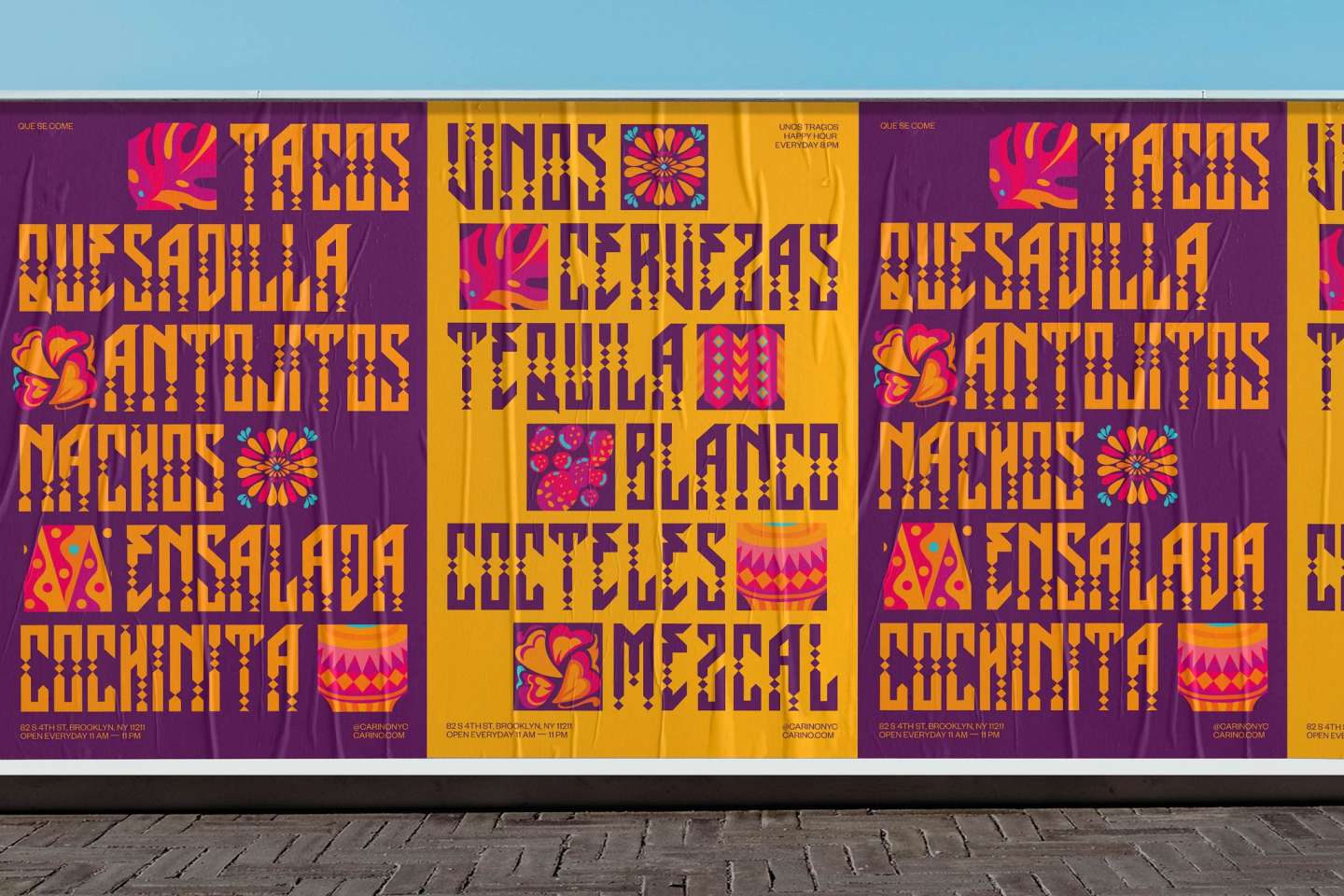
The identity uses warm color to represent the Spanish word ‘Carino’ which translates to ‘affection’. The custom logotype is inspired by Aztec art and architecture. The logotype is accompanied by abstract vector illustrations that connect to form patterns. Each illustration is inspired by and represents a key part of Mexican traditions, cuisine, and culture.
Website: shantanu.work
Instagram: @shantanu.sharma