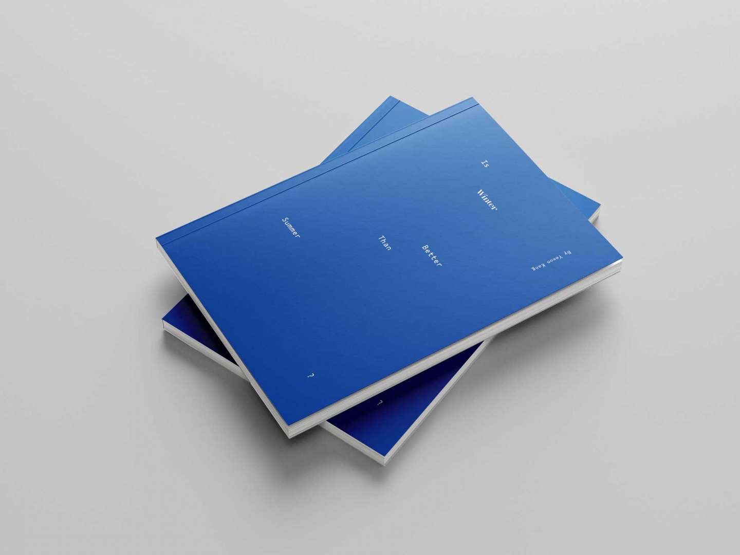
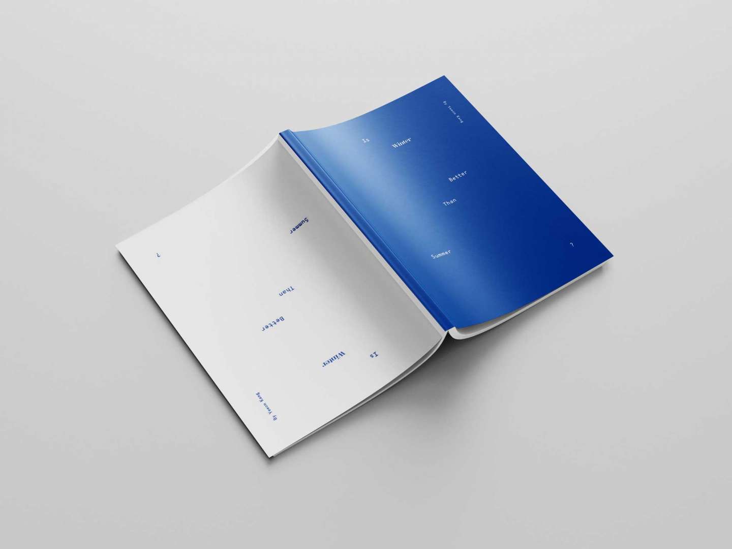
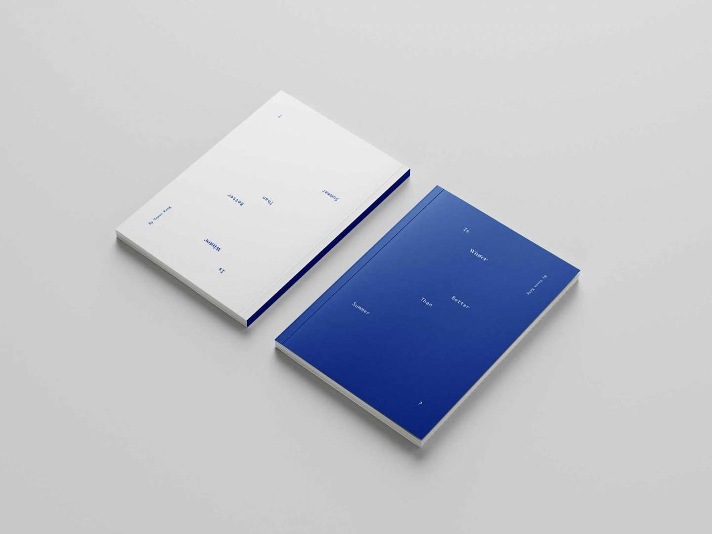
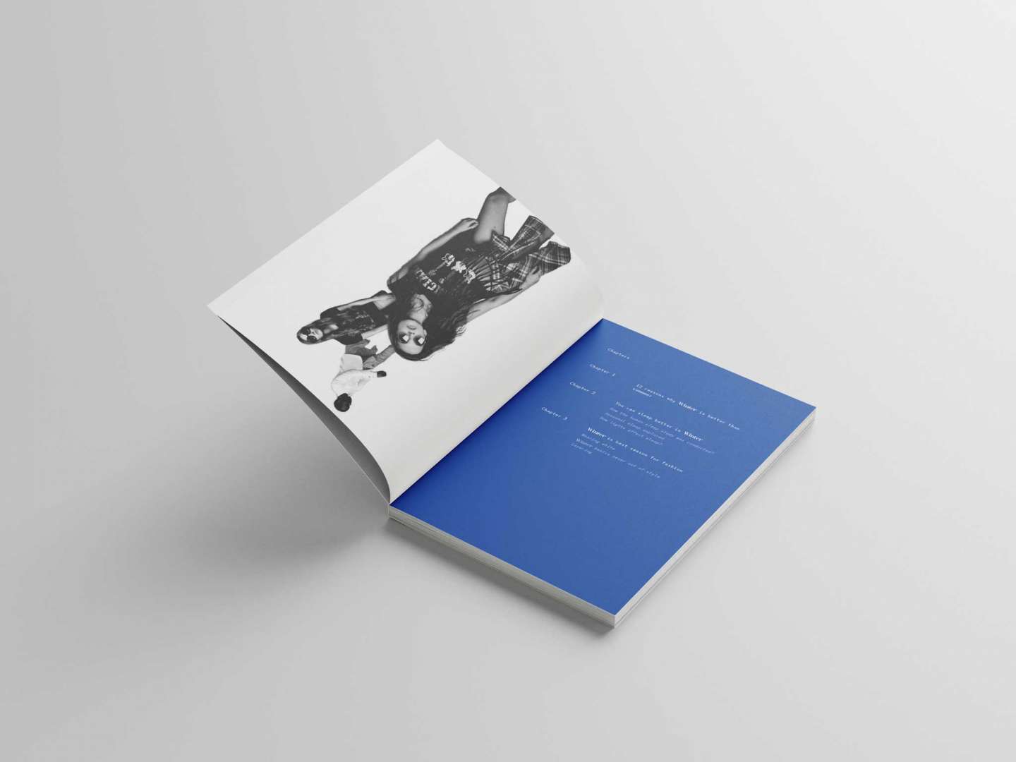
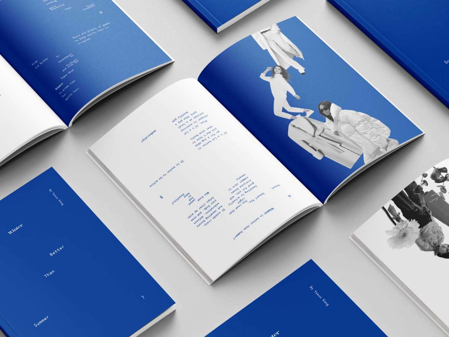
"The Opposite" is a printed book project that explores the opposing views of two different seasons, winter and summer. The book is sized at 6.5 in x 9 in (W x H) and is divided into two sections. My bias towards winter affects the design through the use of different typeface for the word "Winter" in both sections and the use of a dark blue tint in the winter section. The book is designed with light art to add humor and simplicity to the book. It's also unique that it doesn't have a back cover. This means that when you flip the book over, you are presented with the opposing view of the topic, and only the right side of each page is dedicated to the section you are currently reading in. Overall, it's a thought-provoking and visually engaging book that challenges readers to think about their own preferences and biases towards different seasons.