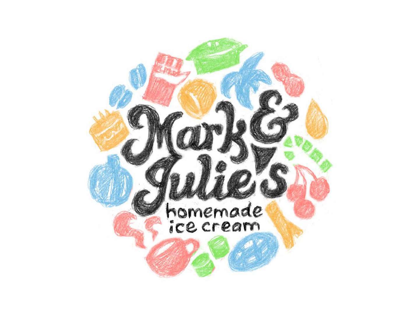
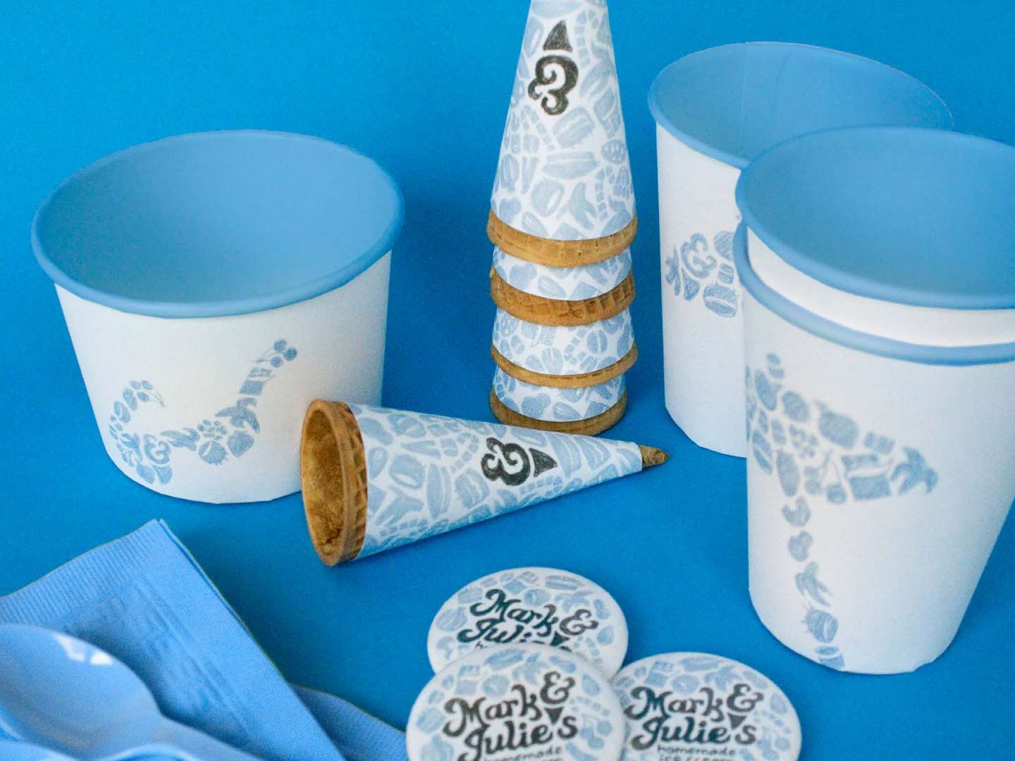
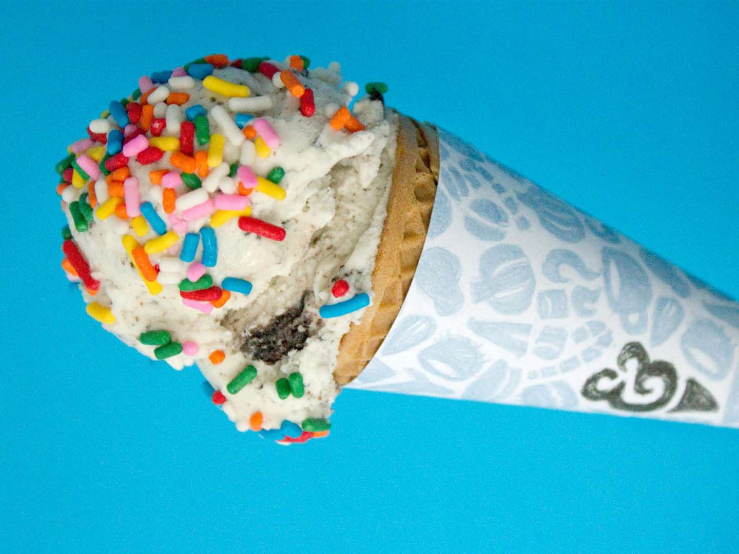
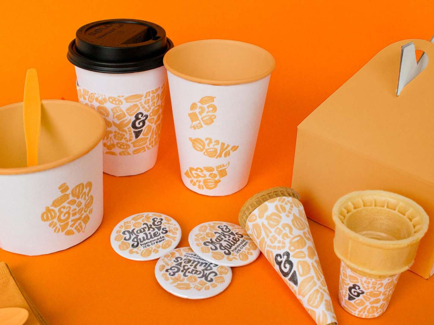
A brand identity for a small local family-owned ice cream shop in West Orange, New Jersey. It includes logos, buttons, ice cream cups, cones, milkshake cups, coffee cups, cake boxes, napkins, and utensils.
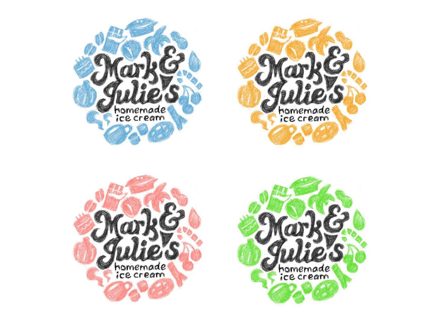
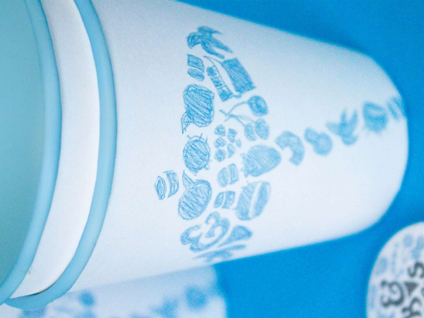
Owned by a husband and wife, Mark & Julie’s is known for a huge variety of handmade ice cream flavors. They also have distinct seasonal flavors like Peach, Pumpkin Pie, and Cappuccino Crunch. The logo represents the integrity of their ingredients, as well as the variety of flavors. The imagery is all hand-drawn to distinguish them from chain ice cream stores, showing a personal touch that represents their friendliness and connection to the local community. All of the imagery changes seasonally, preventing staleness and keeping the staff and customers involved and enthusiastic with every season.
Summer uses a blue color scheme, which is cool, relaxing, and refreshing, creating a refuge from the summer heat. It suggests fruity and fun flavors, like Banana, Coconut, and Cotton Candy.
Fall uses orange, which is warm and enthusiastic, encouraging customers to keep coming even as the weather cools down after the summer months. It represents warmer, sweeter flavors like Pumpkin Pie, Chocolate, and Cinnamon.
As the slowest season for ice cream vendors, I chose pink to make the store feel warm and welcoming. By serving hot drinks like coffee and hot chocolate, they can draw customers towards flavors like Coffee, Chocolate, and Peppermint Stick.
For Spring, green suggests renewal with the coming of warmer weather, and classic flavors such as Mint, Vanilla, and Pistachio.
Promotional buttons also serve as business cards, with contact and location information on the backs.