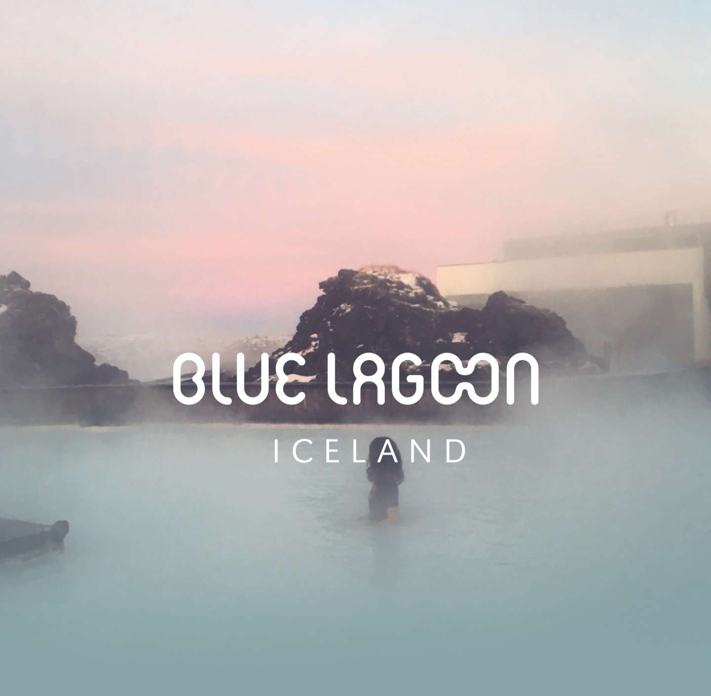
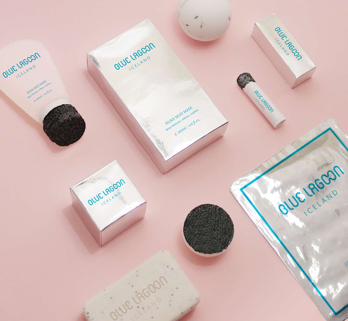
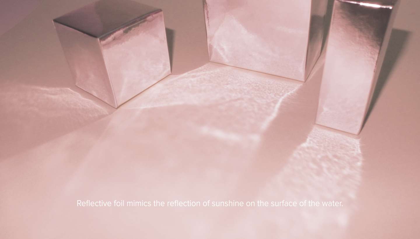
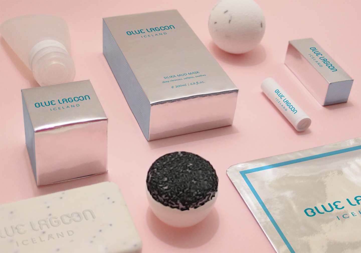
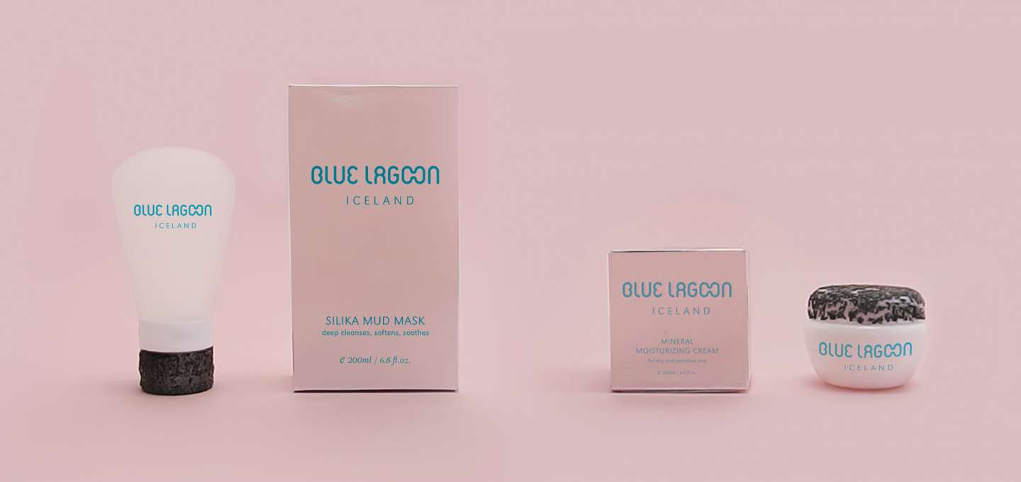
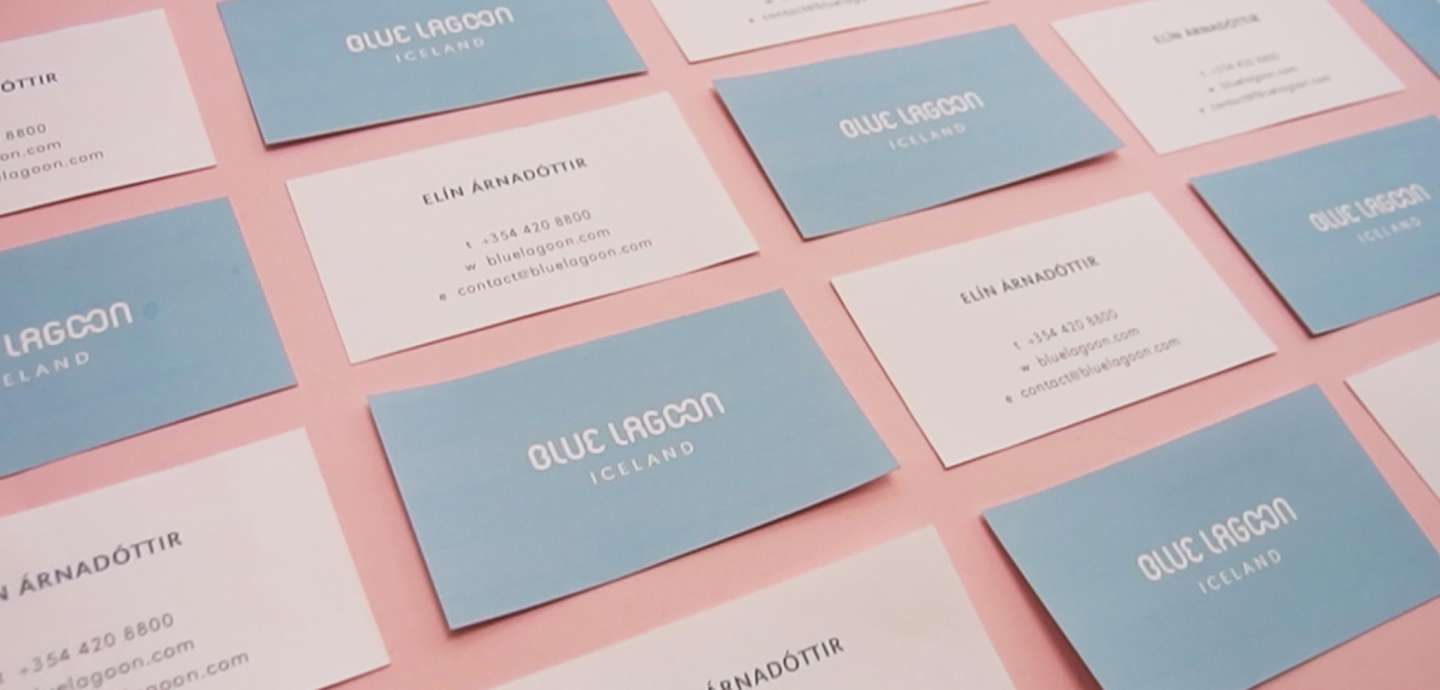
This project is redesign of Blue Lagoon Iceland cosmetics packaging. I chose this brand because I went to Iceland last winter vacation. I really like the country because it is so clean and natural. Blue Lagoon is one of the most famous places for visitors in Iceland. I have never forgotten the softness of sulfur in the bottom of the hot spring. Thus, I tried to reflect the touch to the cosmetic package. Although the sulfur is so soft, the lava stones and rocks are too rough. I felt these two contrasting things coexisted. Upon the inspirations, I used silicone as the material of the products and a lava stone-textured cover. For the material of the package boxes I chose reflective foil, which mimics the reflection of sunshine on the surface of the water. The great quality of Blue Lagoon cosmetics makes it highly recommended, but their current design is too ugly. First, I created their logo with an organic feeling in mind, and I combined two ‘O’s smoothly to reference the microorganisms in the water. The most impressive thing in Iceland was the color of sky, so I picked the colors from photos that I took while there. The main colors are pastel light blue from the water in Blue Lagoon and baby pink from the sunset.