For this project, I designed a MoMA exhibit focused on the architect Zaha Hadid.
Hadid herself, explained the essence of her style very simply: "The idea is not to have any 90-degree angles. In the beginning, there was the diagonal. The diagonal comes from the idea of the explosion which 're-forms' the space. This was an important discovery!" This philosophy of fluidity and dynamism directly influenced my typeface design.
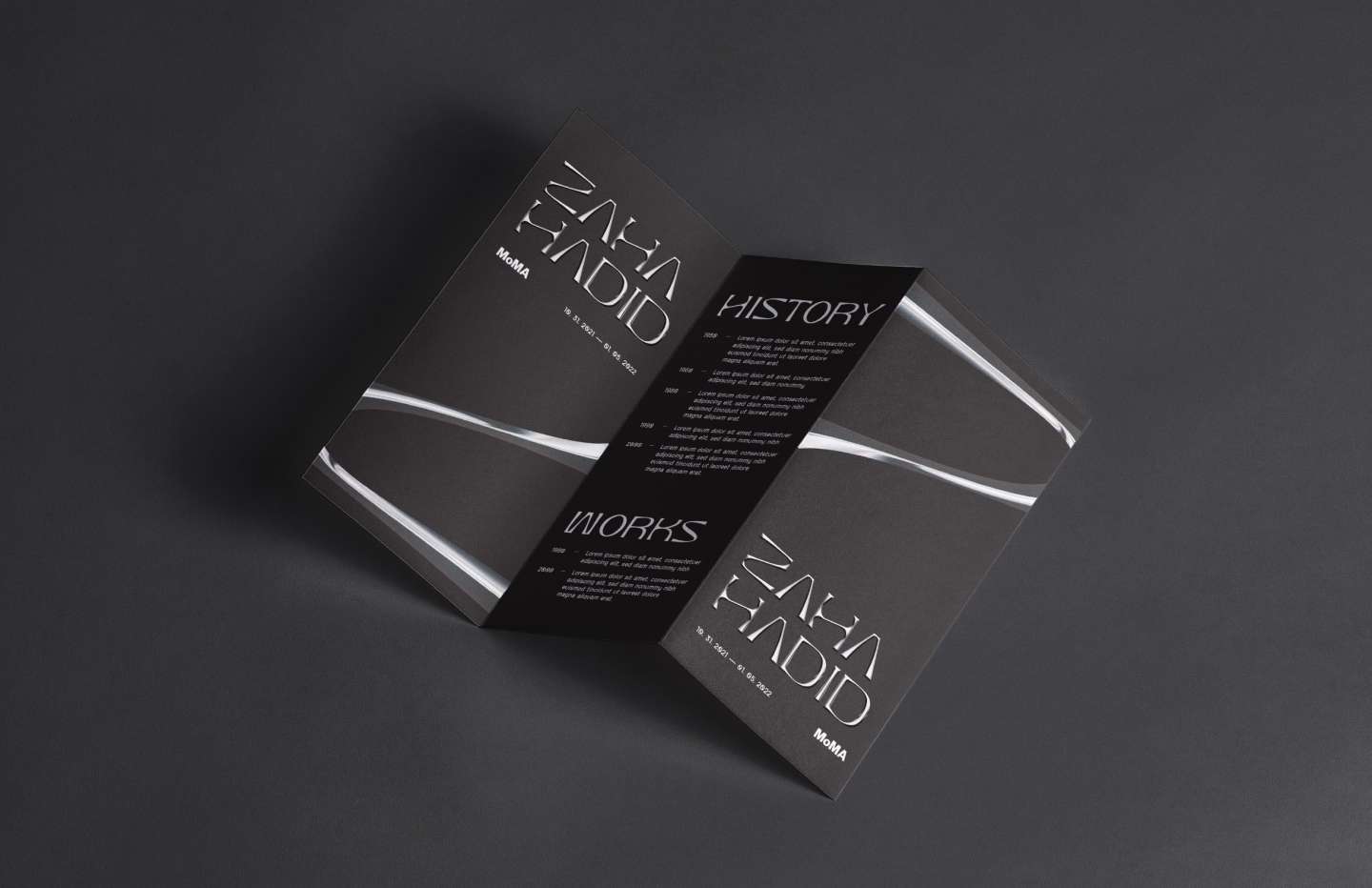
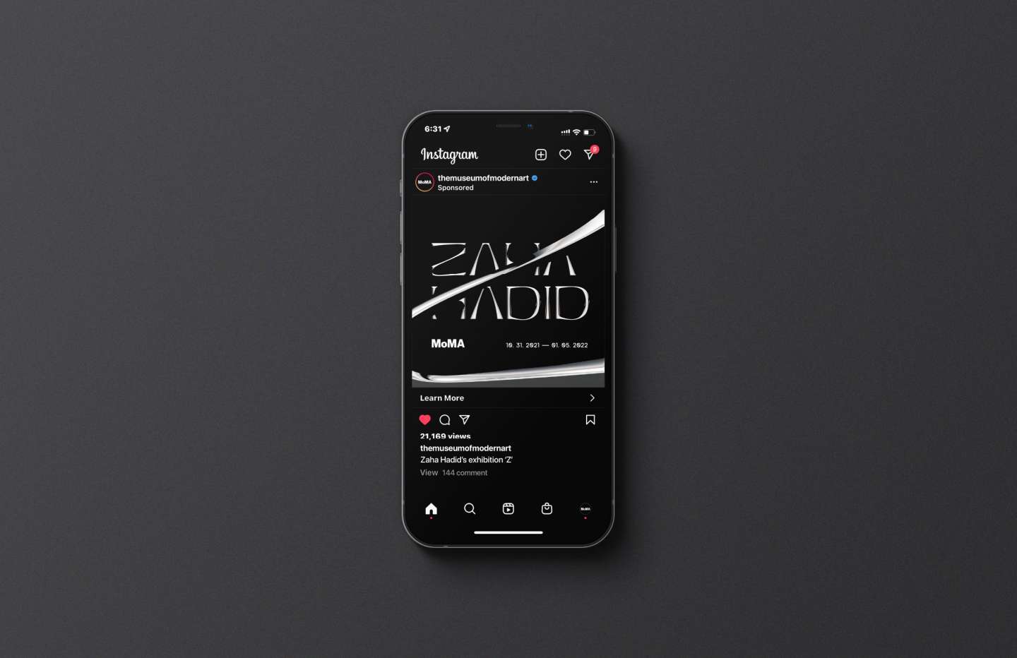
Inspired by Hadid's signature architectural style, I created a custom typeface that reflects the dynamic, fluid forms found throughout her work. This typeface was initially intended as a display font, but during the design process, it became a versatile creation. It remains legible at smaller sizes while retaining its intricate details when enlarged.
The typeface, paired with a complementary bold yet legible font, offers good readability and sophistication.
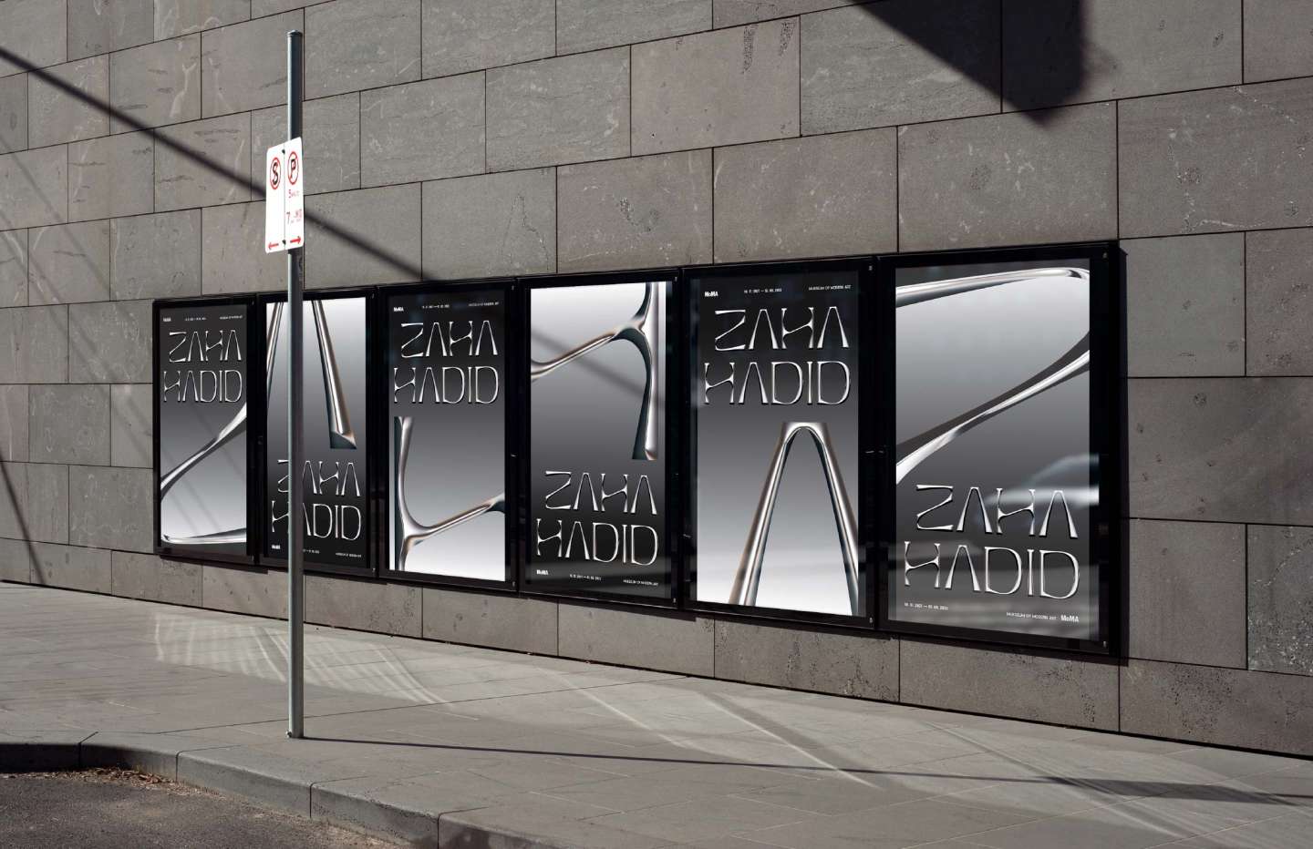
Building on this concept, I created a poster series that incorporates the enlarged details of each letter to form the name 'Zaha Hadid'. This visual playfulness reflects the architect's own design principles. Ultimately, this approach resulted in a sleek and strong brand identity.