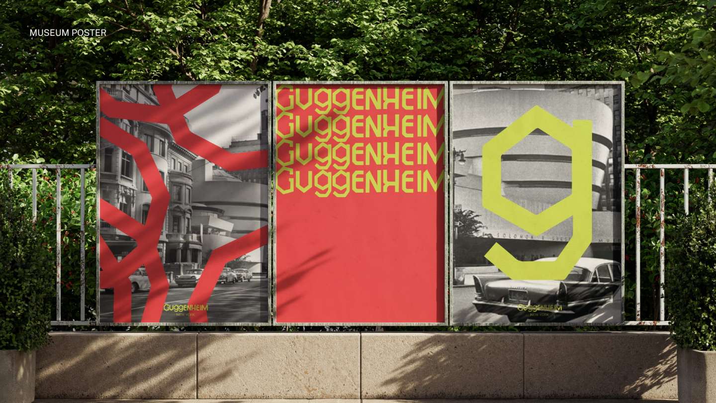
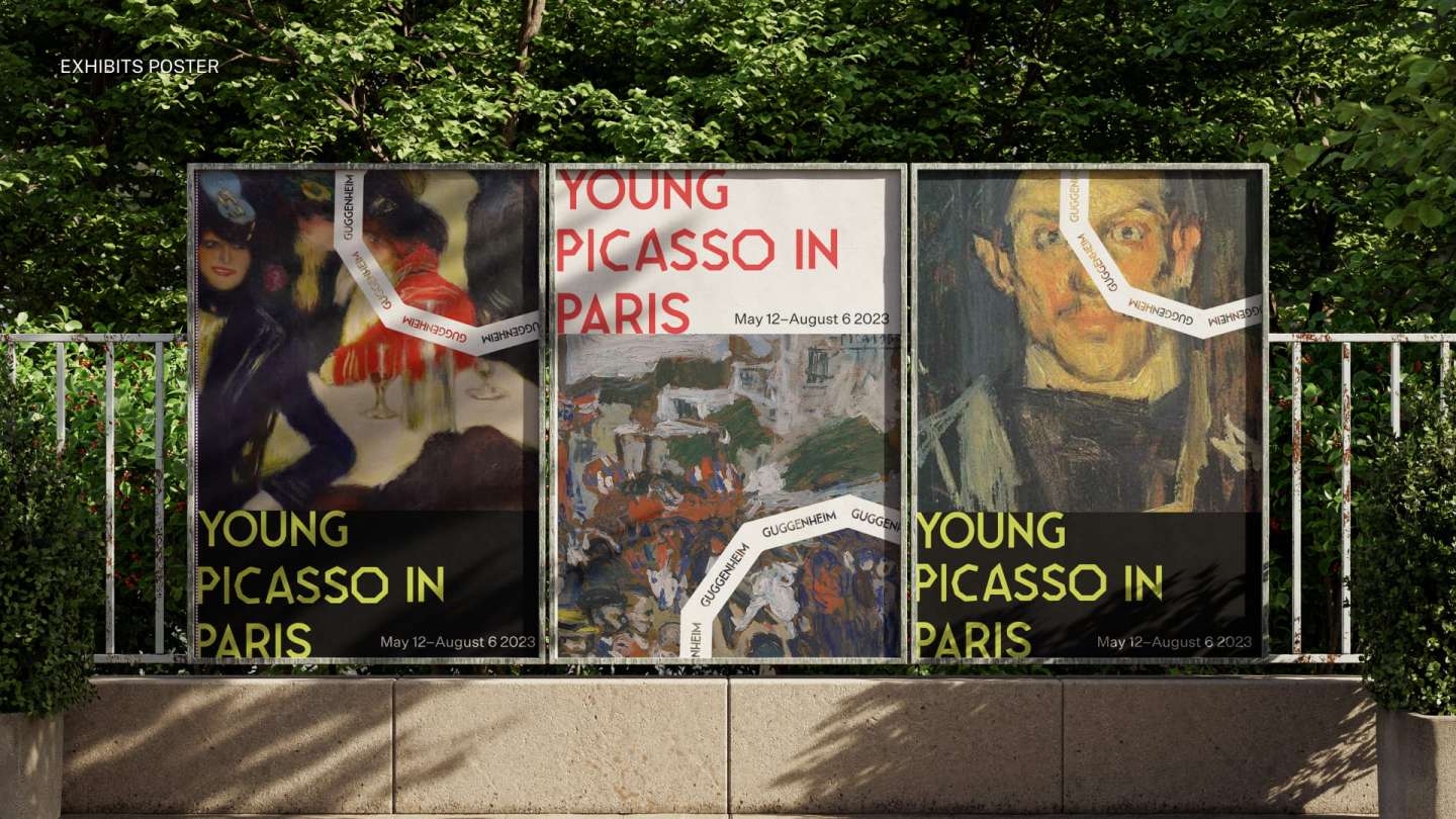
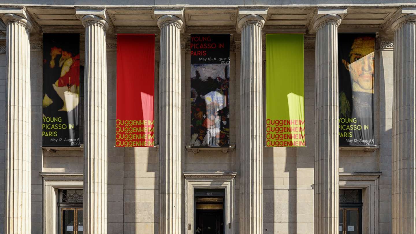
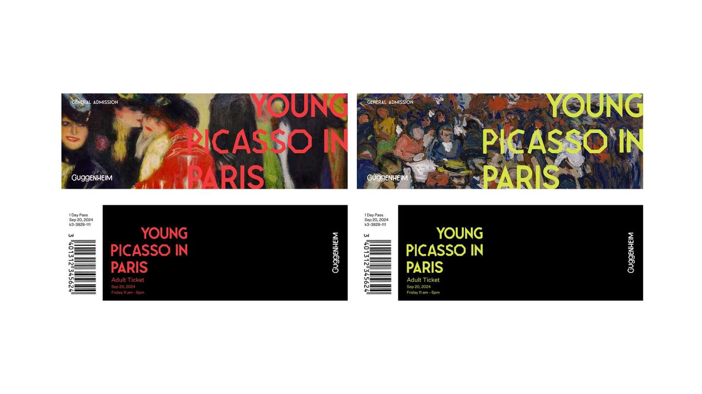
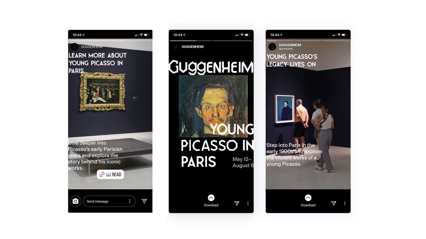
For this Guggenheim Museum rebranding project, I drew inspiration from the museum’s iconic architecture to develop a bold new visual identity. I created abstract shapes based on the building’s curves and contrasted them with a sharp, angular logotype to spark visual interest. The typeface "Leaner" serves as the primary font, paired with "Untitled Sans" for secondary text. The color palette—F13C40 (red) and DEE447 (lime green)—emphasizes contrast and reflects the museum’s dynamic spirit, with red symbolizing passion and creativity, and lime green representing freshness and innovation. To complete the identity, I designed a custom wordmark inspired by angular forms, reflecting the Guggenheim’s progressive and modern character.