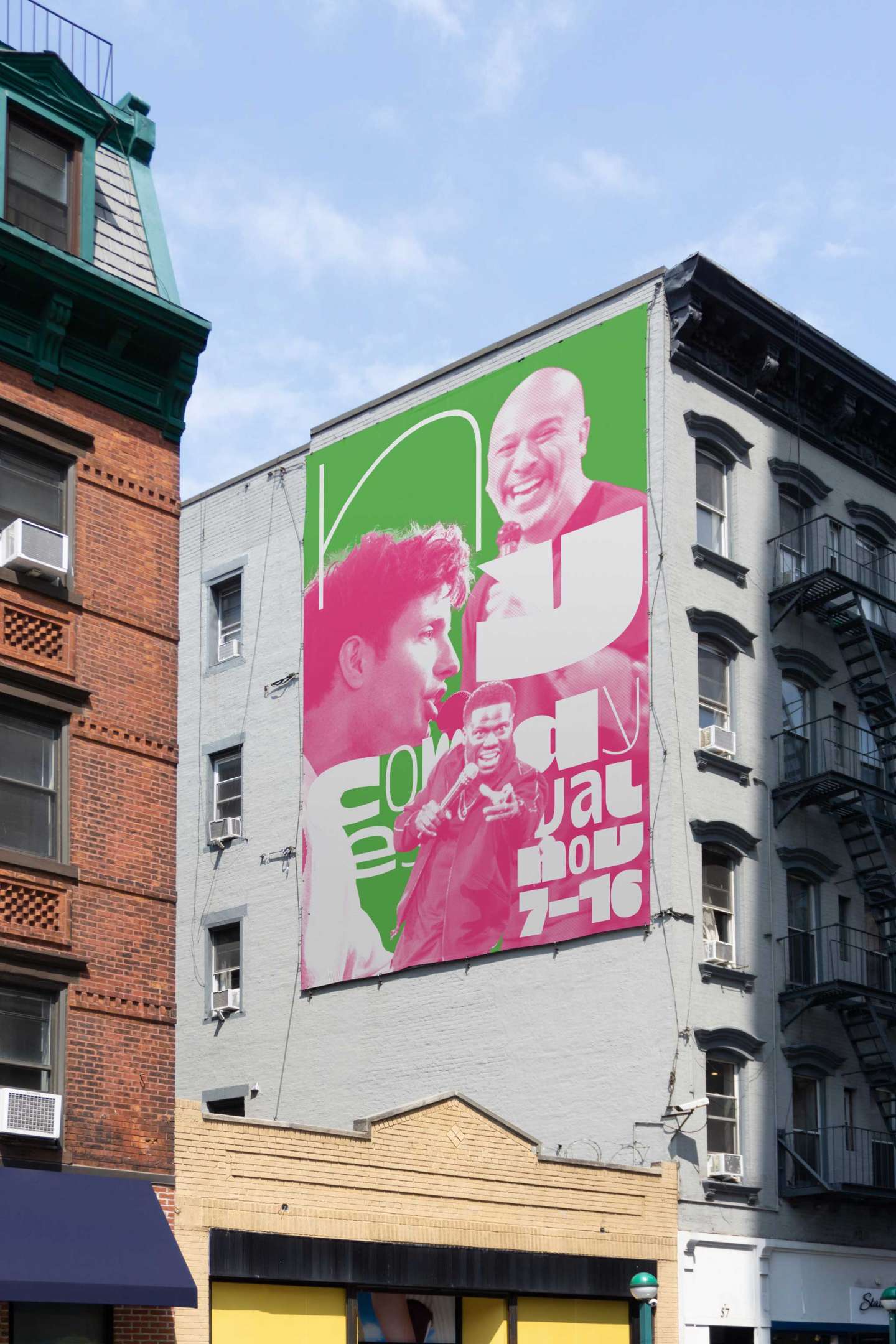
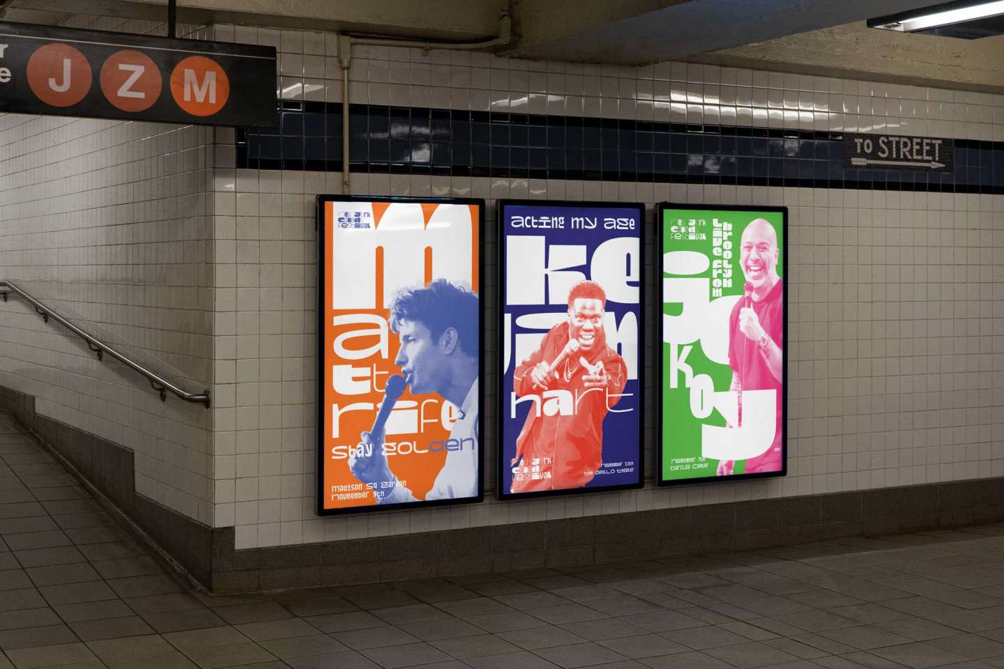
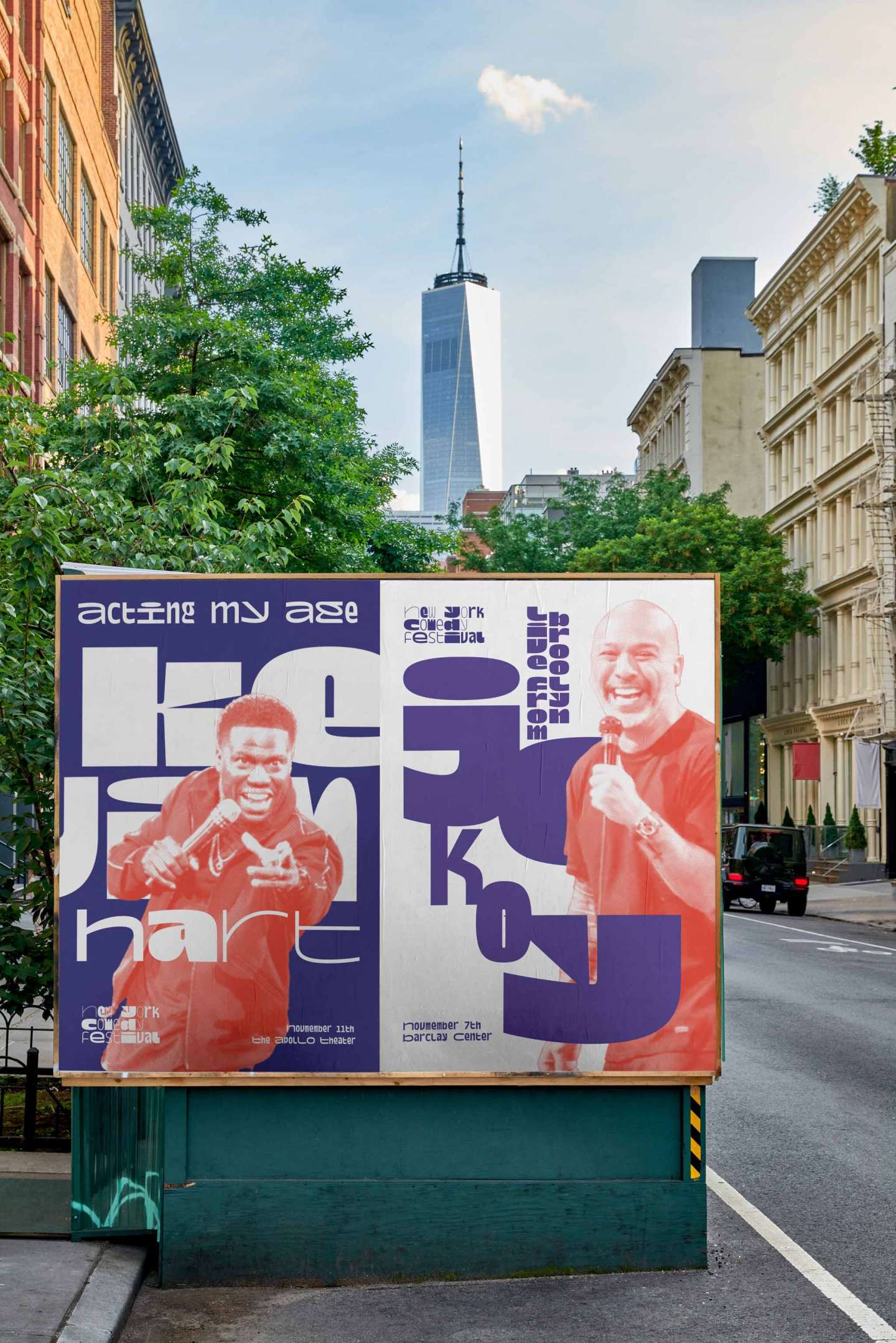
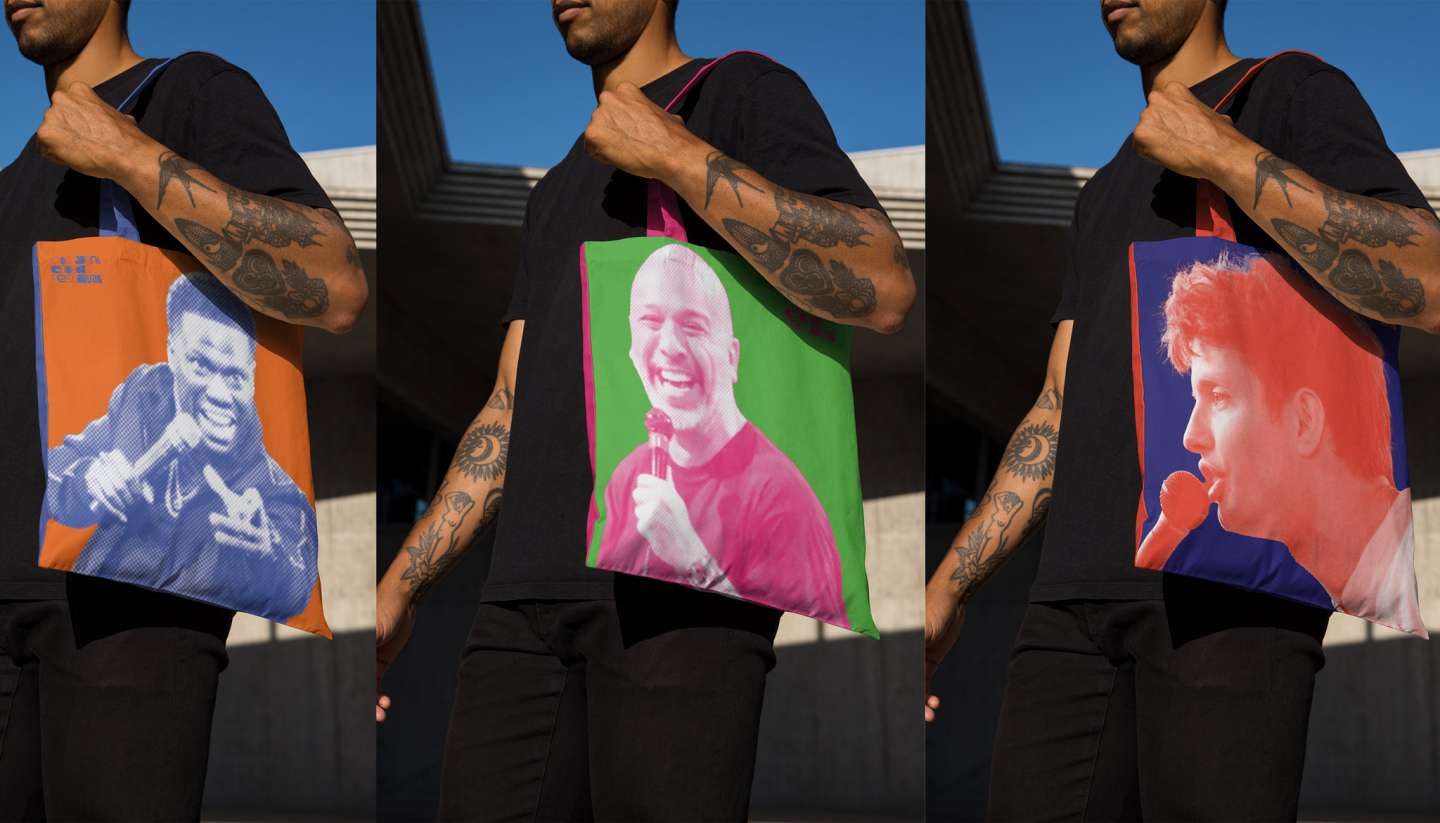
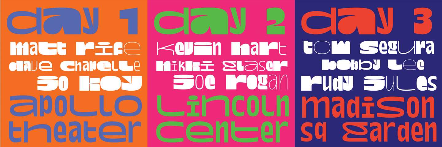
New York is a city full of vibrancy and diversity, but the existing logo for the New York Comedy Festival doesn't quite reflect that energy. This rebranding introduces a playful tone without being overtly “comedic,” using a typeface with dramatically varied weights. By shifting the type’s weights and sizes, the festival’s main logo achieves a dynamic, engaging look.
A vibrant color palette and halftoned images of comedians featured on posters and billboards further express the festival's lively nature. The entire visual concept revolves around contrast—in color, typography weight, and scale. The goal of this project is to inject energy and vibrancy into the festival’s identity, aligning it with the spirit of New York City.