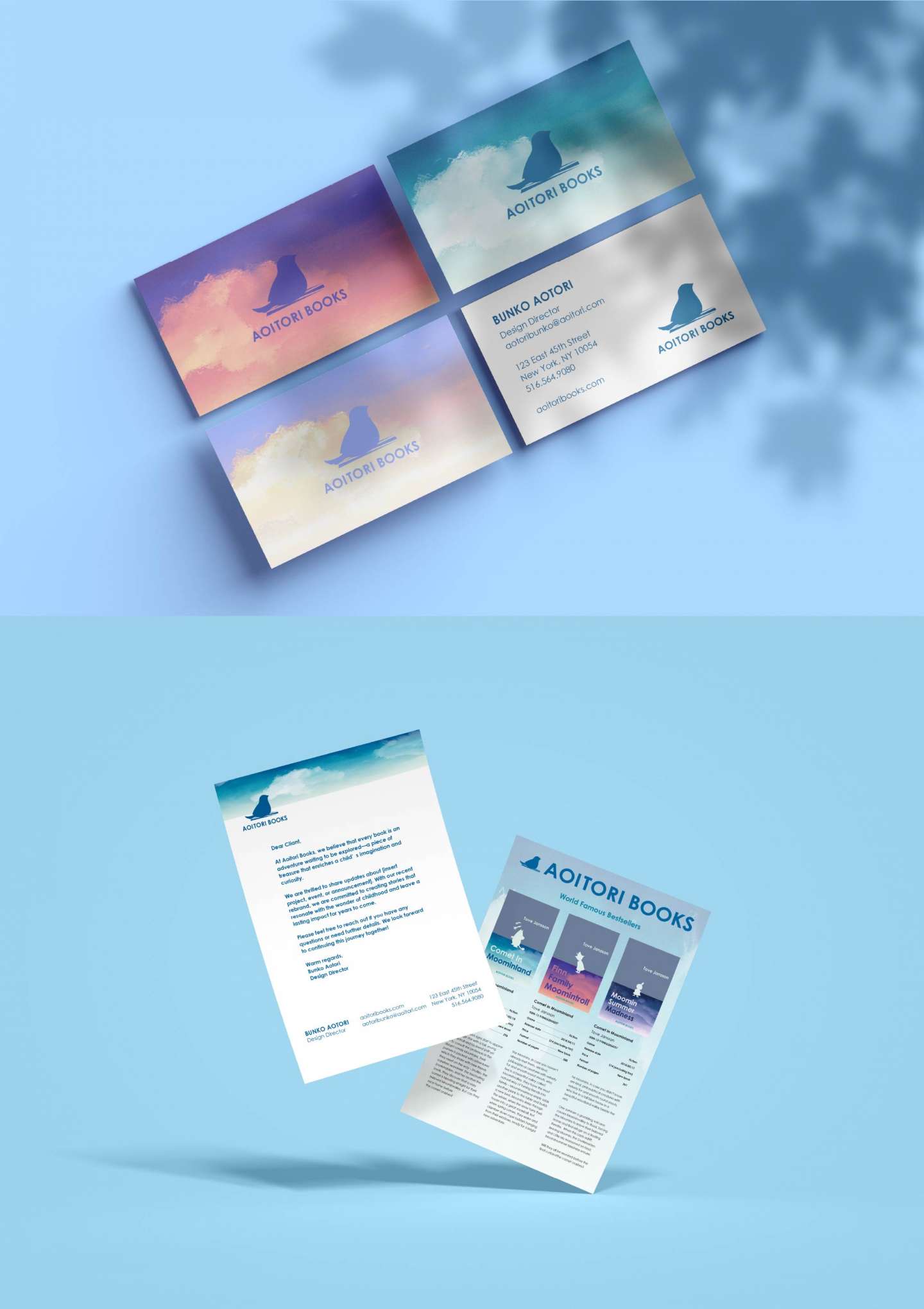
Rebranding and redesigning the editorial system.
A rebranding concept for Aoitori Bunko, a beloved Japanese children’s book label.
Inspired by the idea of children as little birds flying through the wide sky of stories, the design invites young readers to see each book as a piece of treasure collected from their own adventures.
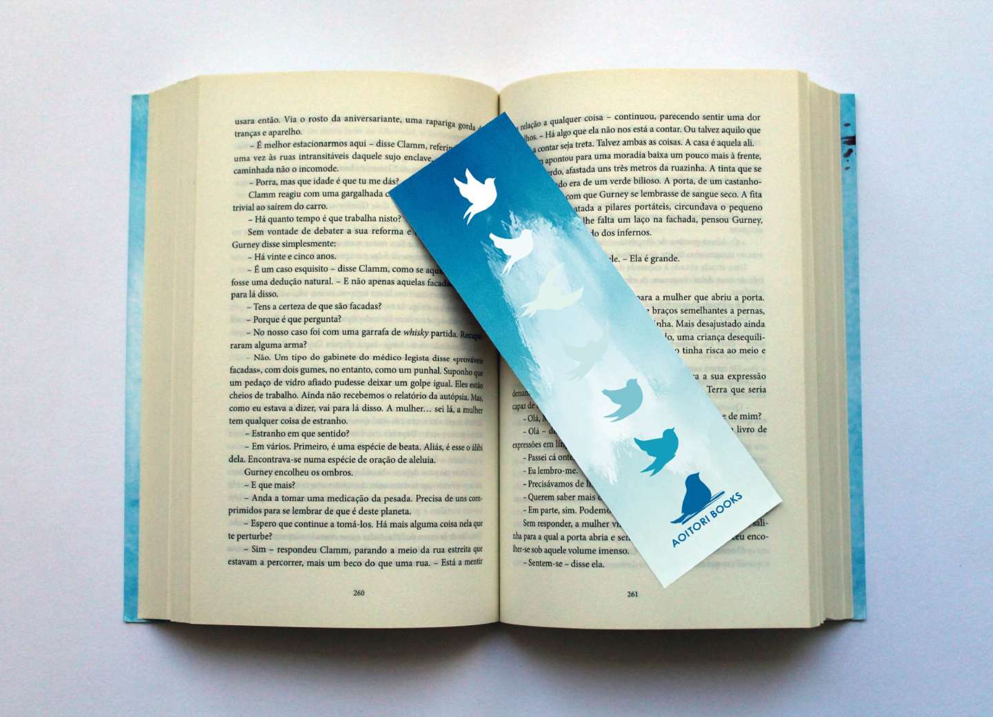
The logo features a bird symbolizing the child readers, while the color palette reflects the changing sky — from morning to night.
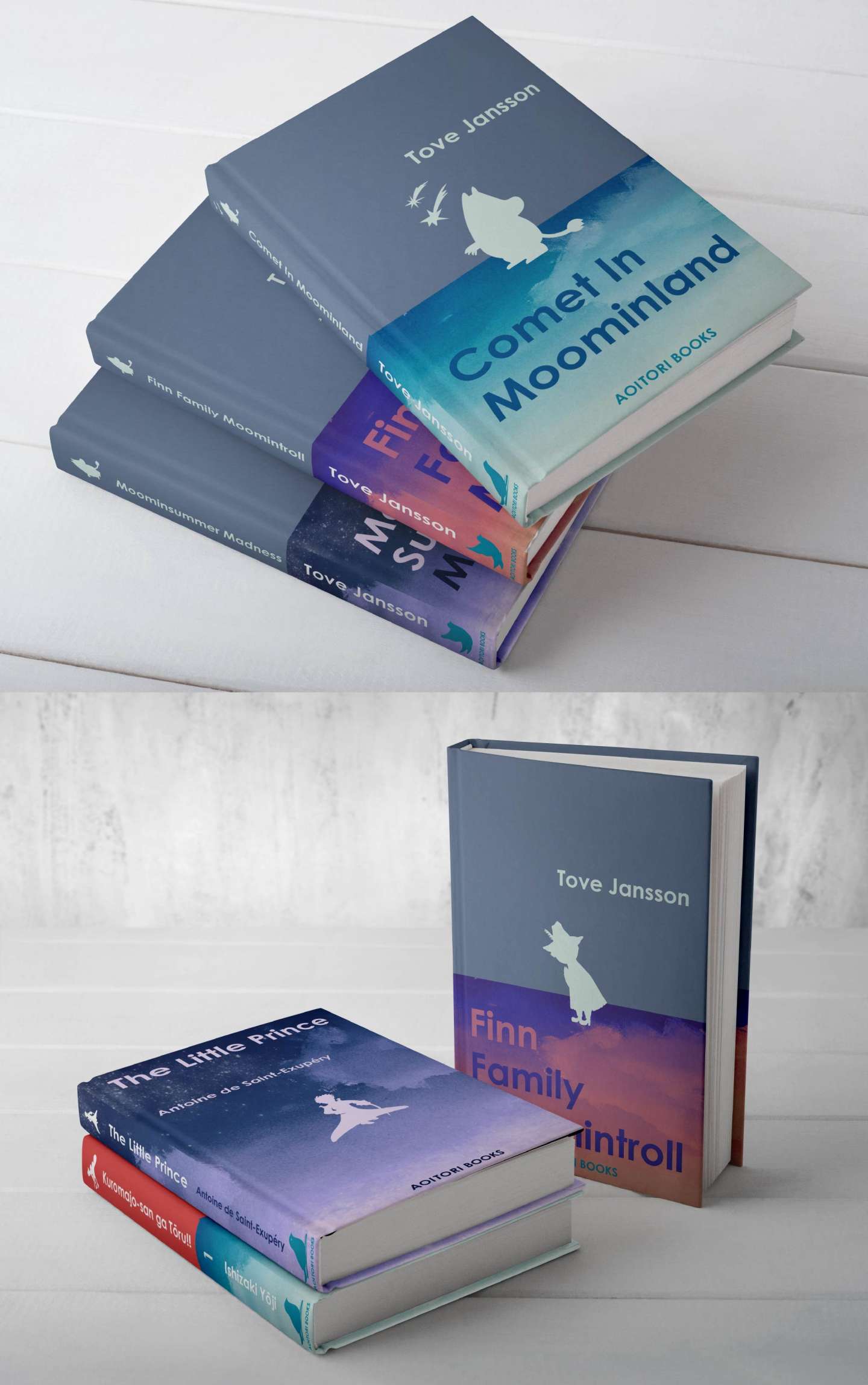
The book covers combine soft watercolor skies with simple, bold color blocks for titles and silhouettes, creating a calm yet playful world of imagination.
As the book series progresses, the bird logo gently changes, showing the bird in motion — a visual metaphor for growth through reading.