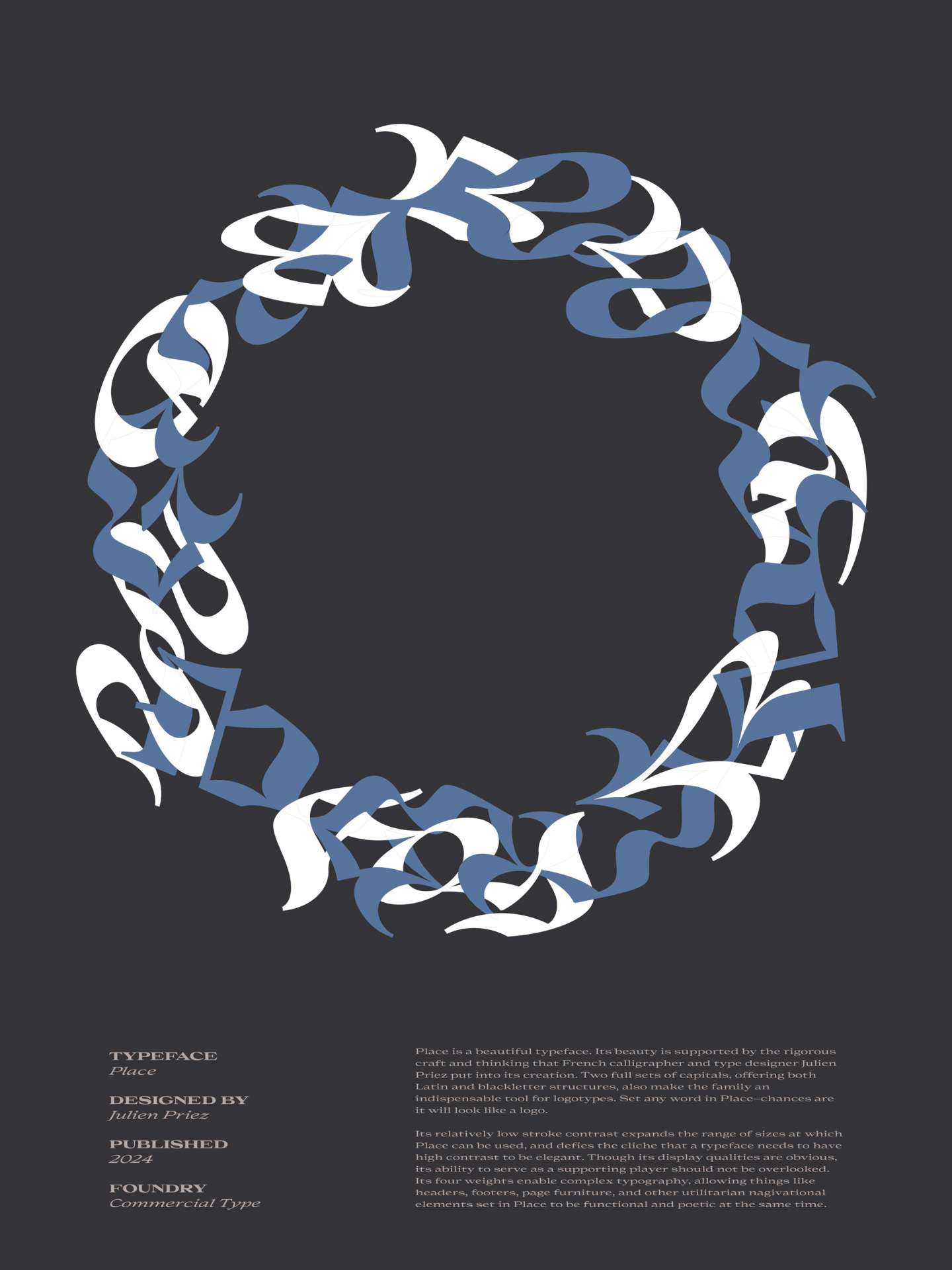
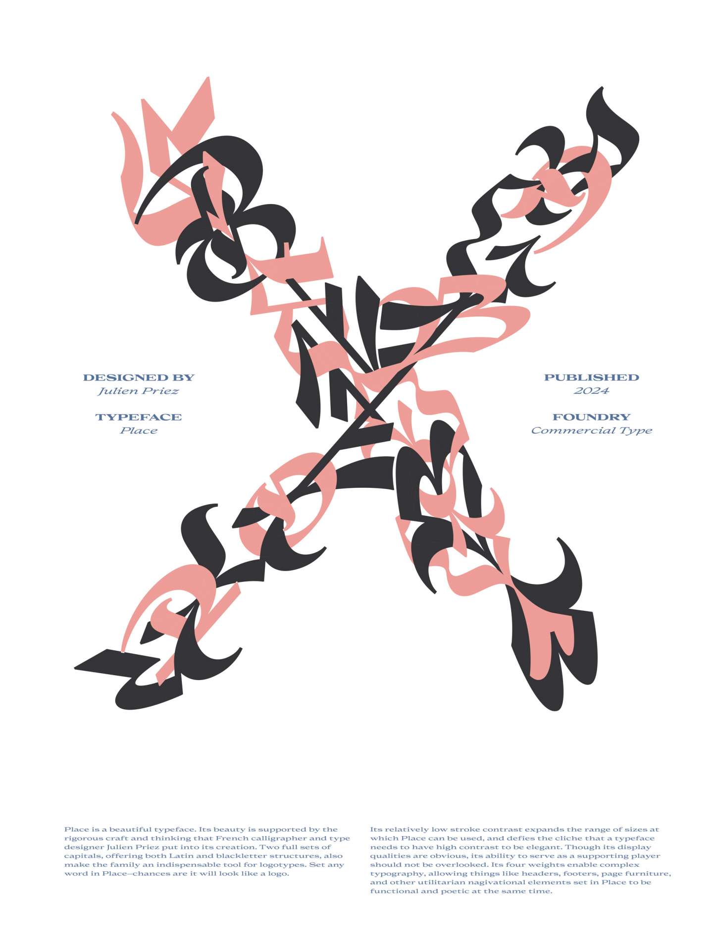
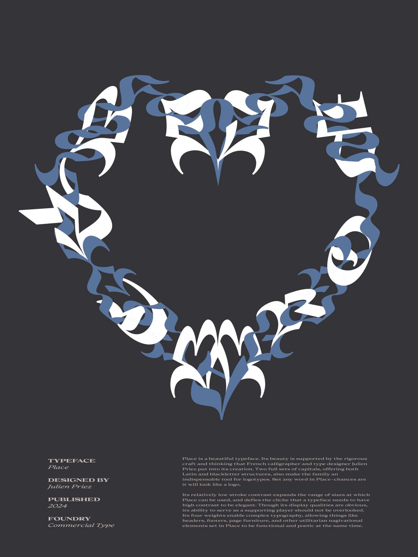
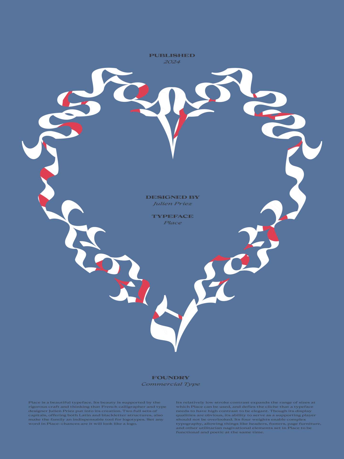
These two series of typographic posters highlight the characteristics of the typeface Place Bold Extra designed by Julien Priez from Commercial Type. In the first series of three, I made the letters flow into each other to show the water-like aspect of the typeface. In the second series of three, I used accessories and a pop of pink to refer to the feminine forms of the characters.