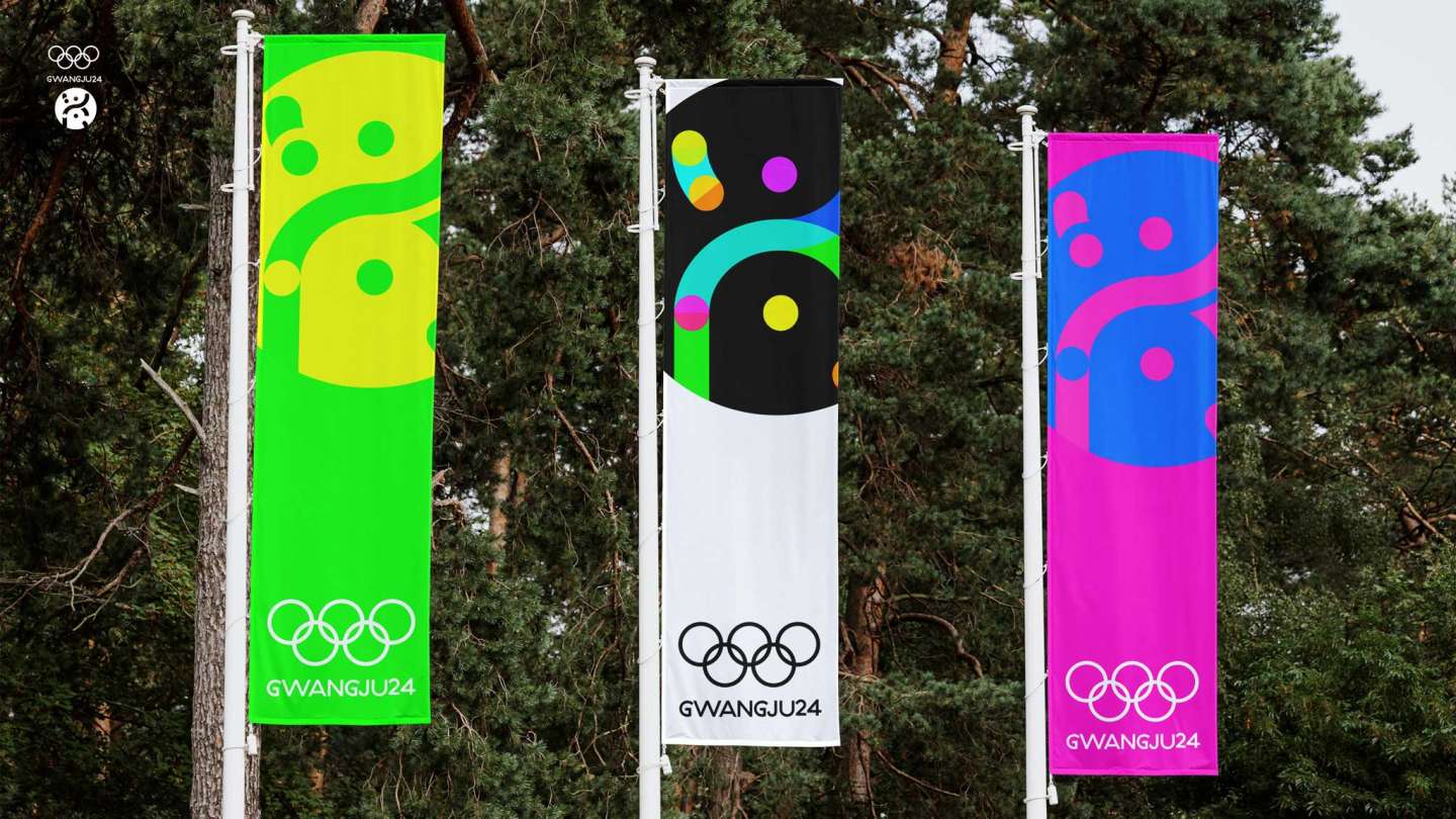
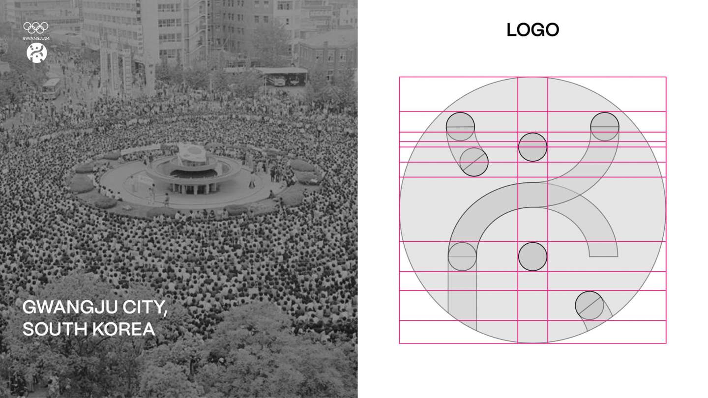
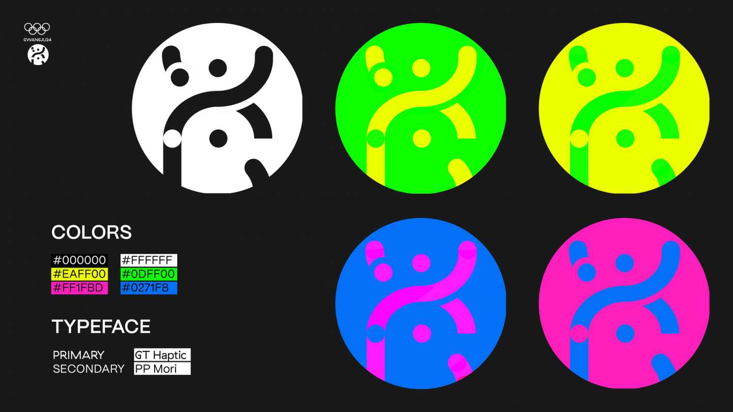
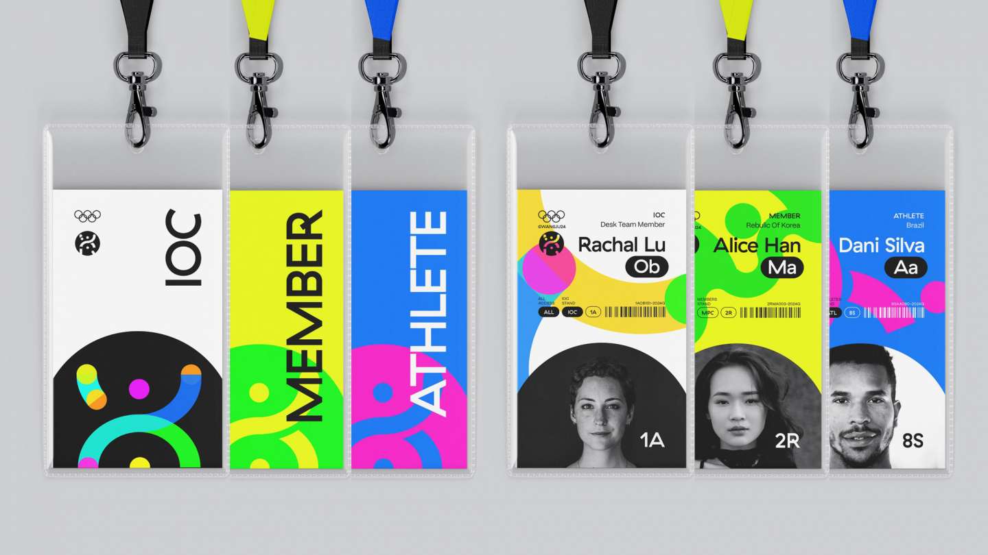
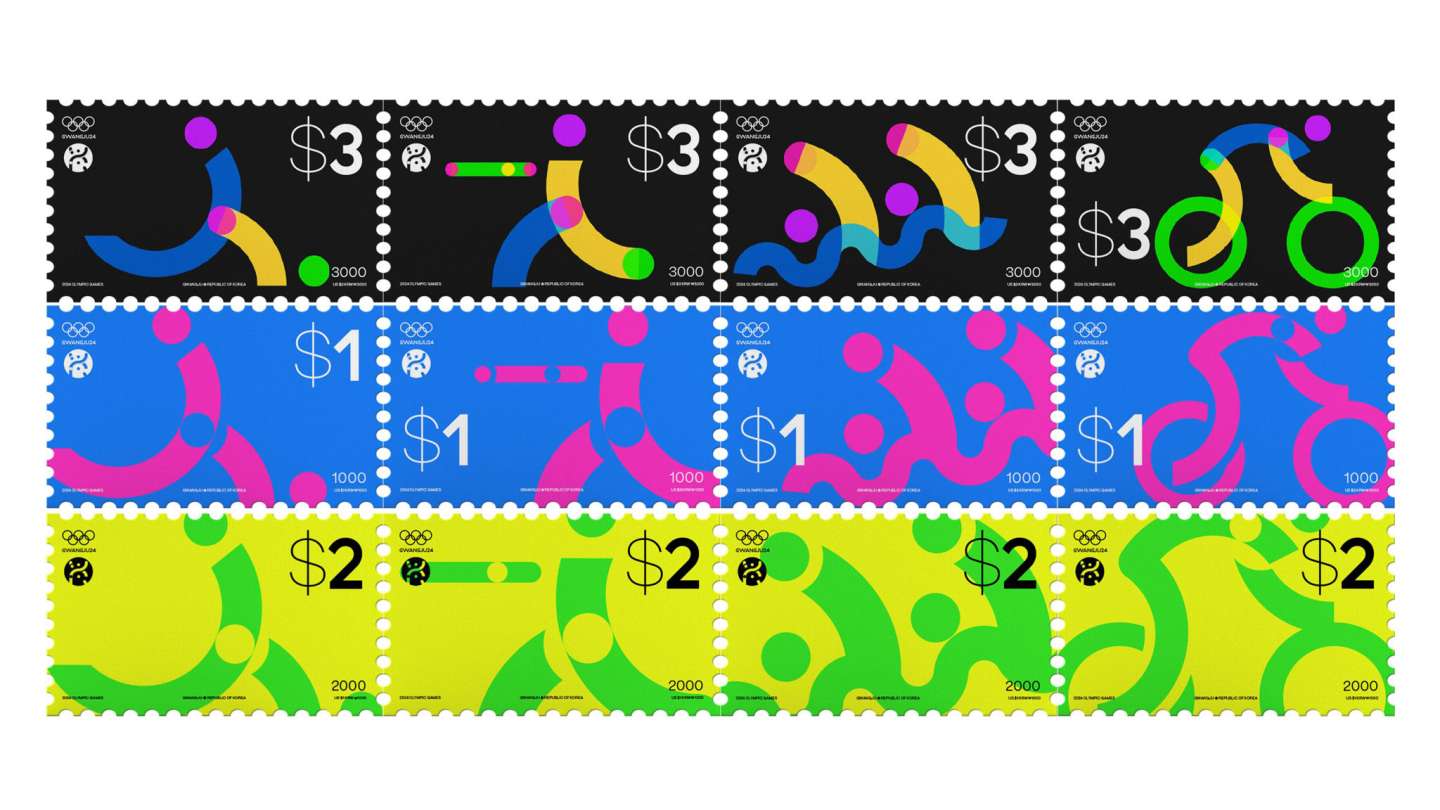
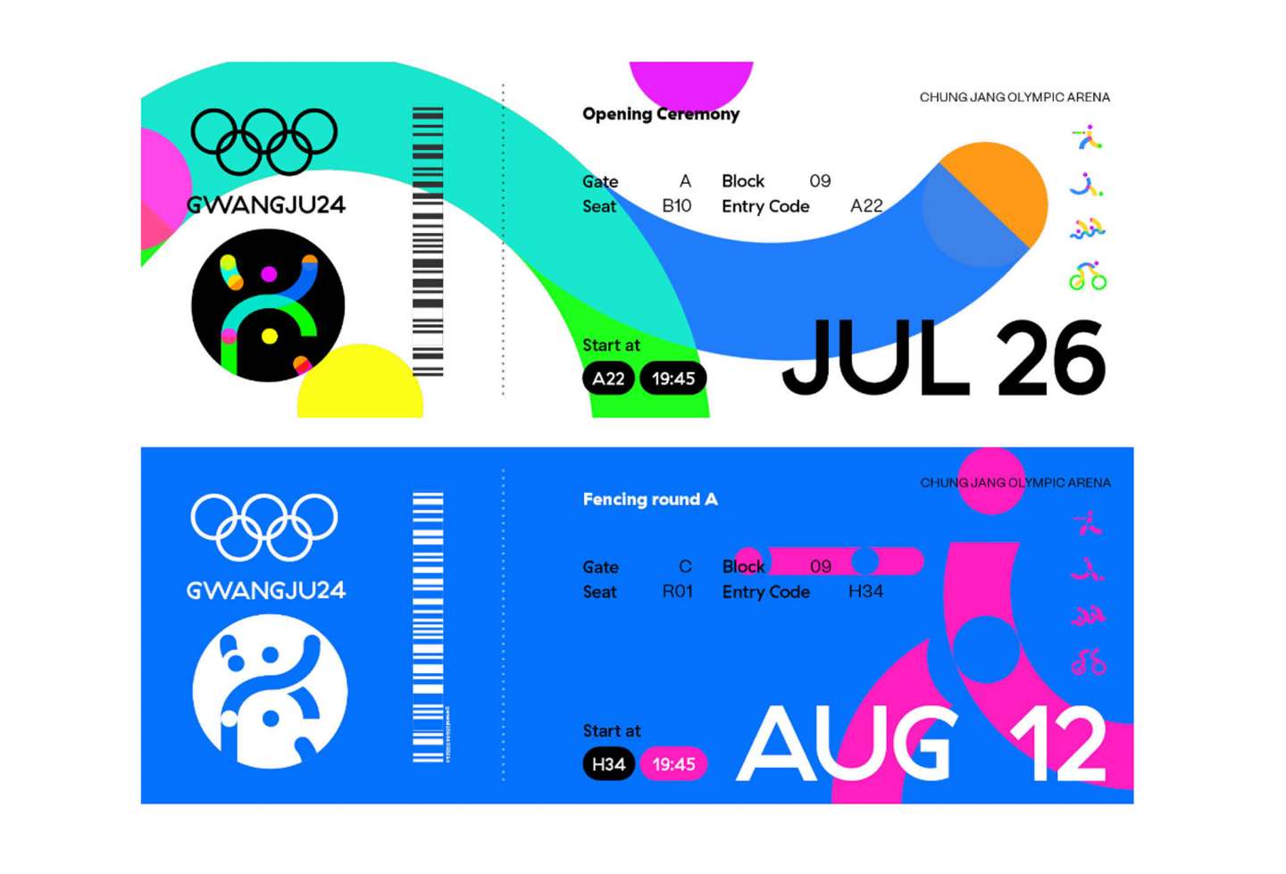
Design and develop an identity system for an Olympic city that can be expanded. A new olympic identity core is ‘The City of Light,’ inspired by meaning of the city’s name, Gwangju in South Korea. To visually represent the concept of light, I used dots and lines in bold colors and overlapped them using color treatment. This approach creates an energetic movement and sense of power, evocative of Olympic sports. The circular shapes in the design feature ‘May 18 Plaza,’ a historical symbol of the Gwangju Democratization Movement, and now a lively, colorful destination for young people.