rebrand for GAP, a company with a strong legacy in American retail and fashion.
GAP has a long-standing identity, one that many of us instantly recognize particularly its classic navy blue logo. Over the years, the brand has evolved visually, but any attempt to change its logo has often faced resistance.
The challenge was: How do you make something feel totally fresh, while keeping it completely familiar?
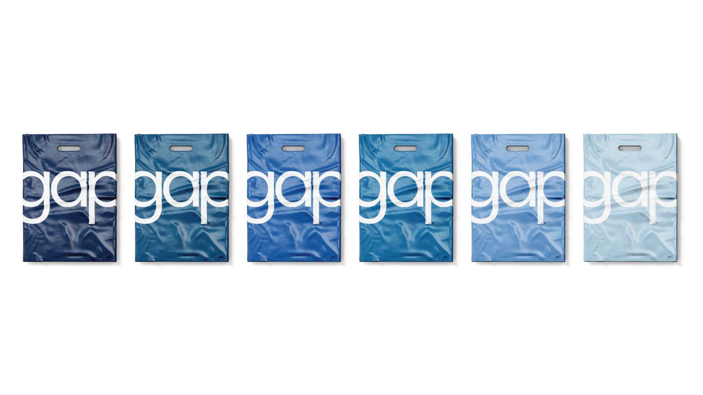
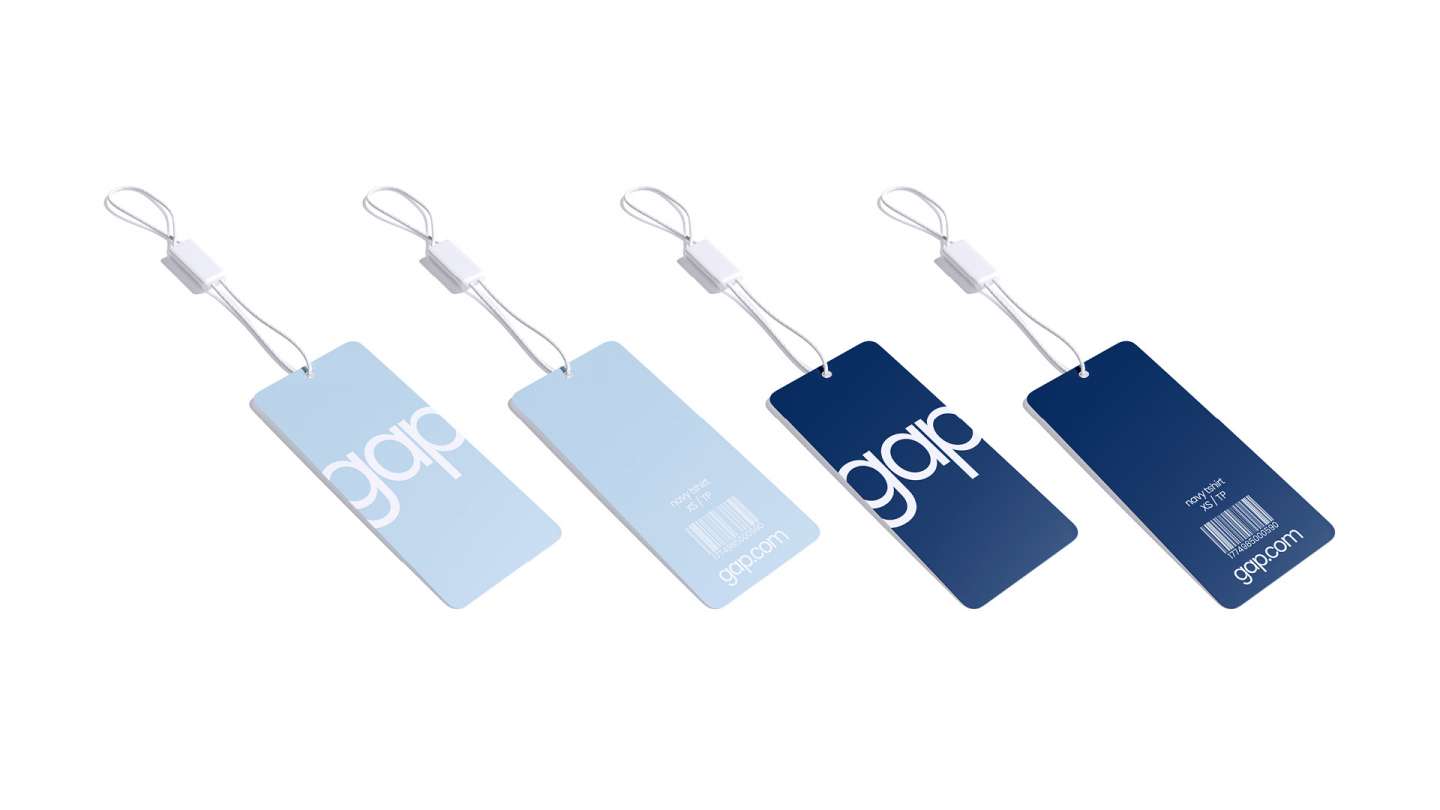
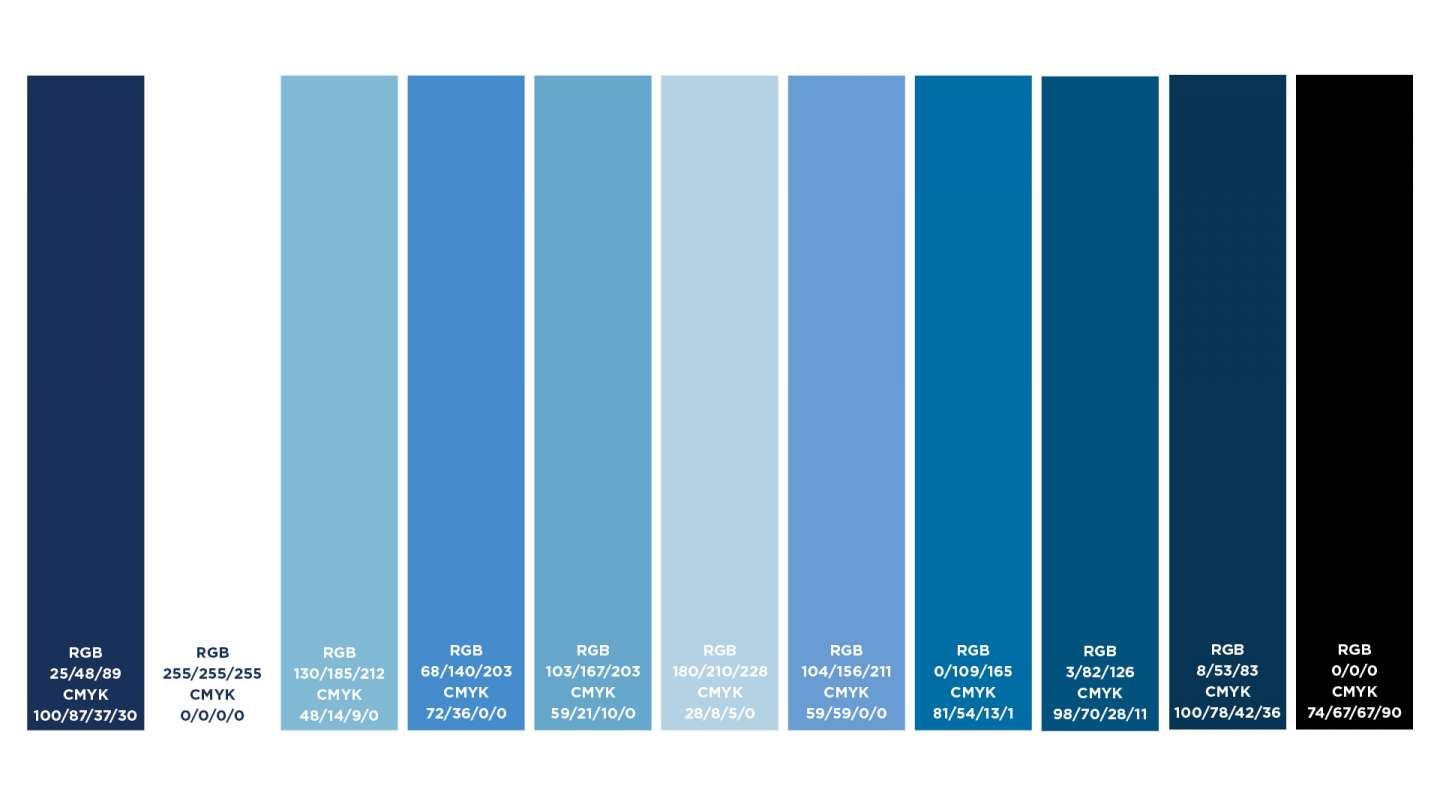
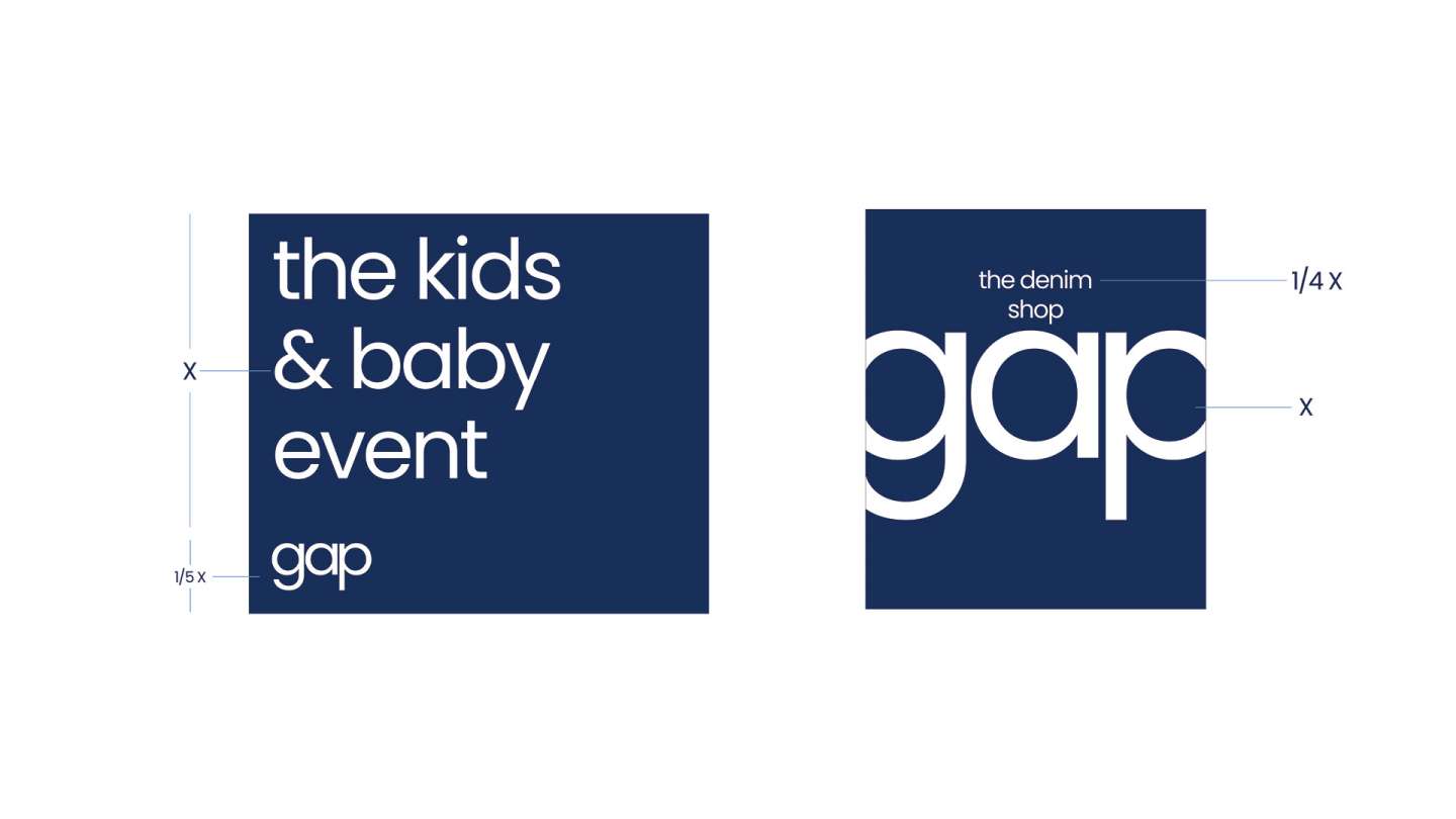
The answer was to modernize the wordmark while retaining the brand’s essential DNA. I preserved the blue color palette, knowing how critical it is to customer recognition. But I updated the wordmark with a more refined, contemporary type treatment using Poppins, a geometric sans-serif typeface that feels friendly, balanced, and versatile.