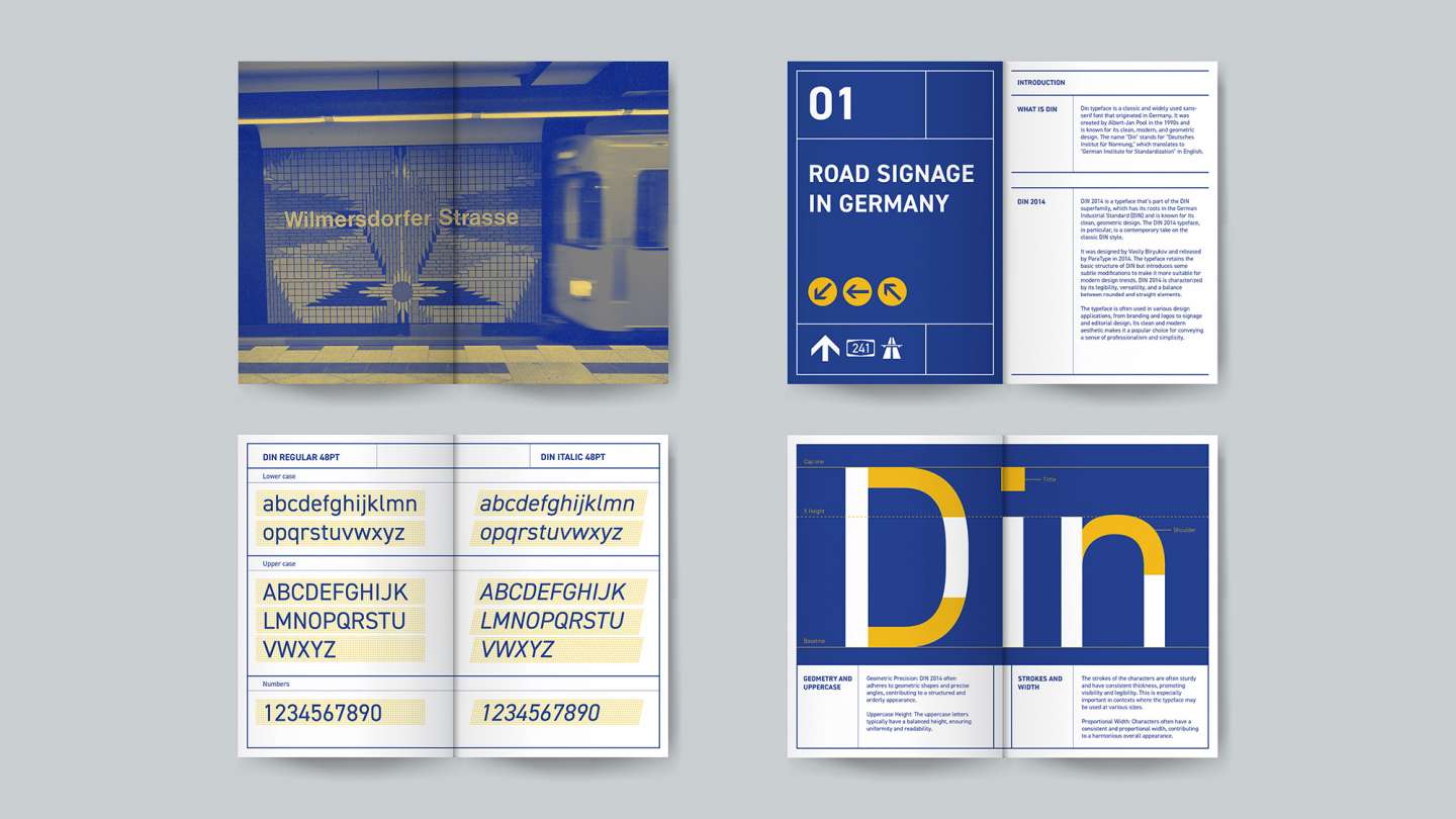
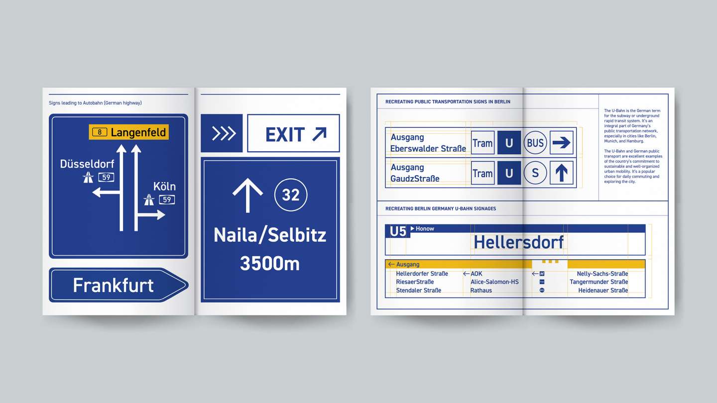
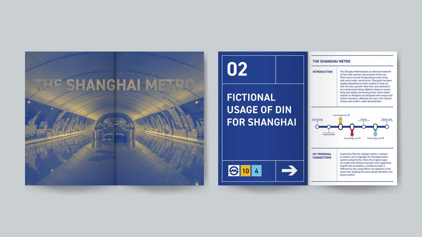
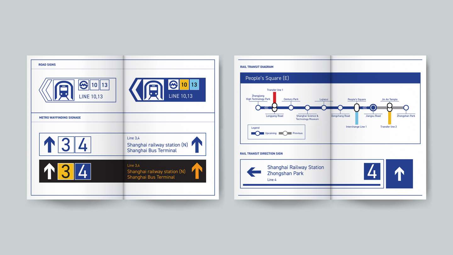
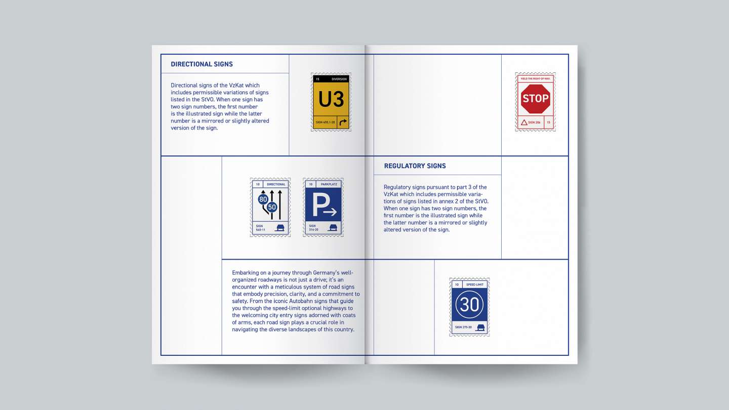
DIN is a classic, widely used sans-serif font from Germany, known for its clarity, consistency, and simplicity. Originally designed to be universally readable, it's often used in signage systems. In this specimen book, I explored the anatomy and weights of DIN, showing its versatility in public transportation signage. Inspired by German U-Bahn signs, I recreated a set of signs for the Shanghai metro using only the DIN typeface, replacing the original designs with both Chinese and English text. While introducing a new look, I carefully followed the original layout and design system. The project brings together German design, DIN typography, and the functional needs of the Shanghai metro.