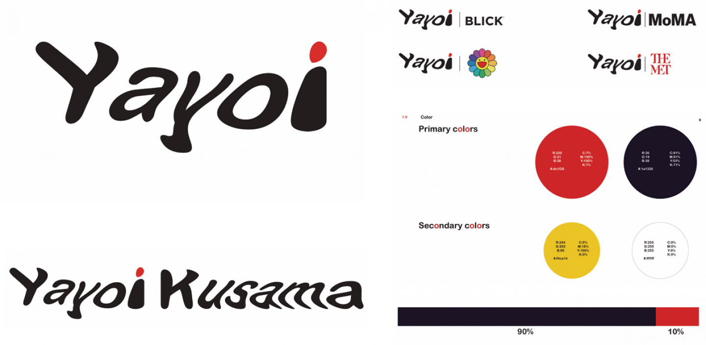
This visual identity system presents a bold, contemporary reinterpretation of Yayoi Kusama’s artistic language, translating her iconic themes into a clean, structured branding guide. At its core, the design balances minimalism with expressive detail, using typography and color as primary storytelling tools.
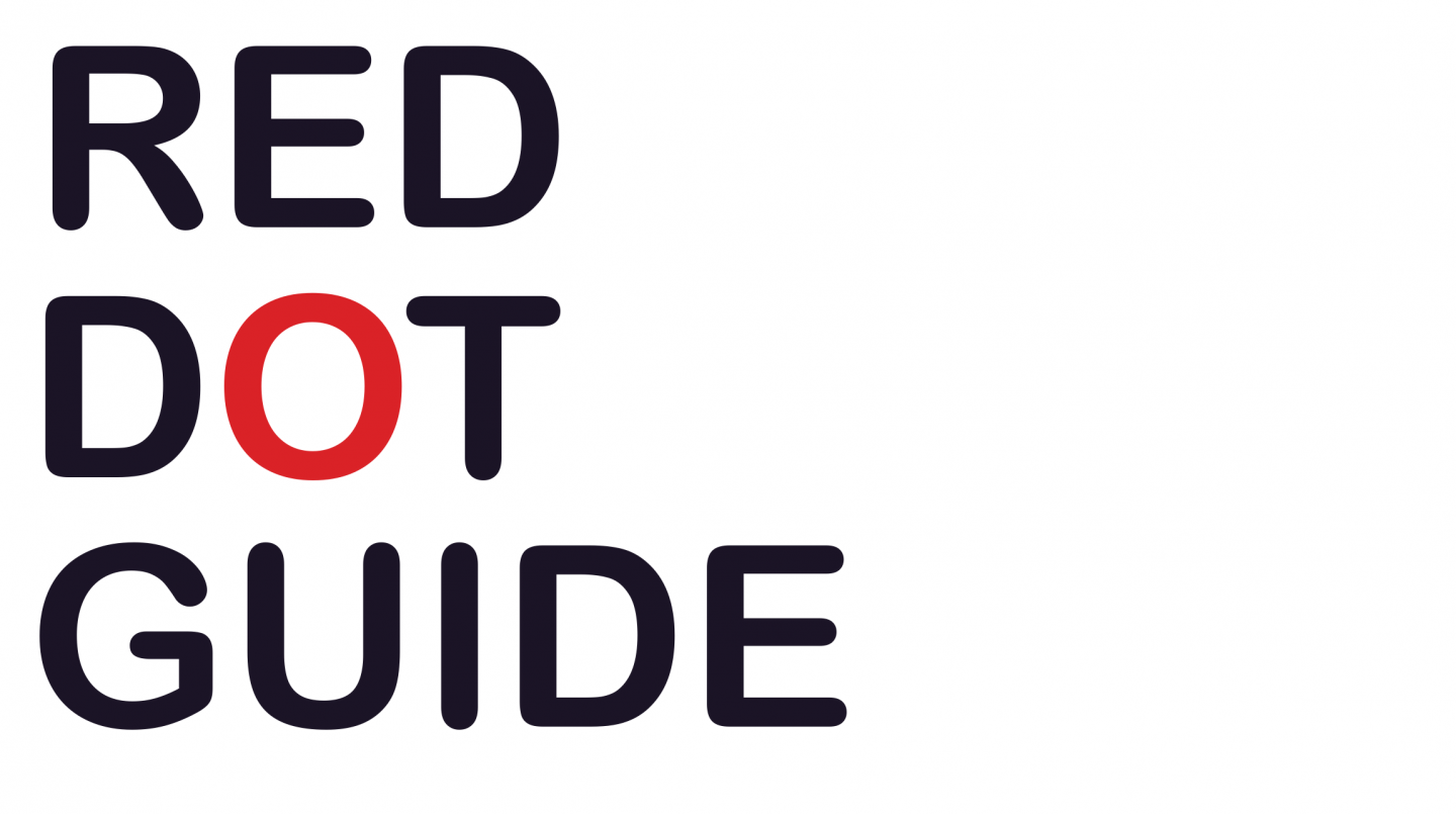
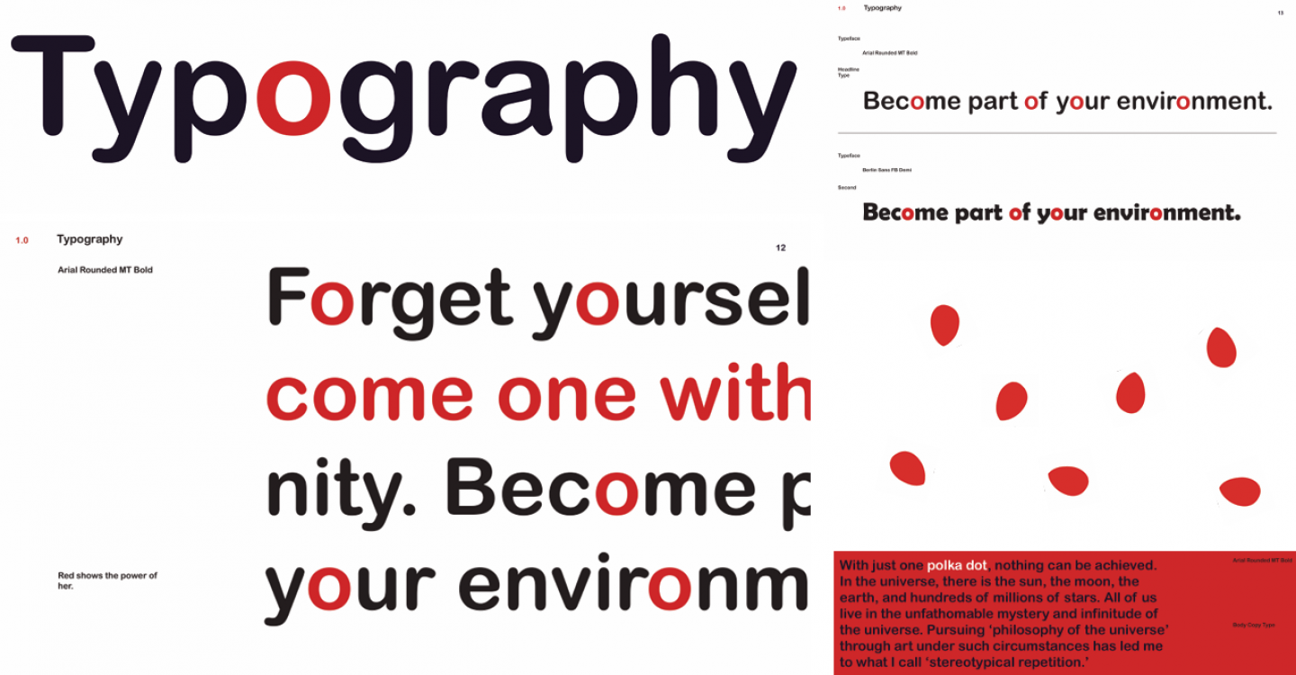
The phrase “RED DOT GUIDE” immediately establishes a conceptual anchor, referencing Kusama’s signature polka dots—symbols of infinity, repetition, and self-obliteration. The strategic use of a single red “O” within otherwise dark typography reinforces this idea: one dot as both a focal point and a metaphor for presence within a larger system.