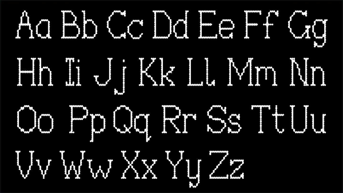
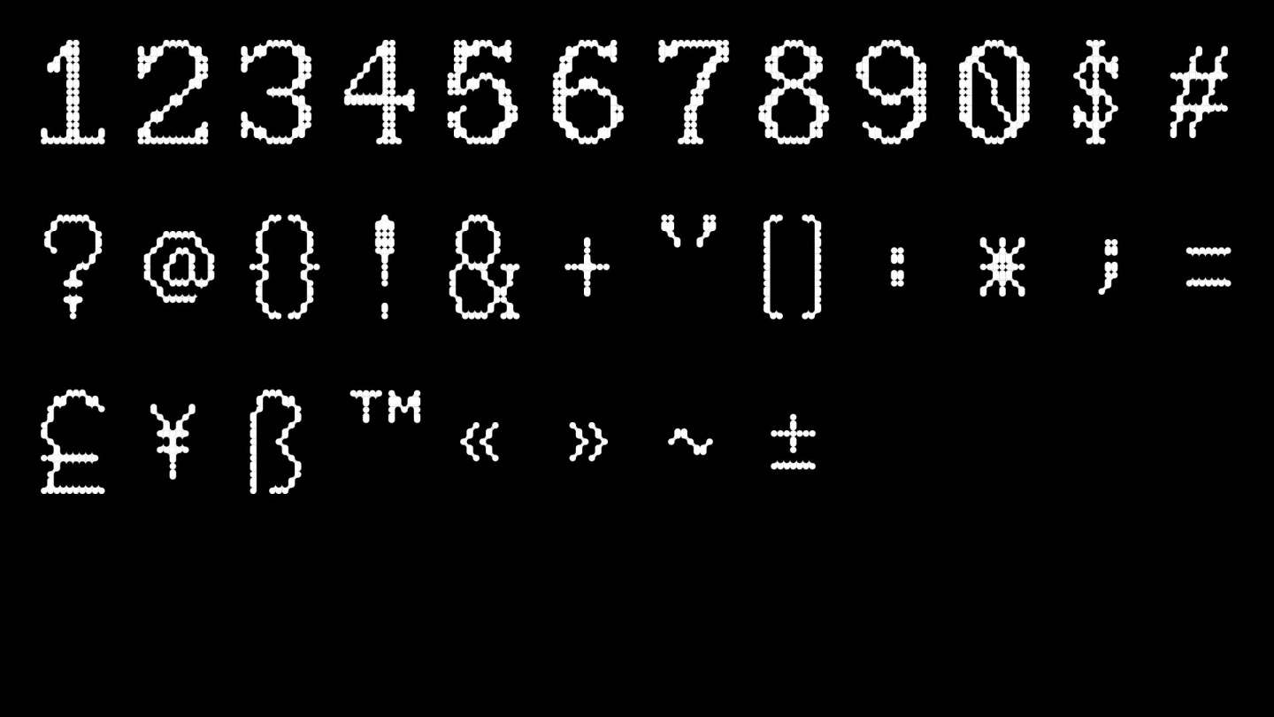
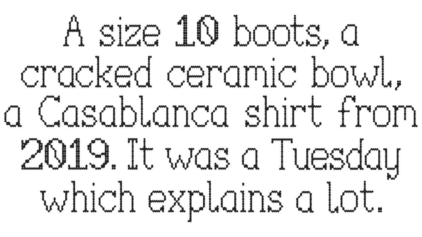
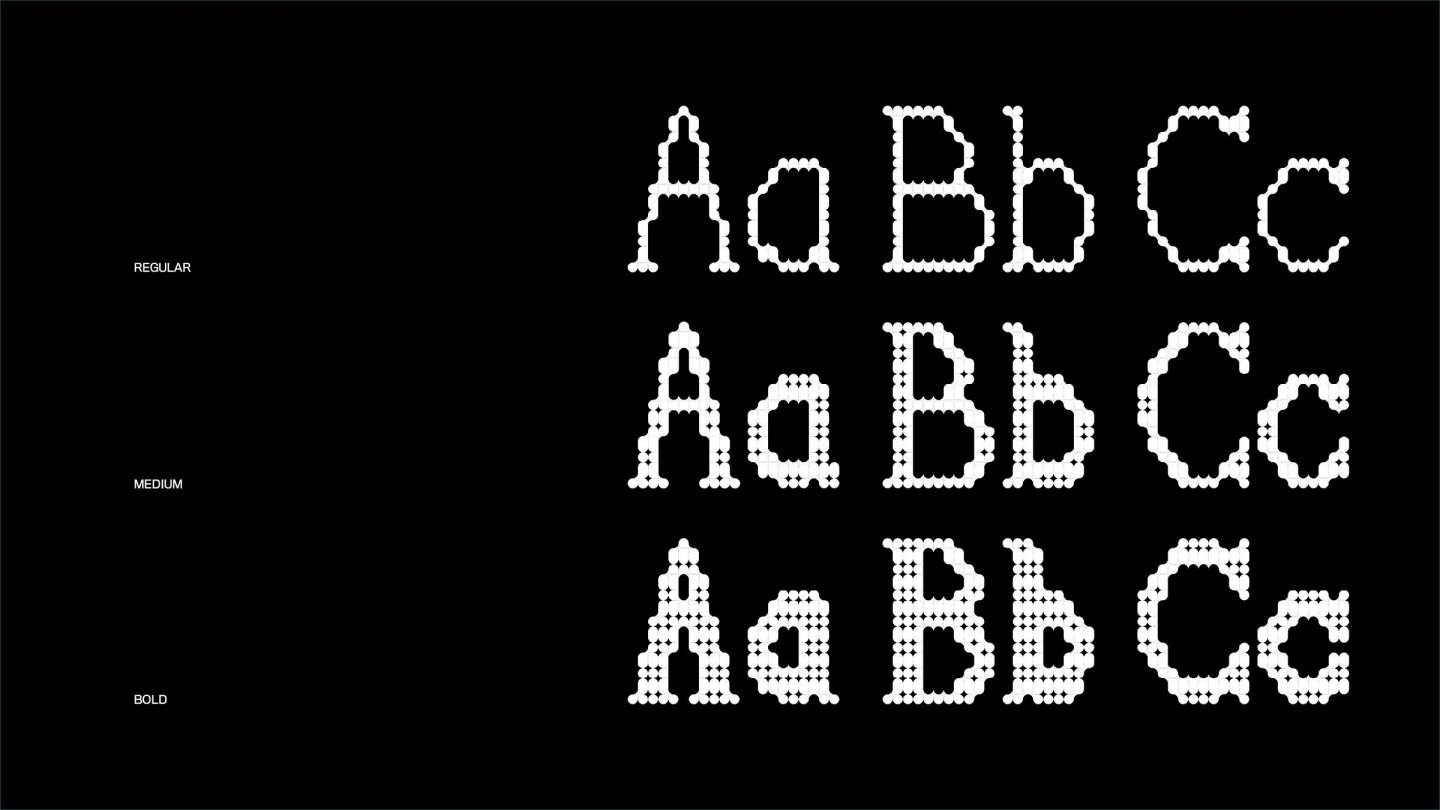
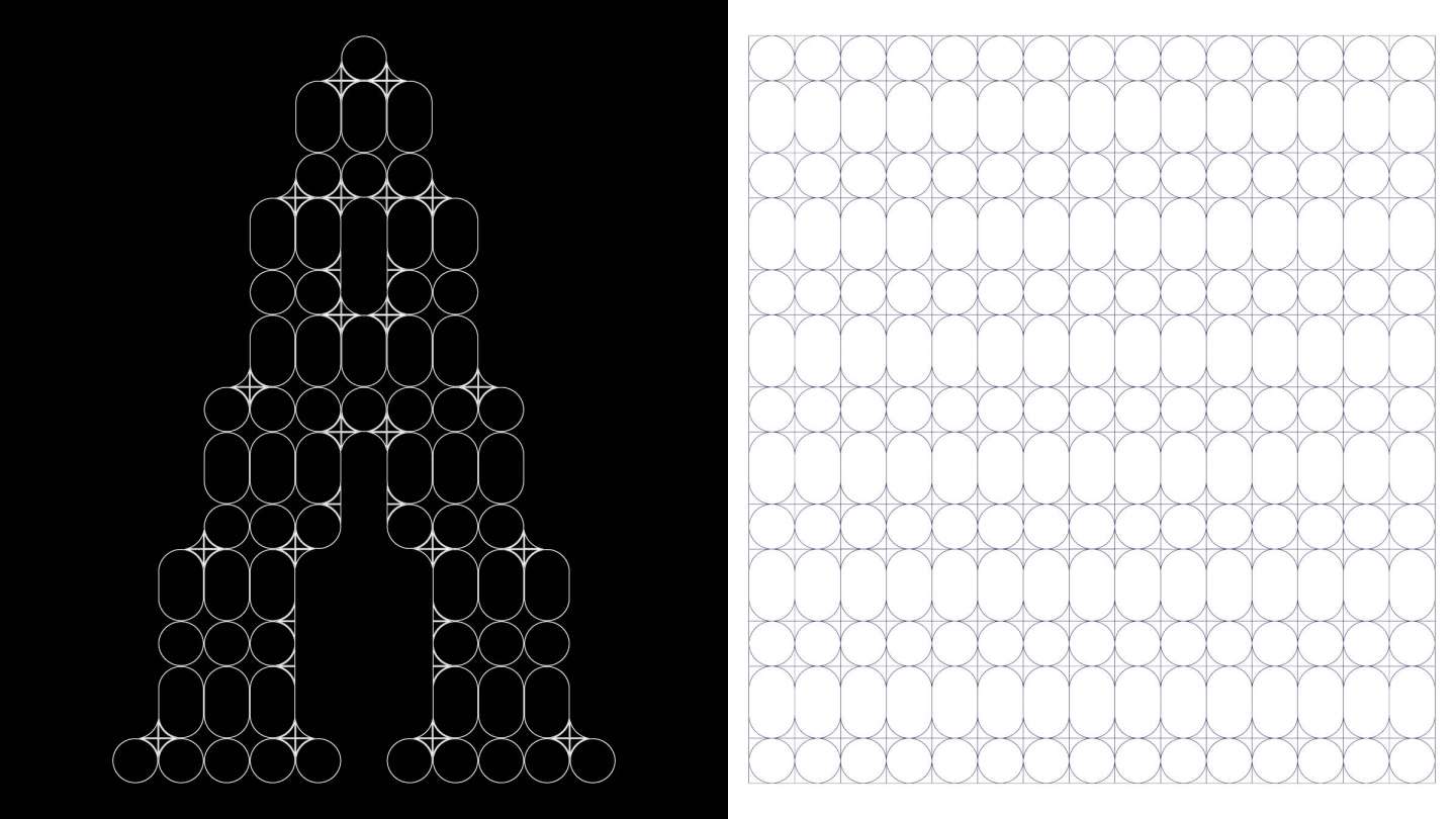
This typeface started as an experiment with a uniform circular grid. From it, I started noticing that the negative space between the circles was doing just as much work as the circles themselves, so I leaned into that, using the gaps to introduce sharper angles into the forms. The decision to make it a serif came later, mostly as a reaction to how predictable sans-serif feels in this kind of modular construction. The result sits somewhere between a type specimen and a biology textbook.