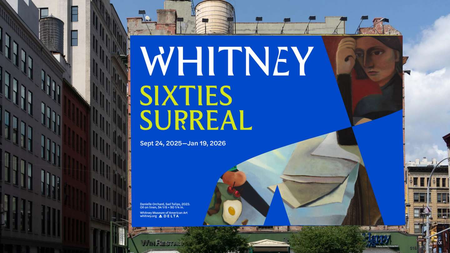
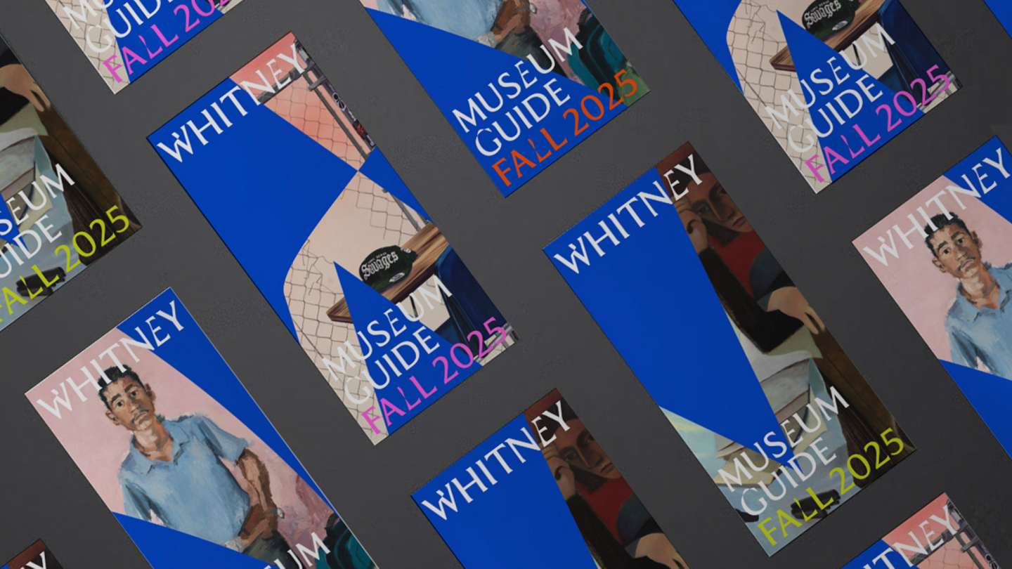
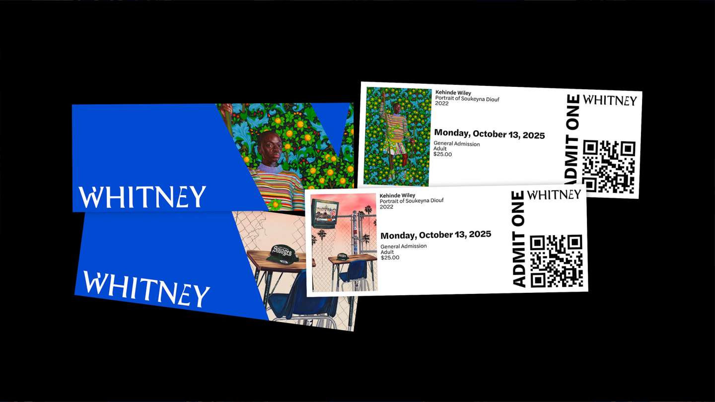
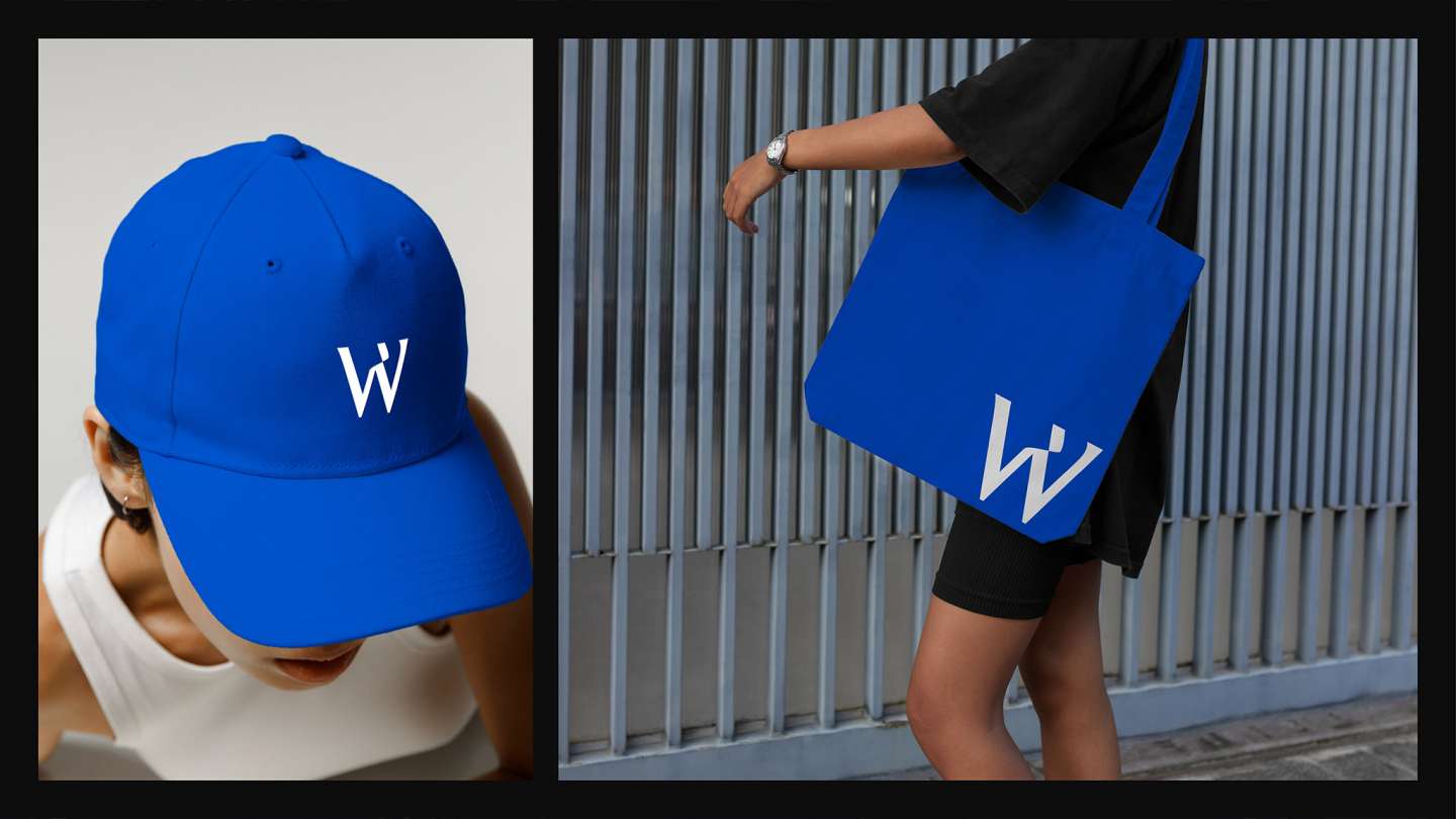
The Whitney Museum of American Art rebrand was designed to reflect the institution’s bold, inventive, and risk-taking spirit, reinforcing its role as a leading voice in contemporary American art. An elegant typeface was modified and subtly integrated throughout the identity, expressing experimentation and contemporaneity. The resulting typographic forms were extended into a flexible system of shapes used as image and color placeholders. Ultramarine blue serves as the primary color, referencing its historical significance in painting, supported by bright accent colors that add energy and contrast.
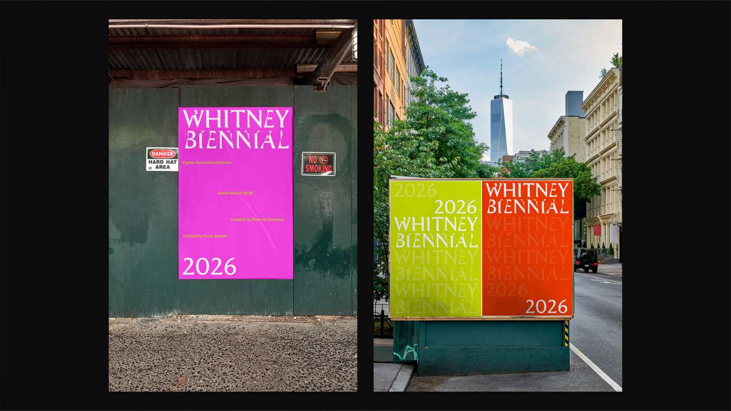
To extend the system for the Whitney Biennial, the visual system intentionally strips away imagery, relying solely on typography as its primary mode of expression. The modified letterforms take center stage, emphasizing text, structure, and conceptual clarity. Ultramarine blue is removed entirely, with the system using only secondary accent colors to establish a distinct yet connected identity that reflects the Biennial’s experimental nature.