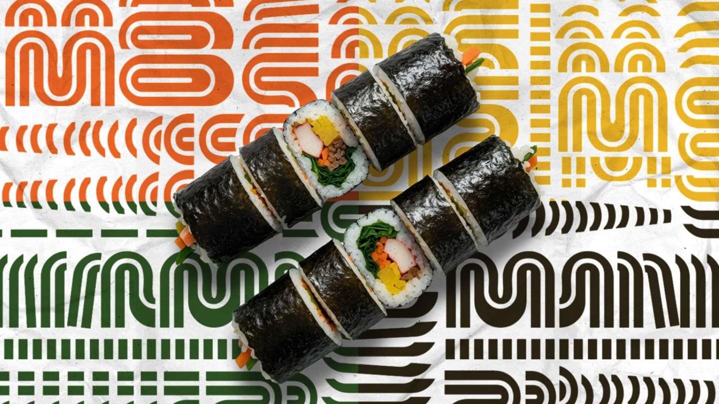
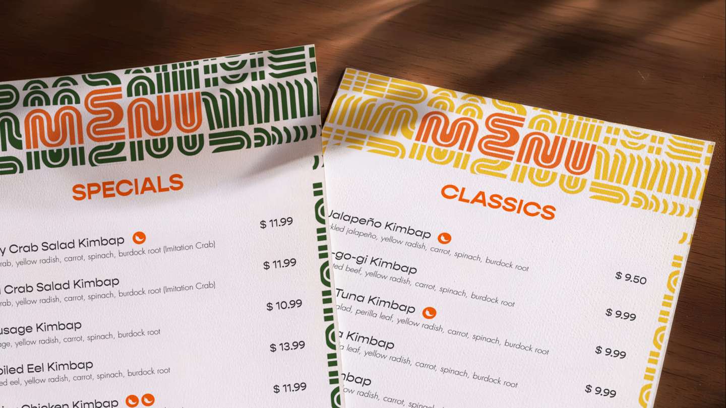
E-MO Kimbap is a brand identity inspired by the familiar figure of the Korean “Emo”, an auntie who prepares food through continuous, repetitive care. Rather than focusing on nostalgia, this project reframes the emo as a symbol of ongoing motion and labor, where rolling and slicing kimbap becomes a rhythmic and continuous gesture. By combining this idea with the fast-paced energy of New York City, the identity translates care into a system of repetition, expressed through modified letterforms, continuous graphic patterns, and a minimal packaging approach that reflects both consistency and speed.