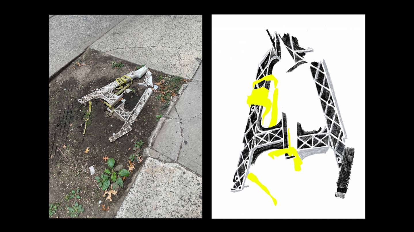
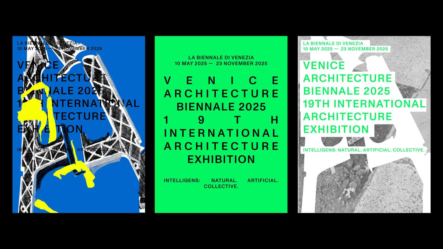
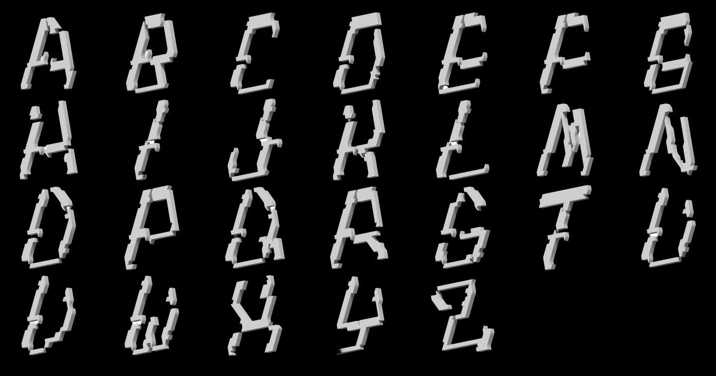
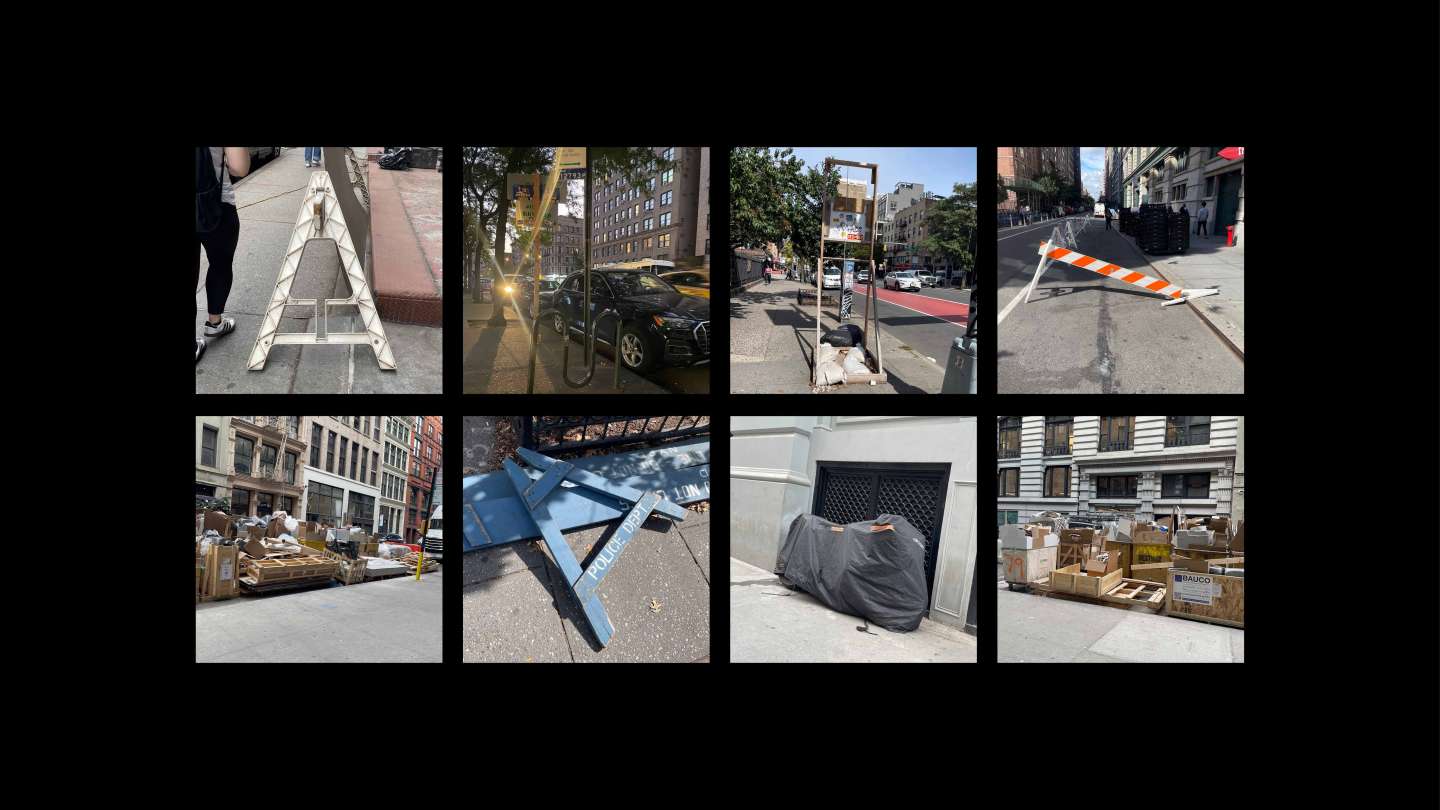
This project began as an exercise in type design rooted in observation, looking for typography already hiding in the world around us. I based my typeface on a broken piece of construction plastic I found on the ground, translating its sharp edges, cracks, and irregular forms into a full set of capital letters. From there, the type became the foundation for an entire visual world. Using the letterforms as both text and structure, I designed a poster for the Venice Architecture Biennale, treating typography as architecture itself fragmented, industrial, and shaped by its environment.