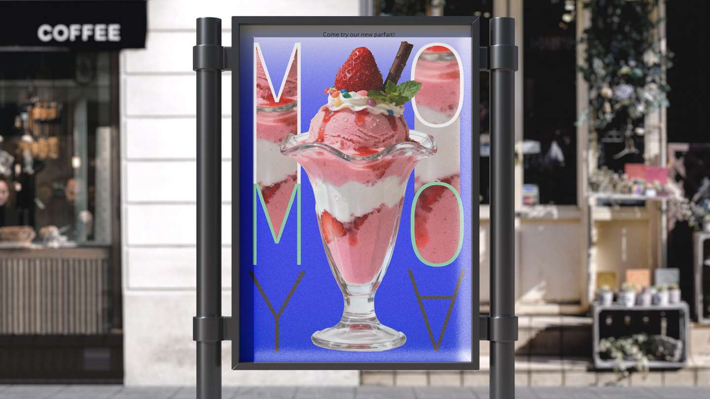
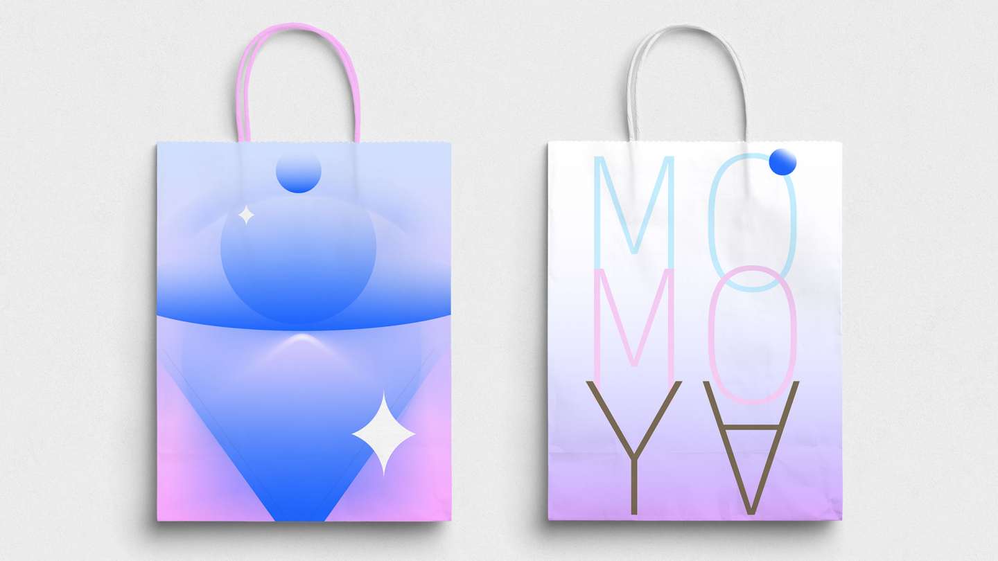
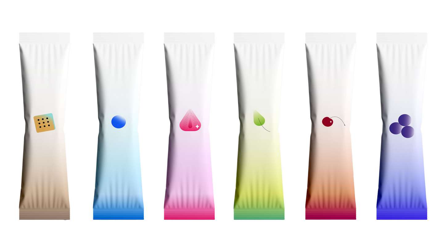
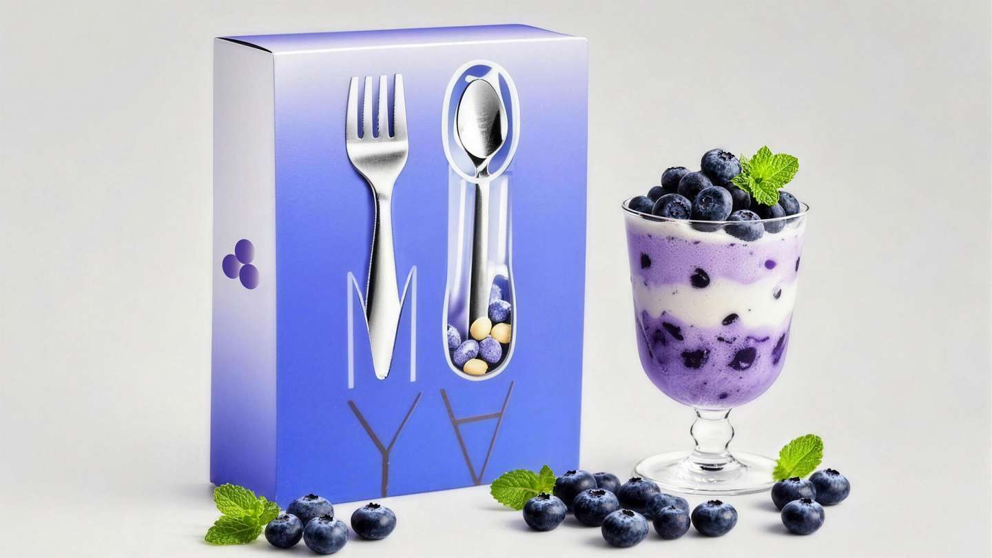
MOMOYA is a rebranding project for a parfait shop known for its giant layered parfait towers. I chose bright, soft colors and created Illustrator illustrations of different parfait flavors to give the brand a younger, more vibrant feel. For the logo, I arranged the letters "MOMOYA" to mirror the shape of a layered parfait, using multiple colors to represent each layer's distinct hue.