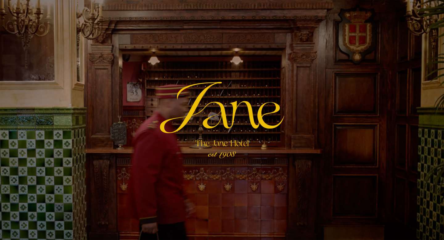
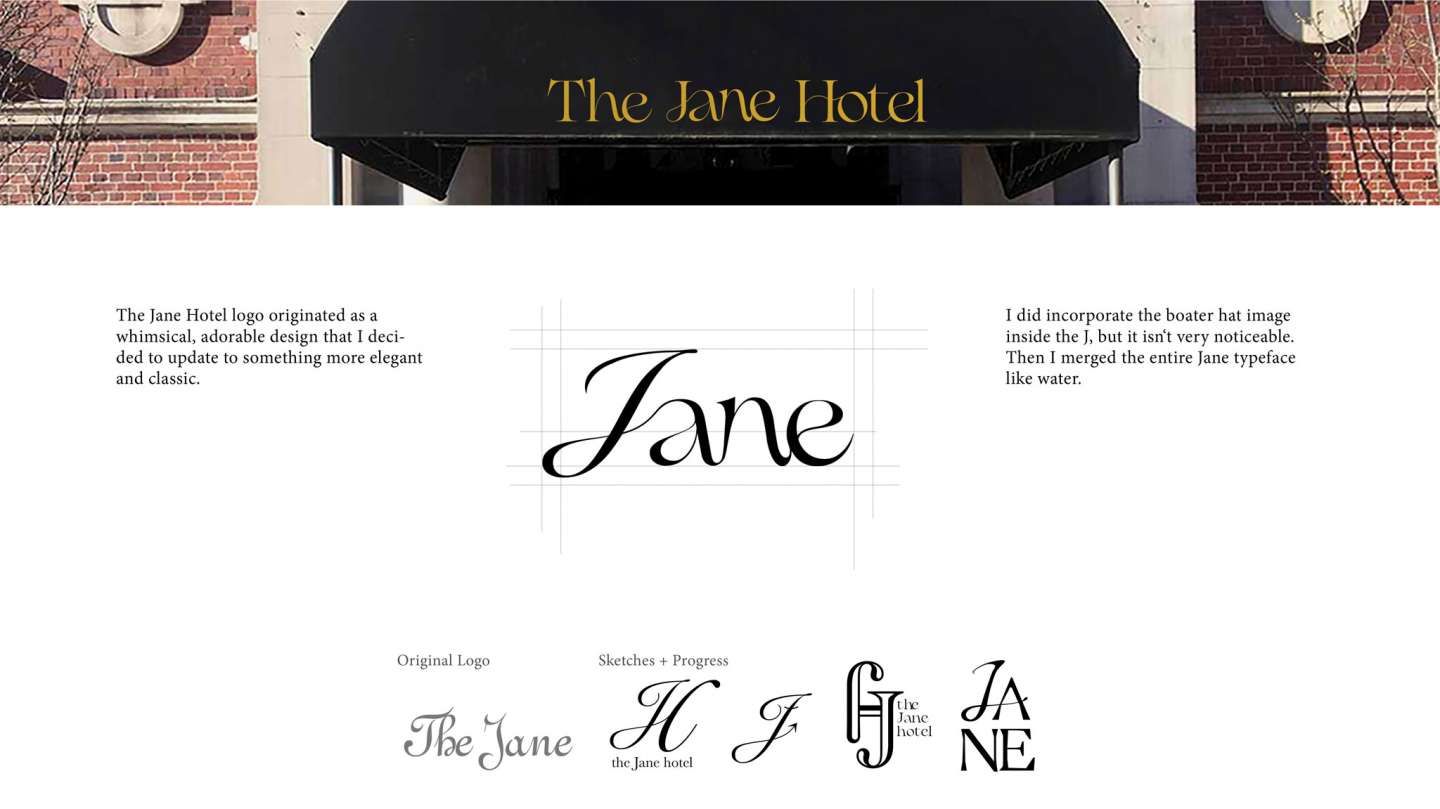
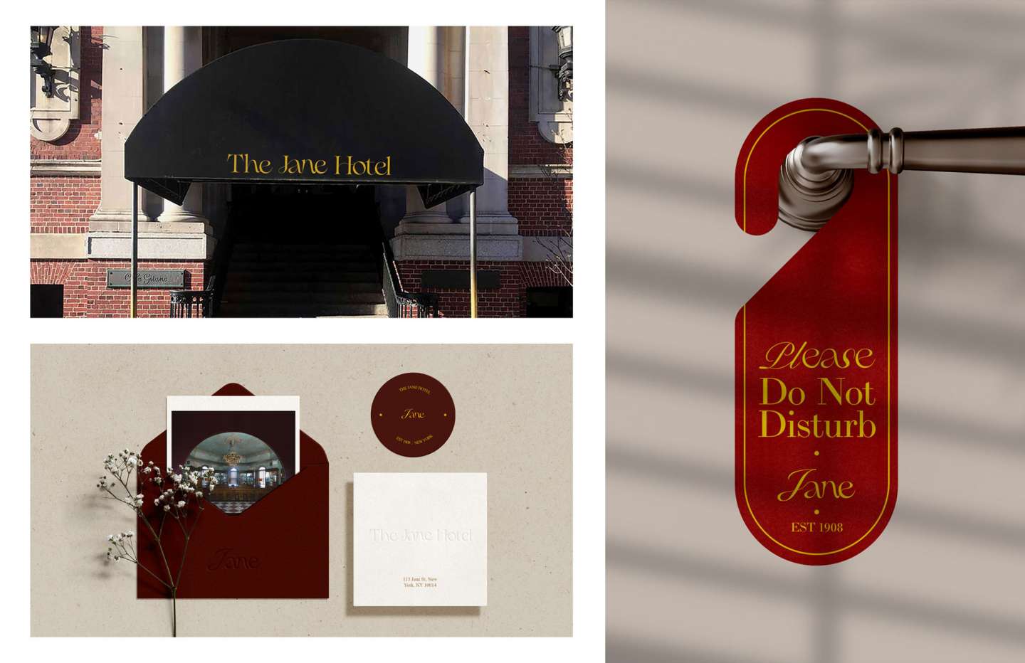
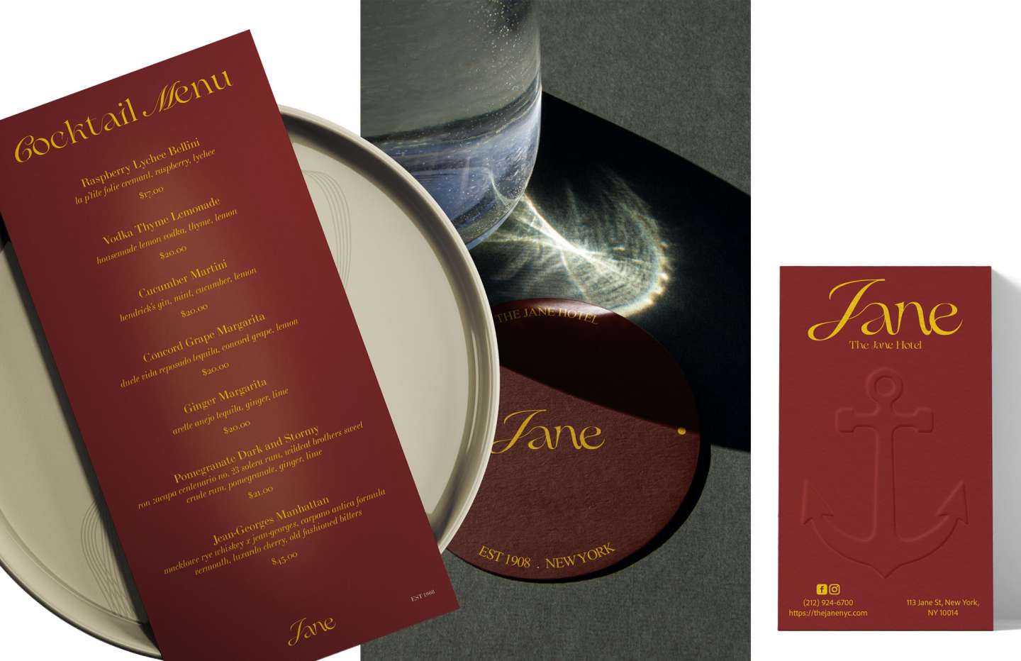
A rebrand of The Jane Hotel, transforming a once whimsical and adorable logo into something more elegant and classic. I incorporated the boater hat into the letterform of the J—subtle but present—and let the rest of the type merge like water. The system extends across cocktail menus and collateral, balancing the hotel's 1908 heritage with a refined, quietly confident voice.