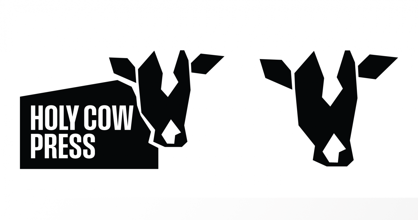
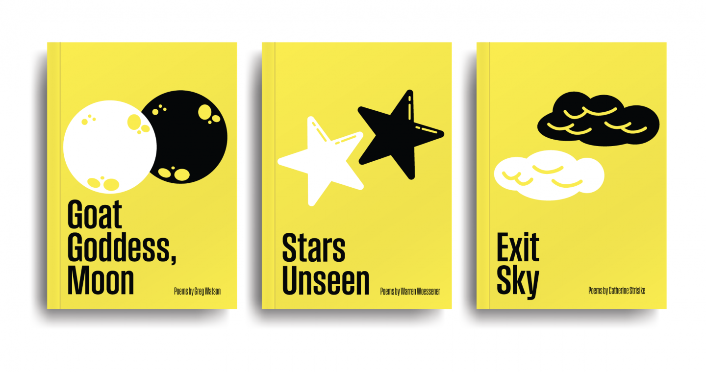
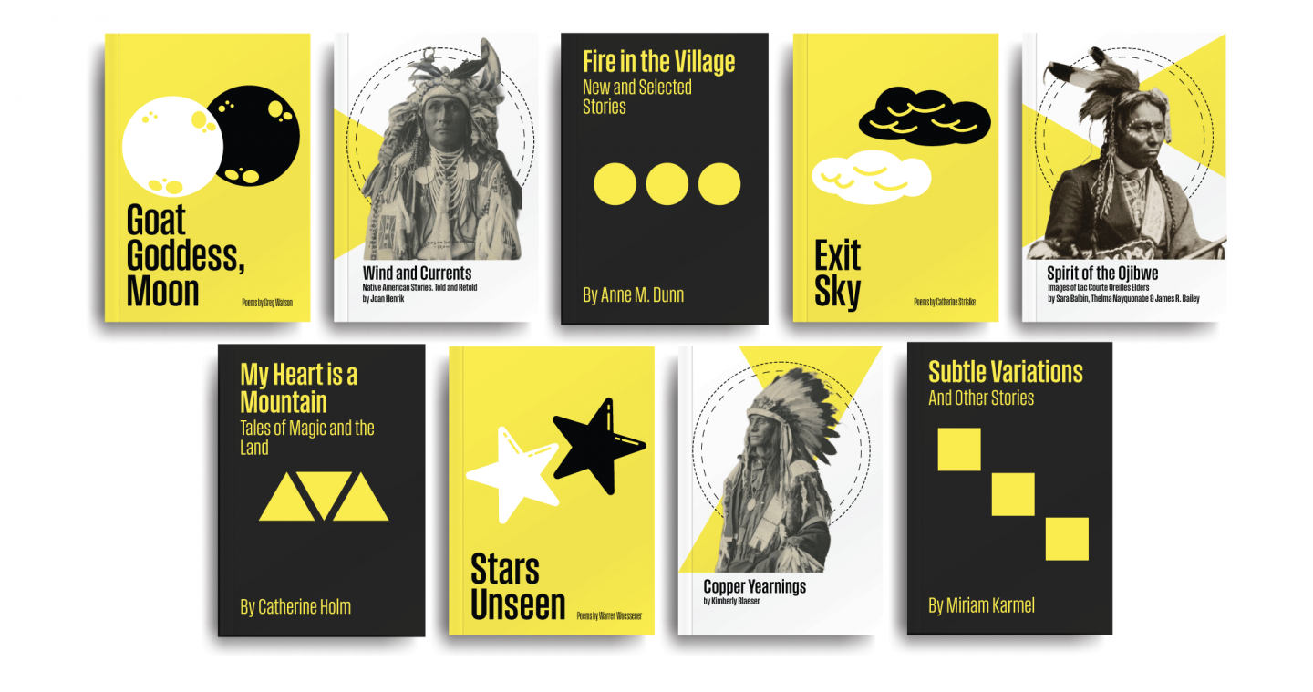
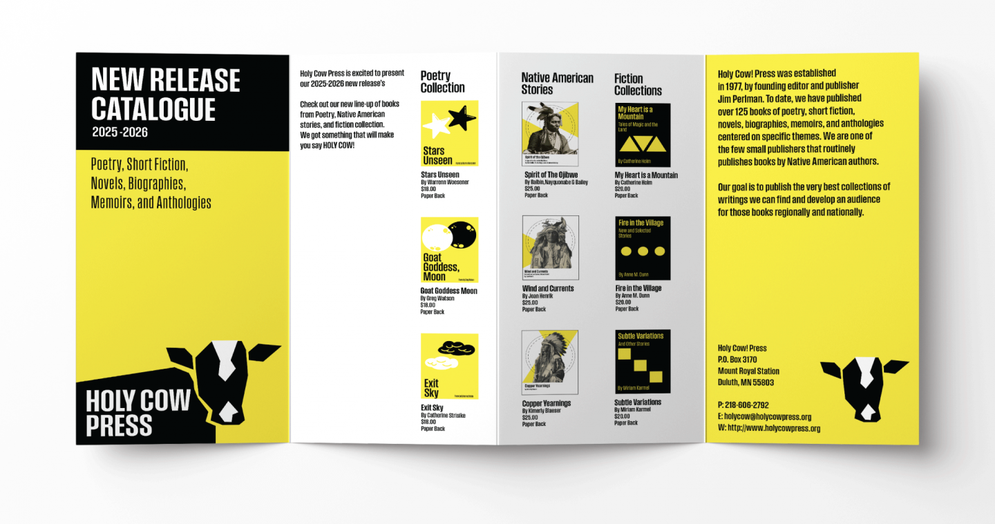
Publishing house brand identity redesign for Holy Cow Press. The process focused on amplifying the distinctiveness of the publishing house’s name, using it as a central visual and conceptual anchor. I developed a bold yellow, black, and white color palette to create a striking, high contrast identity that commands attention. The inclusion of a cow as the primary logo serves as both a literal and symbolic element playful yet strong representing the press’s mission to highlight and embolden authors, particularly those whose stories deserve greater visibility.