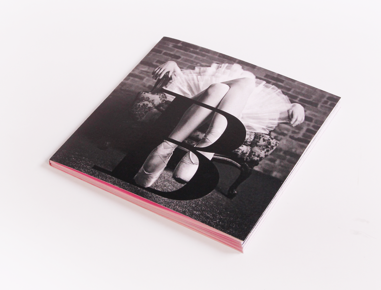
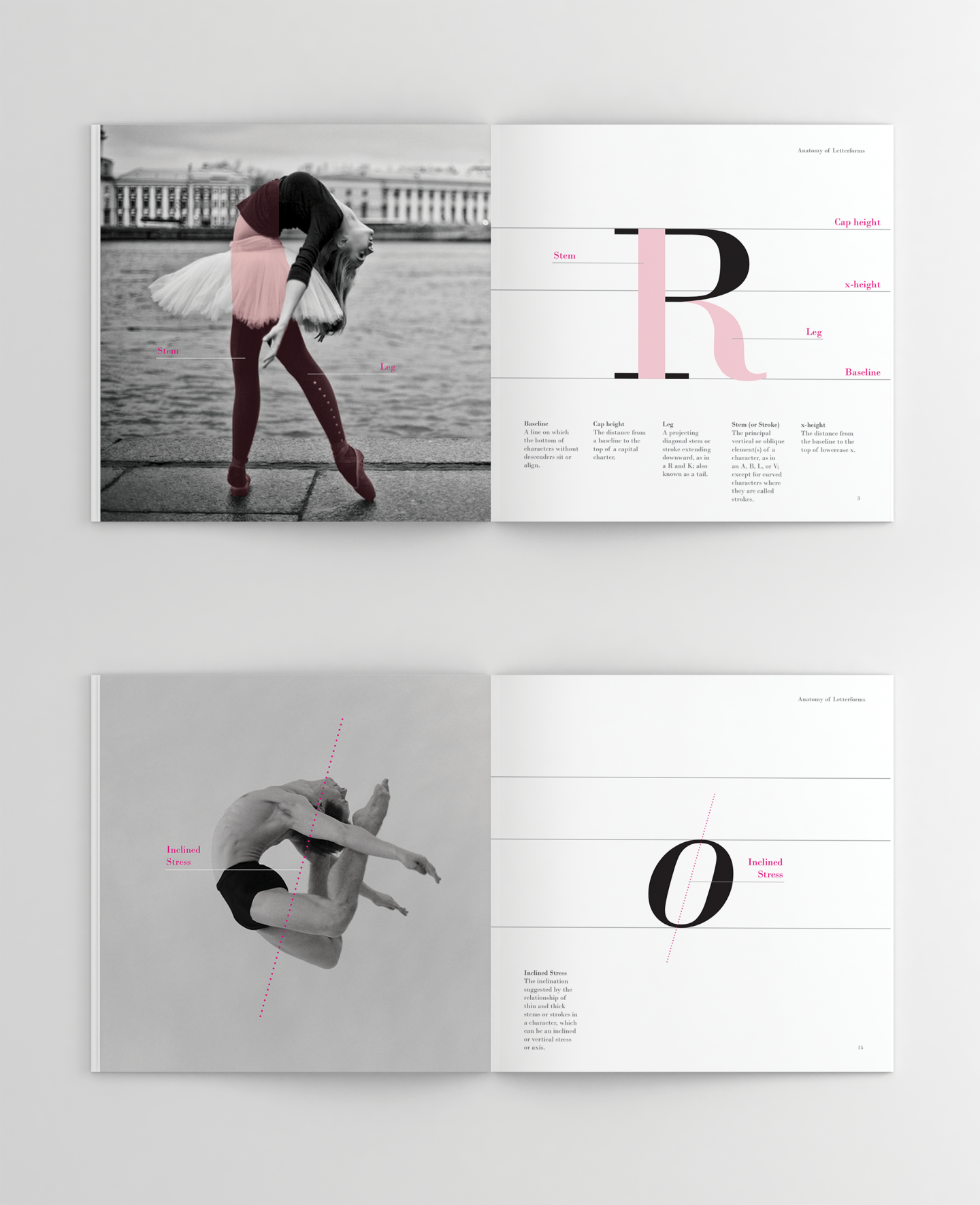
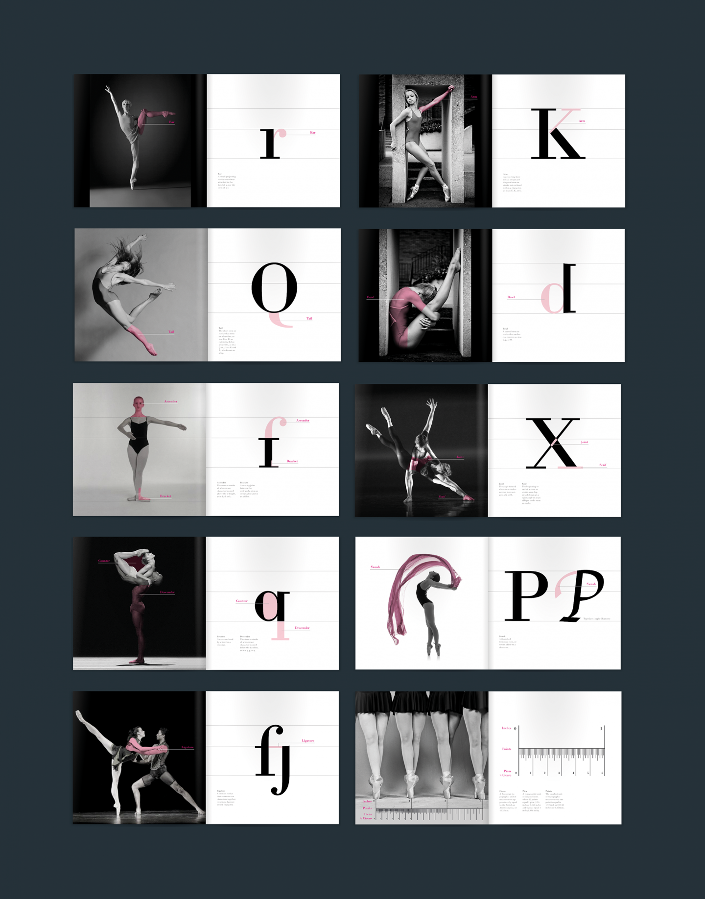
This project is about the introduction of the anatomy of letterforms for a specific group using one typeface. The typeface that I chose is Bodoni, and the target group is ballet dancers. Bodoni is a well-known classical serif, so I think Bodoni is in good harmony with classical ballet. I also think the human body is so beautiful. The cover image of this book is only the letter “B” with legs wearing ballet shoes. The colors are black, white, and magenta to suggest a simple and classical mood. Each page is composed of one letter that offers a possible anatomy letterform on the left and related ballet poses on the right.