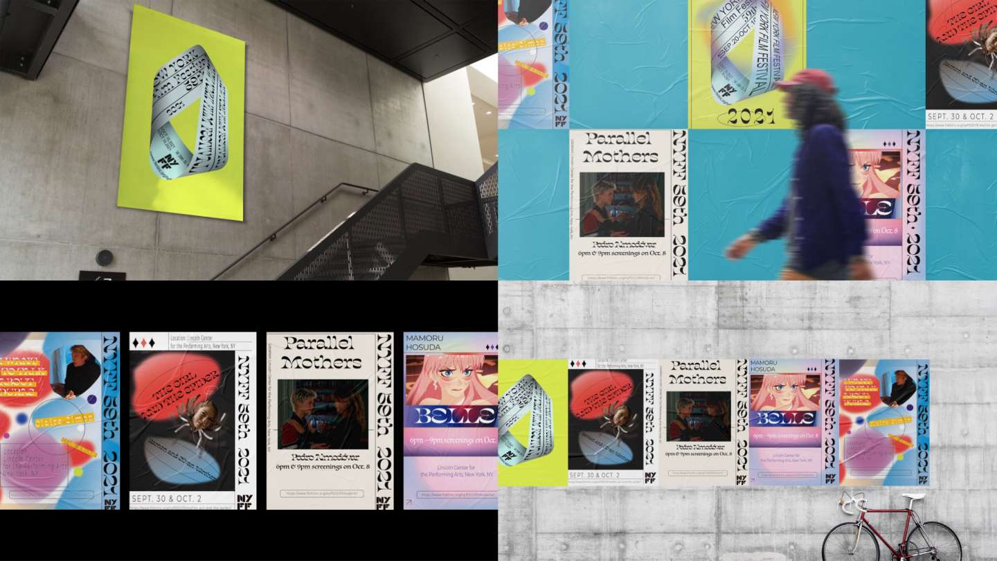
NYFF: The project was to design a series of posters based on the information on the New York Film Festival website. They needed to have a consistent visual effect. The acidic design approach is reminiscent of the visual experience that psychedelic drugs provide. It frequently takes the form of repeating geometric forms or brightly saturated colors. This acidic aesthetic has accepted a societal notion of "free love" and extreme hedonism in today's globe during the last few decades. The film is another form of entertainment that people enjoy. In essence, I believe there is a significant degree of conceptual convergence between the two. As a result, I used vivid colors and vintage fonts in my poster design.
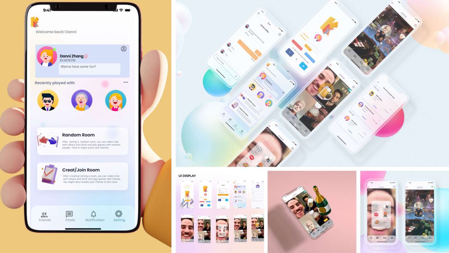
Knock Knock: Knock Knock is an app that allows users to socialize while staying at home and utilizing their remote gadgets. While video chatting with the others, you can drink and play board games. You can also meet new people here. Nothing will be able to keep you from forming connections with other individuals. Our Mission is to connect people all around the world and make people feel less lonely.
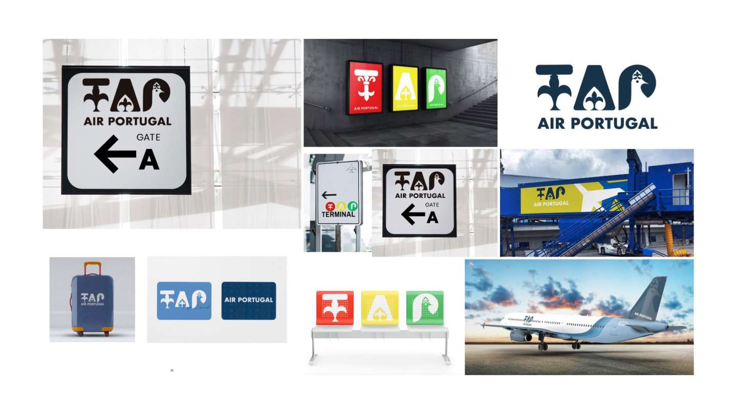
TAP: The aim of this project is to reinvent TAP Airlines. We'll redesign the visual identity and reimagine the complete visual system. I'm hoping to make the sign youthful while including traditional characteristics from the area, to bring a clash of fashion and tradition to a close.
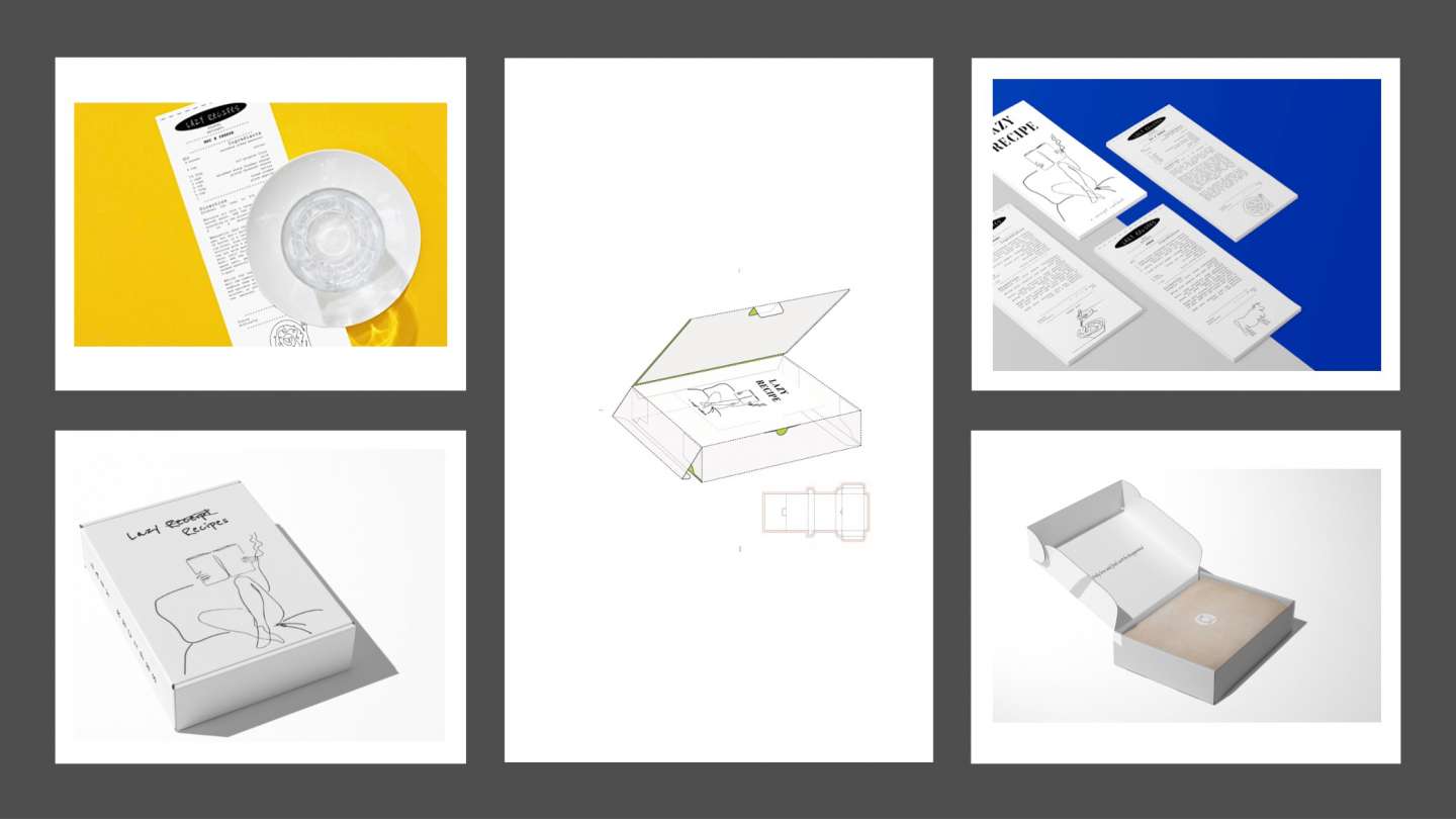
Cook Book: This work is for people who want to cook but are too lazy to do it. The design concept is positioned in the perspective of the mass consumer to find conflicts and solve problems. Based on my always mixing up the spellings of receipt and recipe, I made a receipt from the cookbook. The receipt's size makes it easy for people to tear off and carry menus with them, especially if they're in a hurry. When you go shopping, all you need is a piece of paper the size of a receipt. Furthermore, all of the meals in the lazy recipe are quite basic and simple to make. In addition, I chose edible paper for the sake of ecology and creativity. This saves paper and allows lazy individuals to consume the recipes after they've been used.
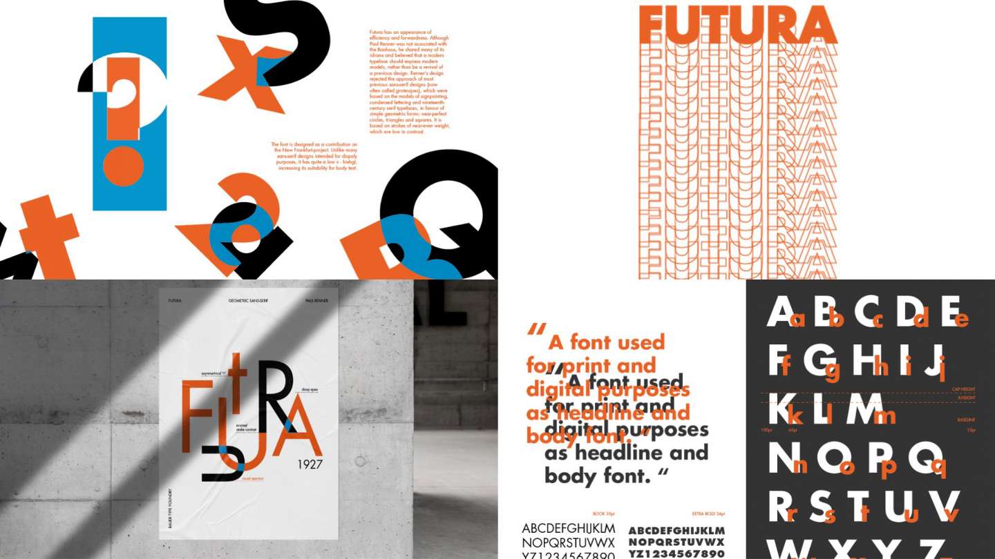
Futura Specimen: Futura is a geometric sans-serif typeface designed by Paul Renner and released in 1927. It was designed as a contribution on the New Frankfurt Project. It is based on geometric shapes, especially the circle, similar in spirit to the Bauhaus design style of the period. It was developed as a typeface by the Bauer Type Foundry, in competition with Ludwig & Mayer's seminal Erbar typeface of 1926.
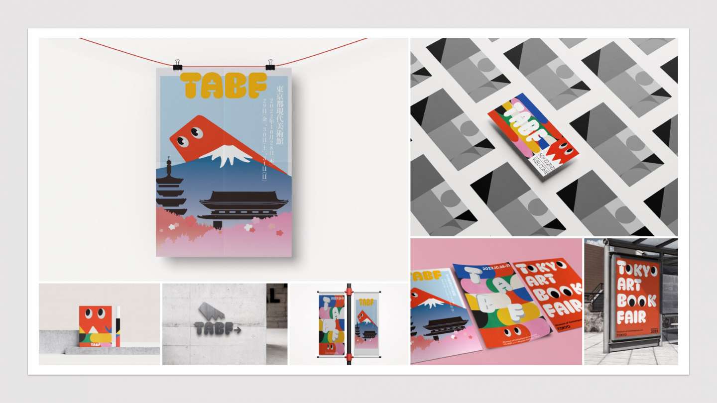
TABF:The aim of this project is to reinvent TABF. The TOKYO ART BOOK FAIR (TABF) started in 2009 as the first book fair in Japan dedicated to art publications. Once annually, the TABF serves as a place for artists, galleries, and publishers of unique art books from both Japan and abroad to converge in Tokyo.