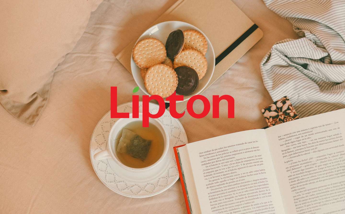
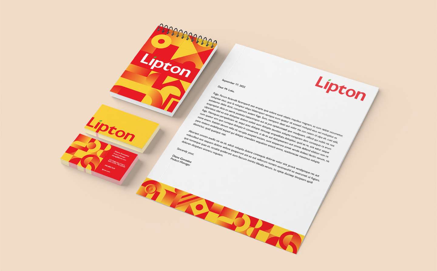
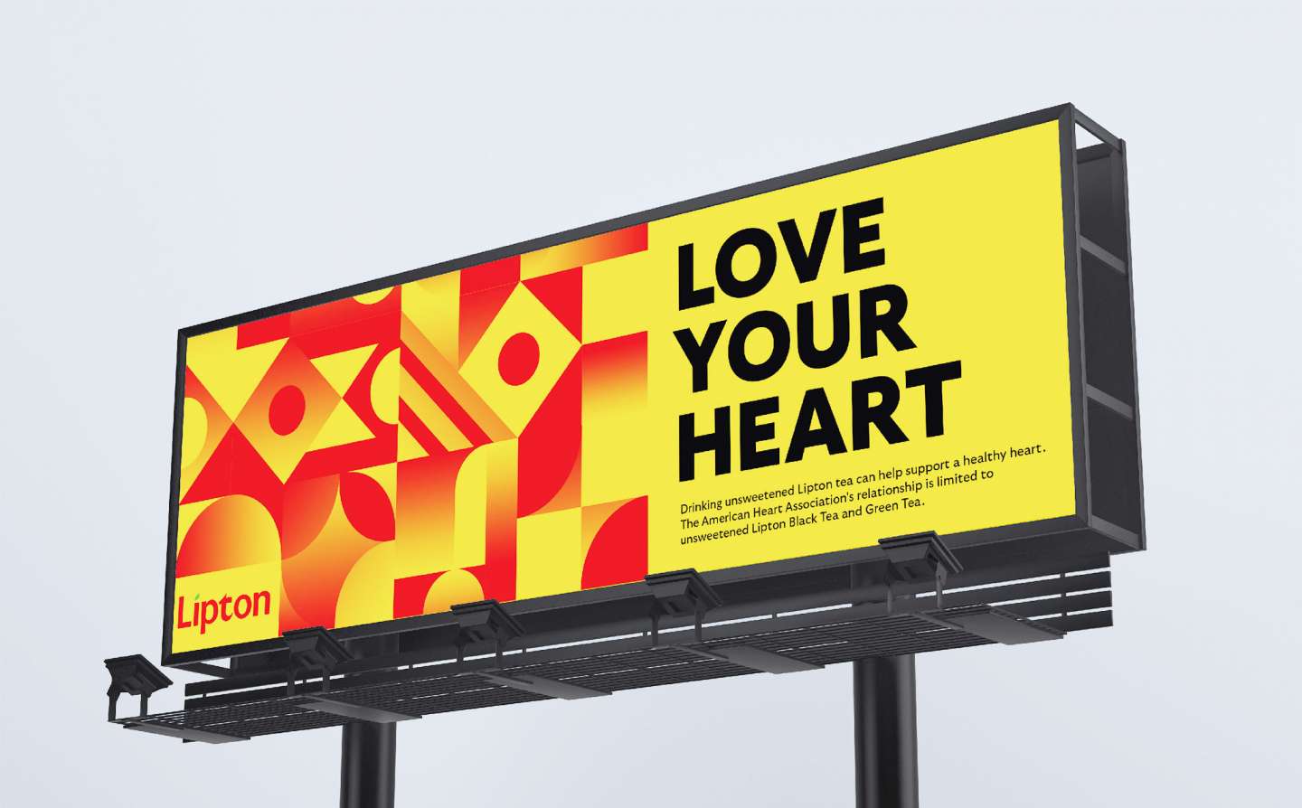
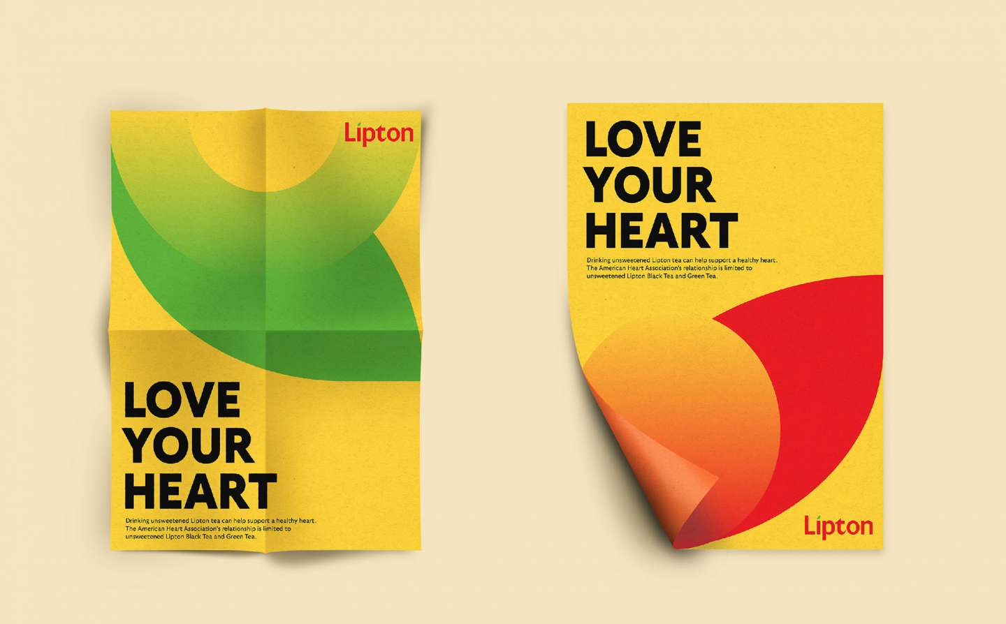
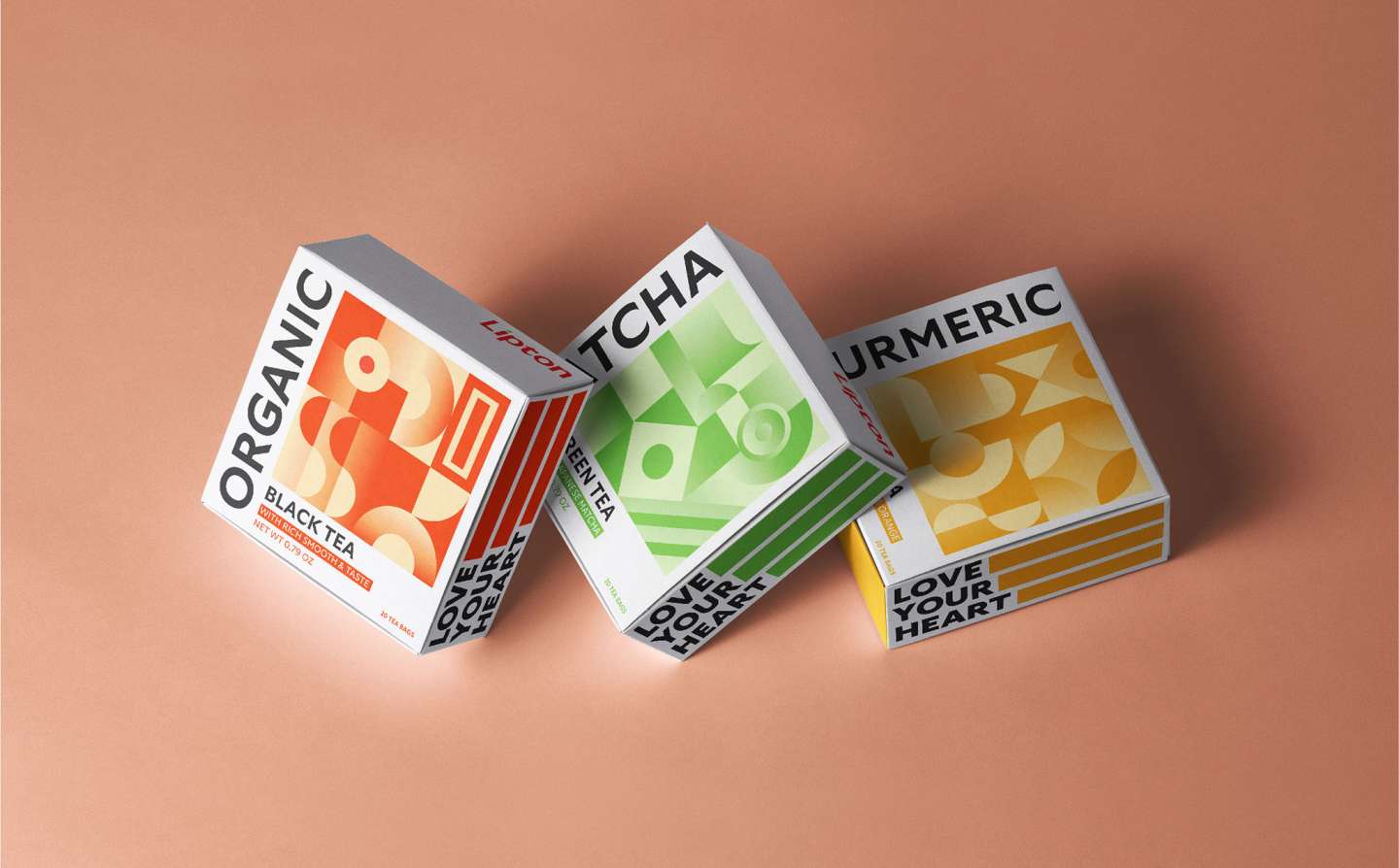
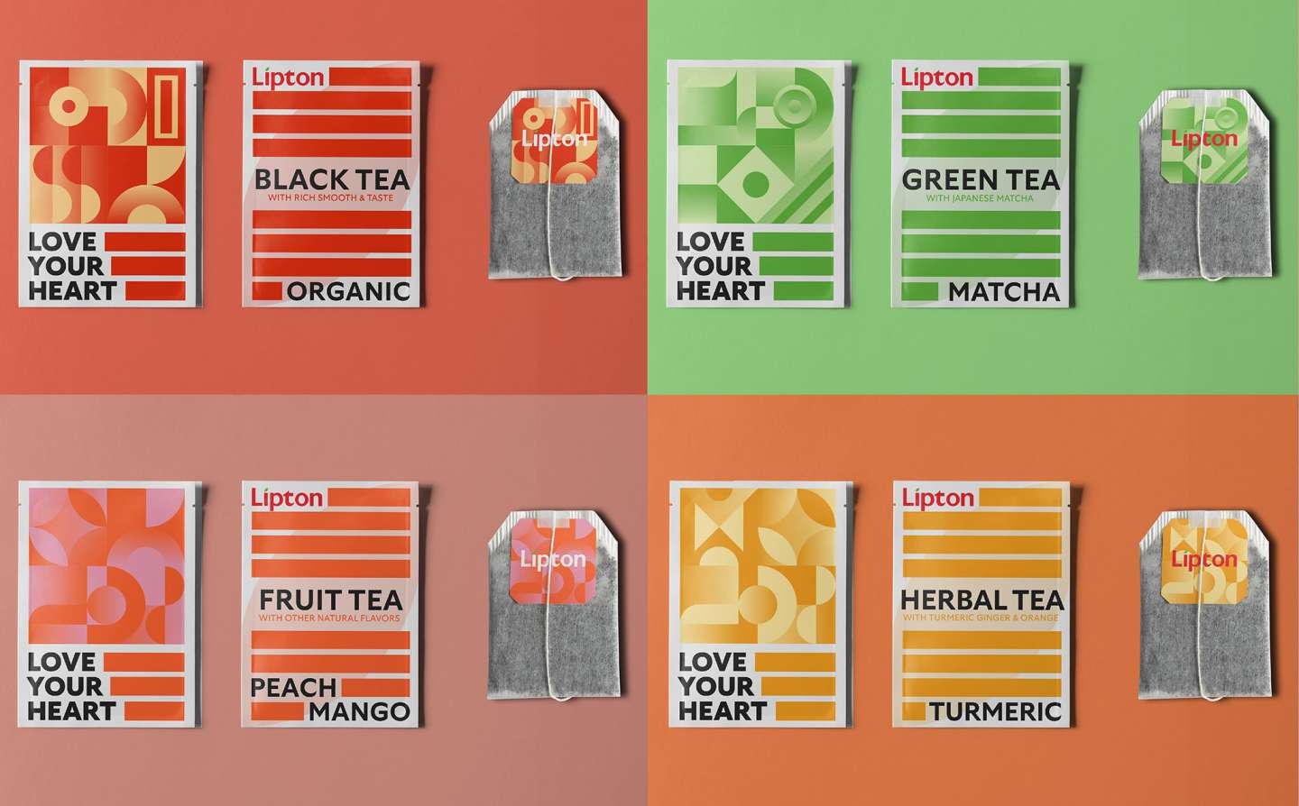
A rebranding project for Lipton tea. The new branding focuses on clean, minimalistic designs with bold typography and vibrant colors that appeal to a younger audience. The packaging has been updated to feature a more streamlined design, with a new color palette that includes fresh greens, reds, and yellows. The Lipton logo has also been modernized with a simplified font and more contemporary styling. The overall effect is a more approachable and relevant brand image that appeals to a modern consumer who values health, wellness, and sustainability.