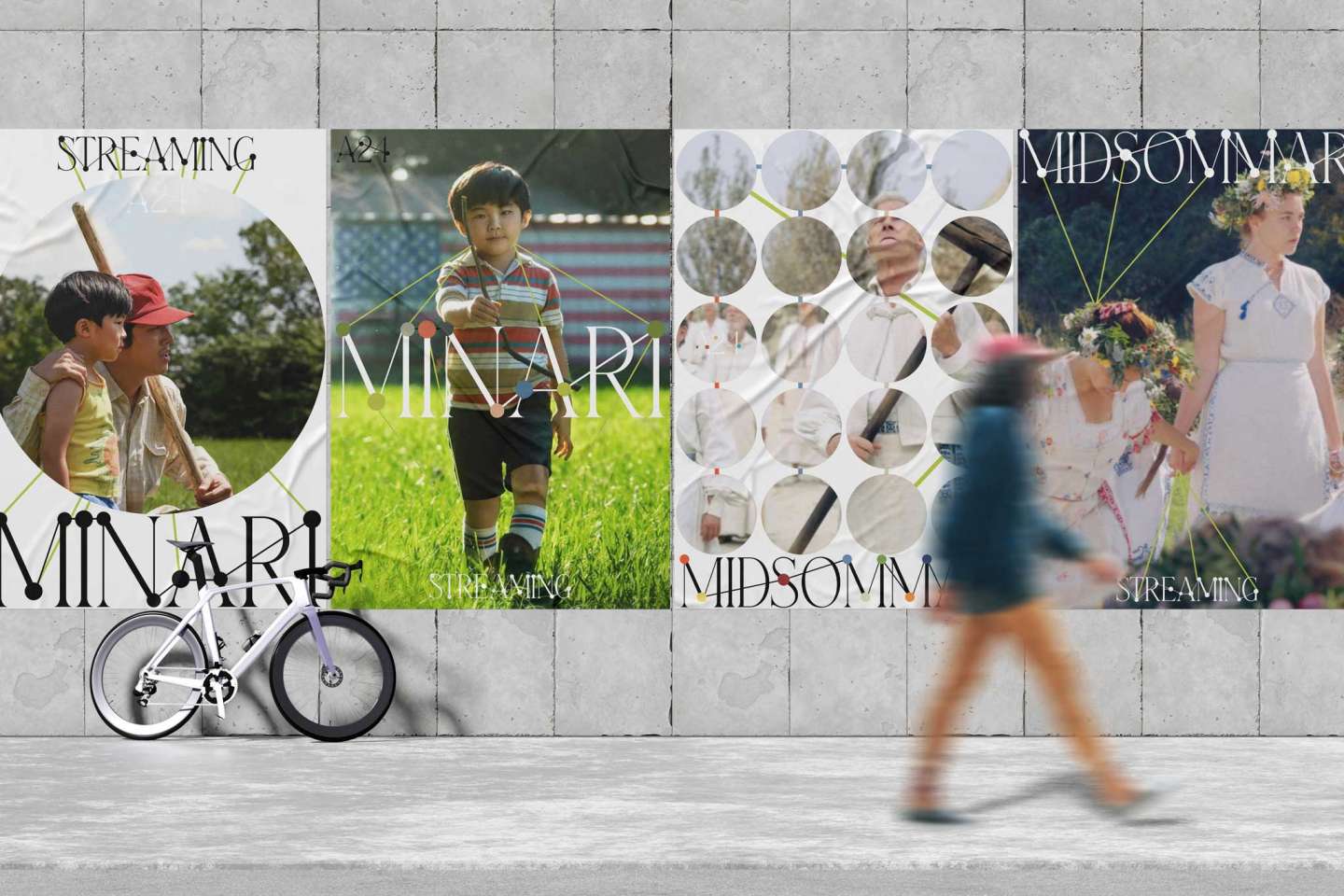
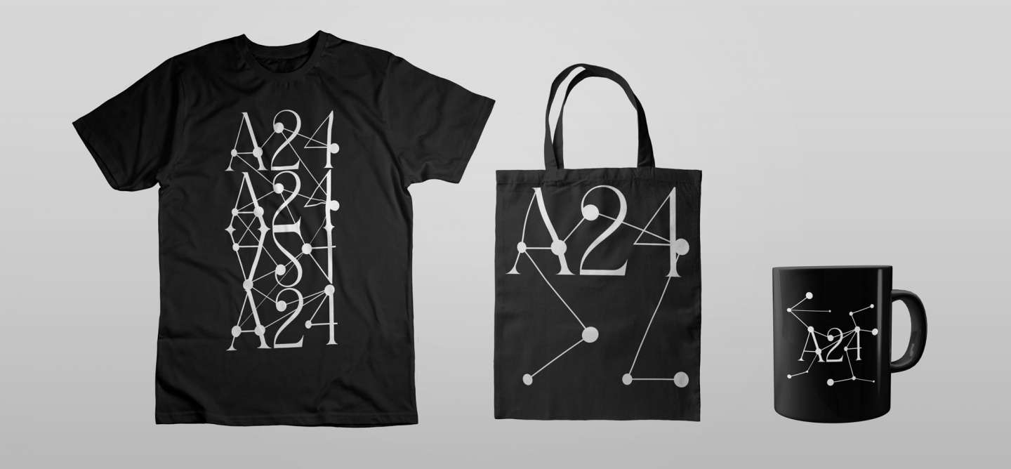
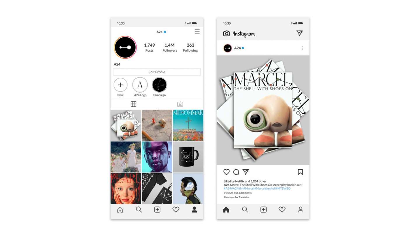
The A24 rebranding project is all about capturing the essence of connection through a dynamic and expressive logo. I drew inspiration from the idea that stories and emotions are interconnected, just like the dots and lines that connect each letter in bold and engaging typeface. By using a concept of plot, the logo captures the dynamic nature of storytelling. The tint of colors used in the brand represents the unique personality of their production, and my aim is to make a harmonious connection between the typography and the dots and lines.