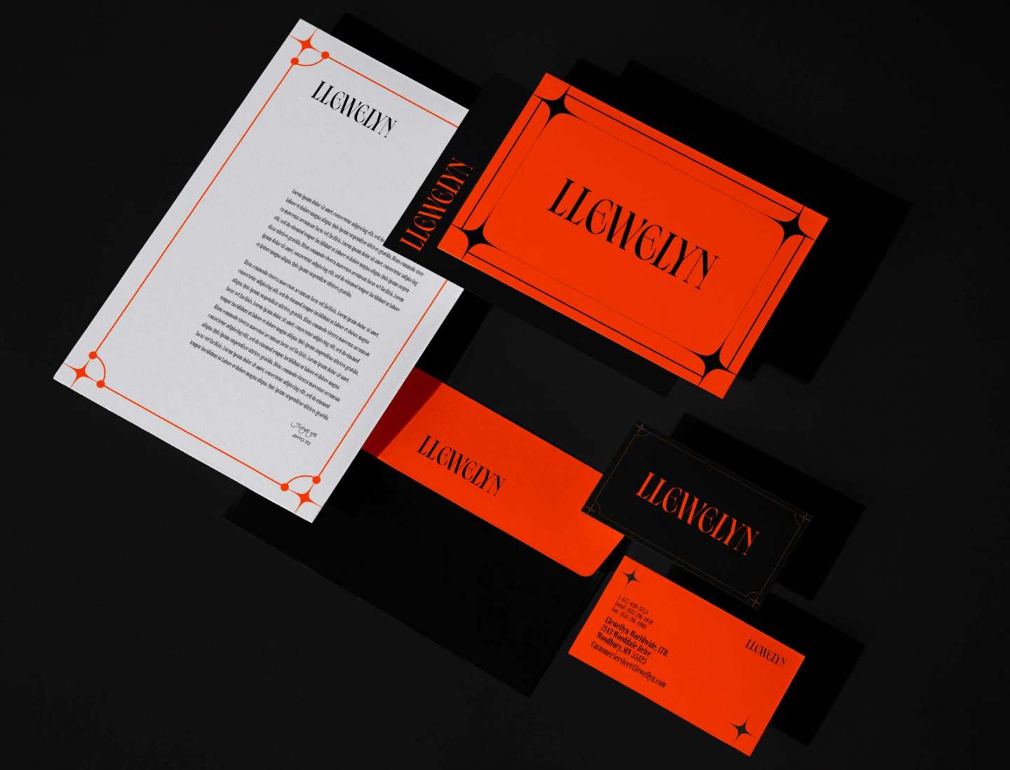
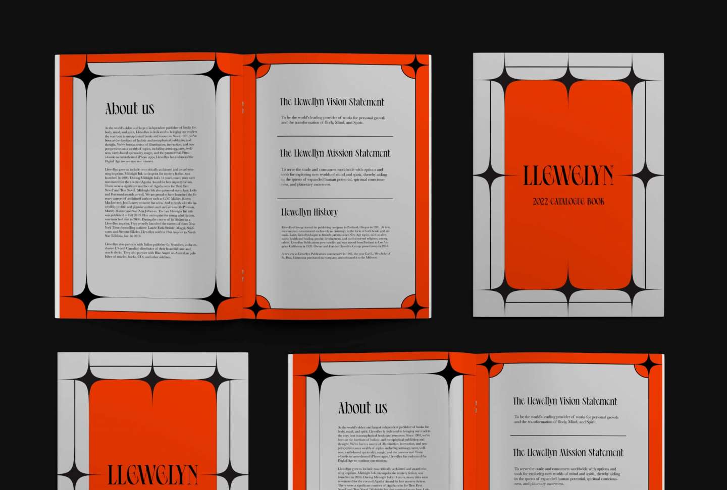
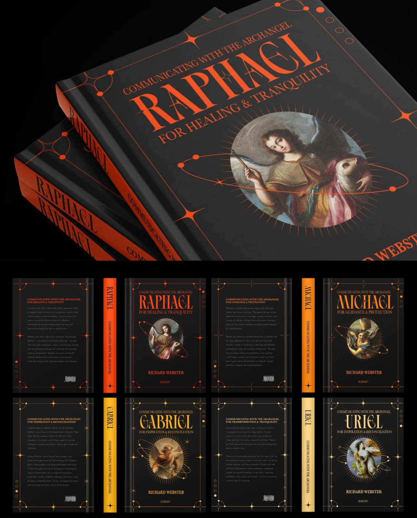
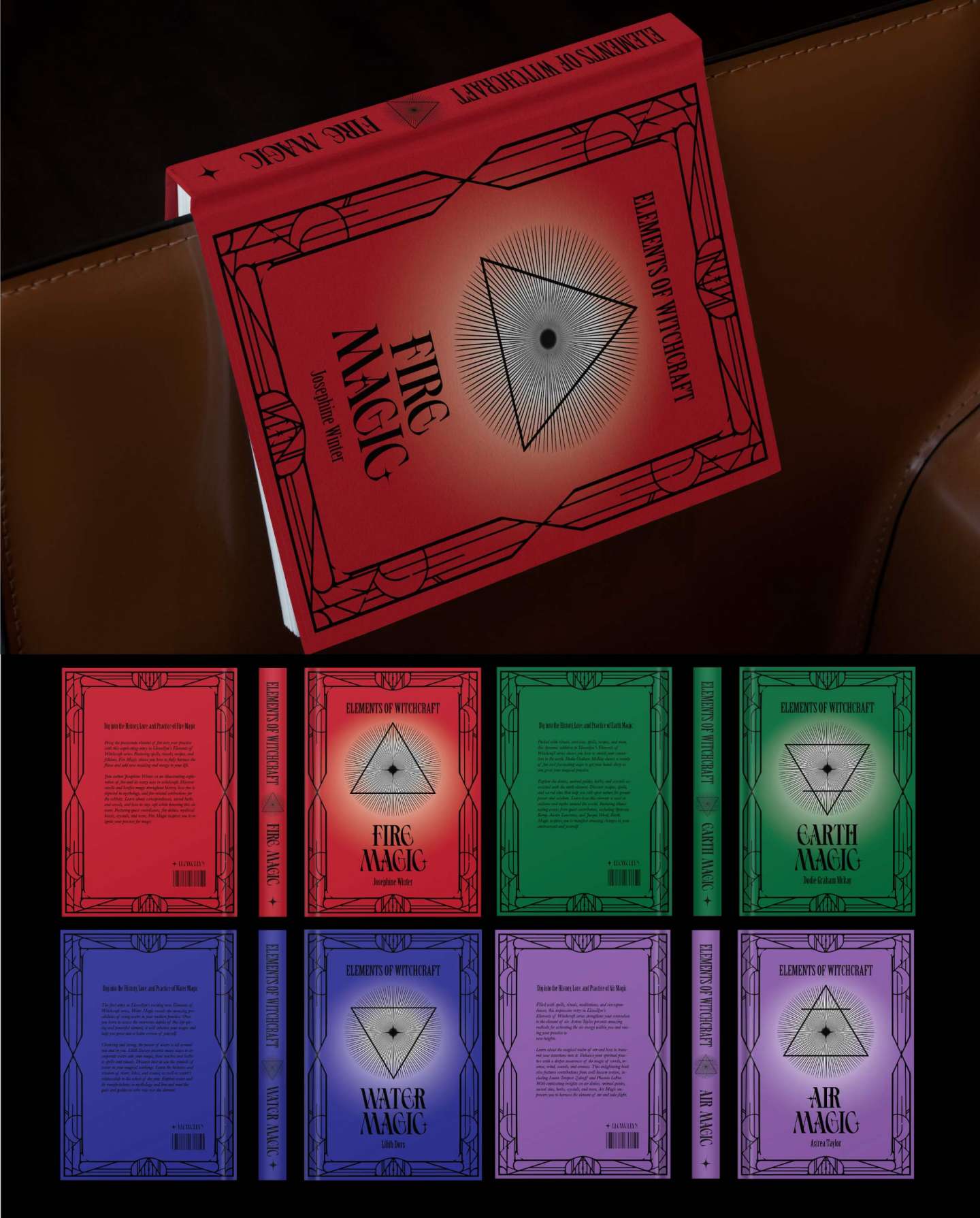
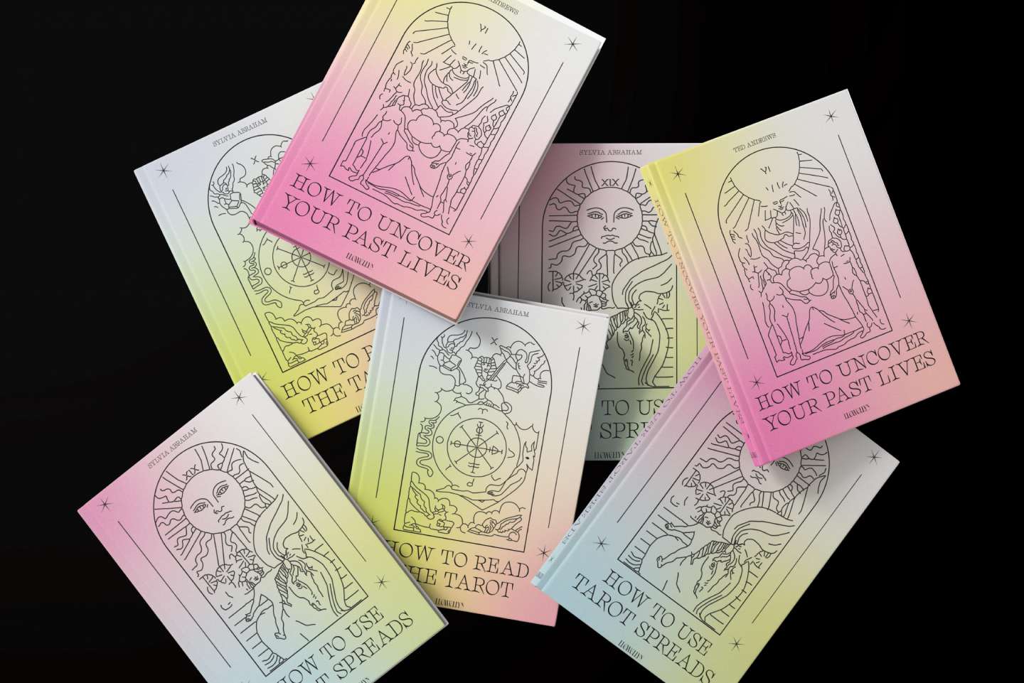
I rebranded a project for a book publishing company that was established in 1901, with a focus on New Age subjects like alternative health and healing, psychic development, and more. My goal was to give the brand a more current look and feel, while still paying homage to its rich history. To achieve this, I opted for a typographical style that was both distinctive and classic, and carefully selected a color palette that would blend seamlessly with the overall design. The end result is a brand that perfectly balances modernity with tradition. Additionally, to make the brand even more distinctive and personal, I decided to create unique illustrations for the cover of the book series. I used my own artistic skills to produce high-quality and visually appealing illustrations that perfectly complemented the overall design aesthetic. By doing so, I was able to create a complete visual identity for the brand, with a consistent look and feel that conveys both modernity and authenticity. Redesign a publishing company Llwellyn identity as well as a series of three different books from that publishing house. These books are meant to explain difficult topics for spiritual.