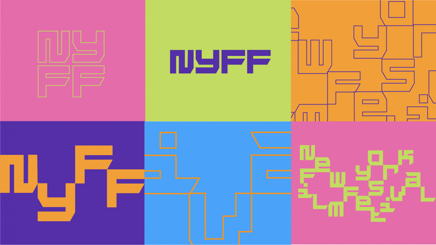
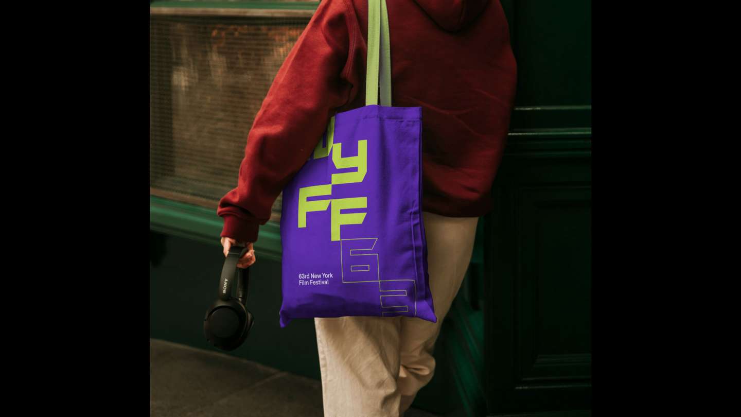
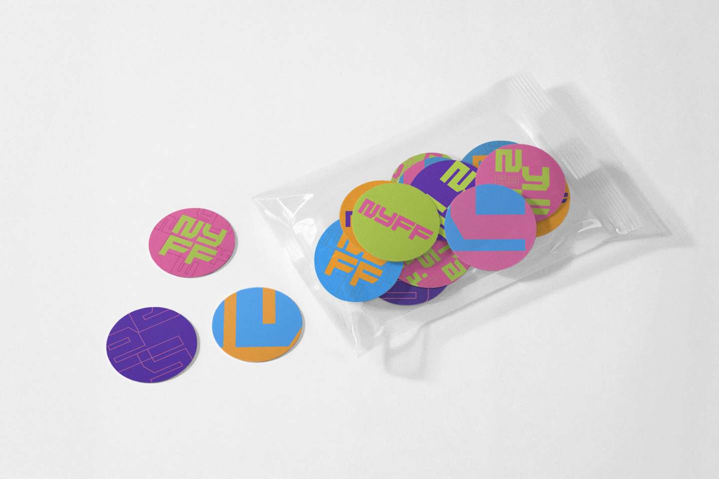
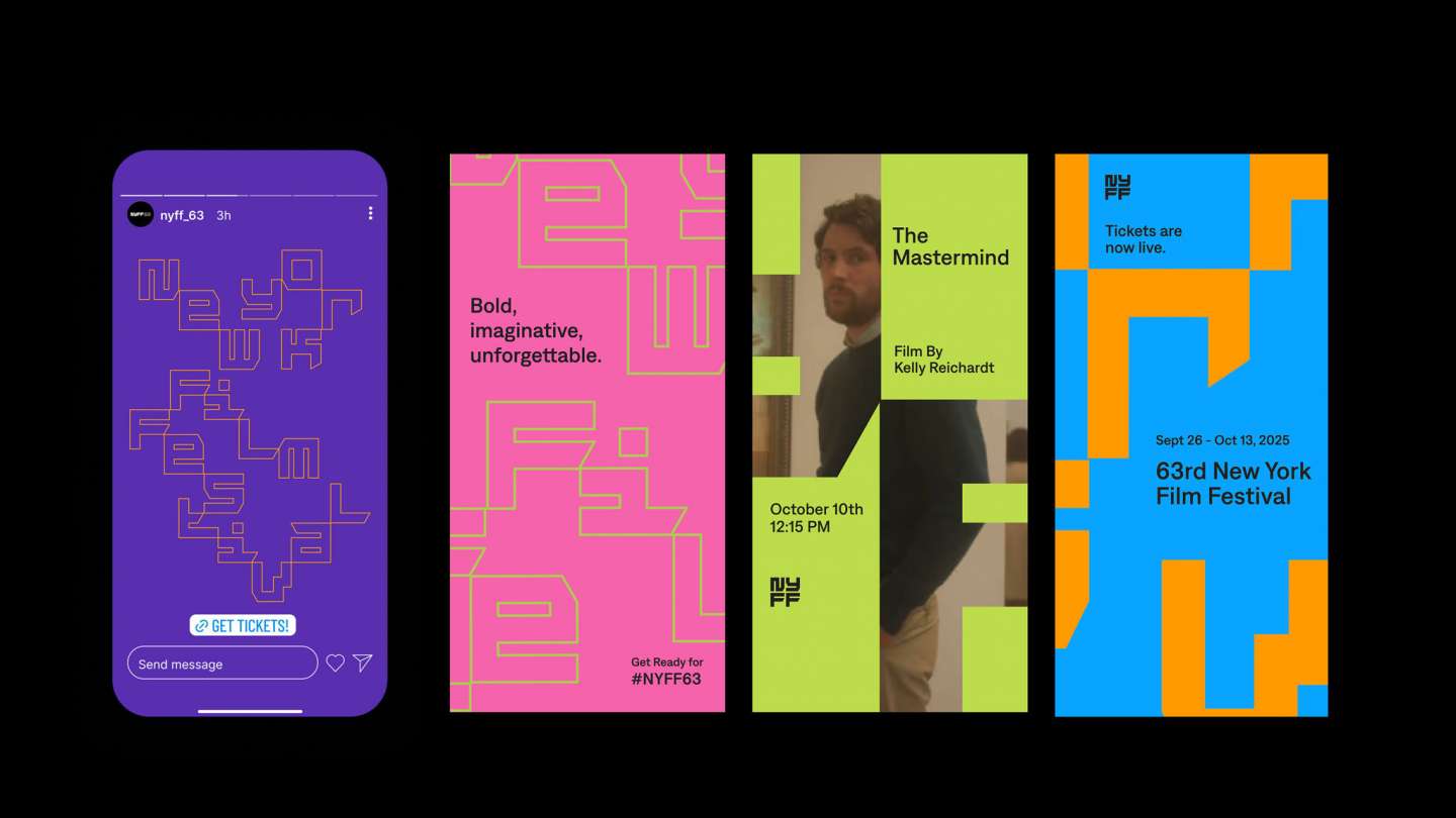
A rebrand for NYFF 63, this project evolves the NYFF50 logo, preserving its original beauty while updating it for today’s world. The new version bridges heritage and innovation, reflecting NYFF’s ongoing evolution. We customized the wordmark by sharpening its edges to emphasize NYFF’s focus on experimental films, using bold angular forms to convey the idea of breaking out of the grid and breaking free from rules and structure. The design captures NYFF’s creative and pioneering spirit, where film and design both push boundaries and explore new possibilities. The typeface can also extend into patterns across the visual identity.