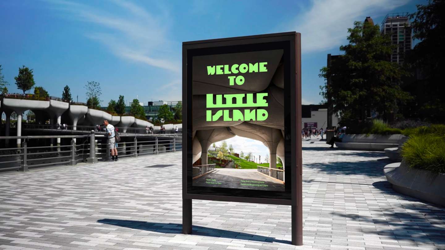
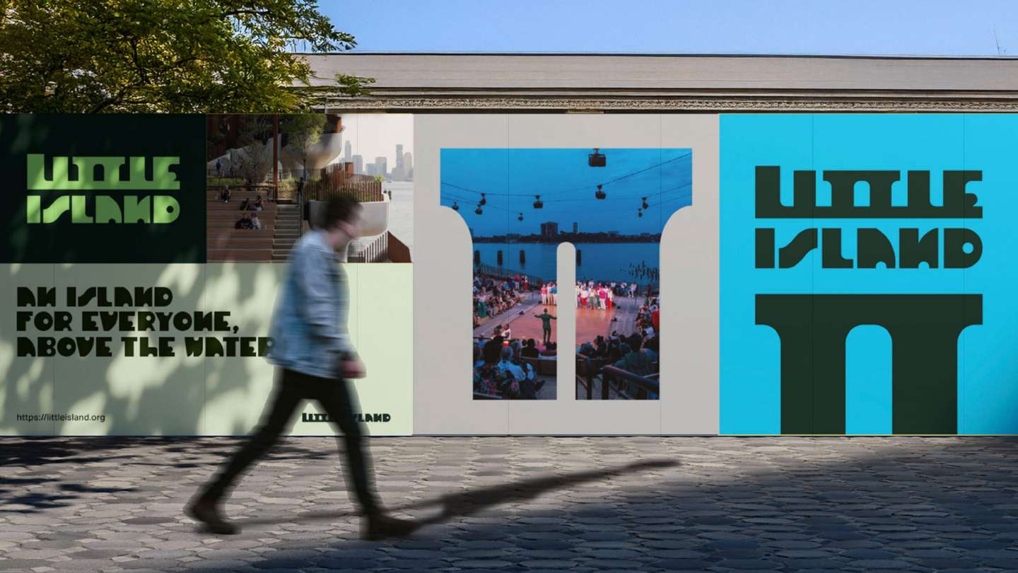
Little Island is a rebranding project that builds its identity from the island’s architectural structure. Inspired by the repeating forms of its pots and supporting columns, the typography is constructed as a modular system. These elements translate spatial rhythm into typographic form, extending across signage and graphic applications. By shifting and repeating, the system reflects the island’s continuous composition and architectural flow.